The “surreally good” identity for a grown-up cereal brand
by IBRAHIM
The “surreally good” identity for a grown-up cereal brand
Surreal resists the clichés of the cereal aisle, with a series of “off-beat” visuals and multi-purpose mascot.
London design studio Onwards has crafted the “off-beat” branding for adult-orientated cereal brand, Surreal.
Surreal is a new range of cereal, geared towards a more mature audience; the four flavours are sugar-free, gluten-free and vegan.

“Most importantly, it tastes like the indulgent cereal we all still secretly love,” says Onwards founder Joe Ryrie. The Onwards team is responsible for the naming, strategy, and packaging for the cereal start-up.
According to Ryrie, the studio saw an opportunity to put a spin on familiar cereal branding codes. “The reason why we love those favourite childhood cereals is because they take us back to a time when we were free of responsibilities,” Ryrie says. “It was a simpler time.”
Perspective-shifting breakfast
The branding hopes to engage a sense of “innocent questioning” for its adult consumers, the designer adds. One of the guiding principles – ‘Never stop playing’ – is rooted in the idea that a “playful mindset is a healthy mindset”, Ryrie explains.
The double-meaning within the name Surreal helps to communicate this attitude, the designer explains, pointing to some of the out-there images throughout the identity. “It’s one of those names that looks really obvious, but as with any naming project, it takes a lot of grasping to get to the obvious answer,” he says.

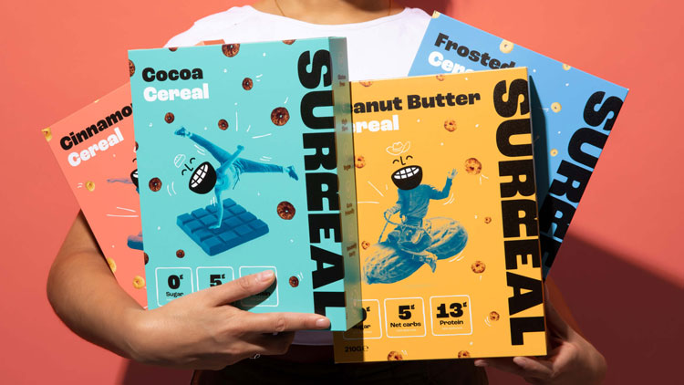
The wordmark – which uses the typeface Roc Grotesk – shifts perspective on the second ‘r’. This lets the brand display the wordmark horizontally or vertically while remaining legible, Ryrie explains.
On the packaging, the wordmark is displayed vertically which aims to engage a “more playful mindset at the start of your day”, the designer says. “It’s the idea of shifting your perspective in the morning.”
The packaging contains more “off-beat” visuals which relates to the four flavours, Ryrie says. The peanut butter range features a vintage photo of a cowboy riding a peanut, while the cocoa series replaces an exercise mat with a chocolate bar.
“Surprising and uplifting”
Onwards has also designed a mascot for Surreal; a smiling face with a cereal bowl for a mouth. Ryrie describes the face as a secondary logo, which can adapt to a variety of expressions. “We wanted the whole brand language to feel surprising and uplifting and a little bit off-beat,” he adds.
One of the challenges for the branding was to balance a sense of playfulness while creating something for adults, Ryrie explains. While Surreal uses bright colours typical of the category, other visual elements such as the typeface have a more “modern and sophisticated” feel, he adds.
The packaging also displays the nutritional value clearly; icons explain the food’s carb content and that the cereal is keto-friendly.
It’s most clear in the brand’s messaging, according to Ryrie. “The copy is thought-provoking, upbeat and a little bit eccentric rather than just fun and playful,” he says. These include taglines like ‘You cannot be cereal’ and “It’s surreally good”, which roll out across social media campaigns.
What do you think of the branding for Surreal? Let us know in the comments.
Recommended Posts

NB invites local designers centre stage for Vineyard Theatre rebrand
February 24, 2023

“AI revolution” will change way design studios look within three years
February 24, 2023
Rbl rebrands ZSL with ecosystem-inspired identity
February 23, 2023