Rbl rebrands ZSL with ecosystem-inspired identity
by IBRAHIM
Rbl rebrands ZSL with ecosystem-inspired identity
The conservation charity’s rebrand is a “journey of recovery” to unite its “innovative, science-driven” conservation work and “rich history” through a new logo and graphic system.
Leamington Spa-based studio Rbl has repositioned The Zoological Society of London (ZSL) to better represent the interconnected strands of its work with a new logo and graphic language inspired by ecosystems.
After being recommended to ZSL, Rbl won the work through a competitive pitch process. Rbl creative director Adam Concar says that the brief was about “solving a problem” and that ZSL was “very open to how they solved it”.

Coinciding with the brand’s 200-year anniversary, ZSL was also looking to shift its strategy and “capitalise more on the brand”, says Concar. Despite rebrands in 2003 and 2015 seeking to achieve this, Concar says that ZSL ended up “creating identities for every activity due to a lack of strength behind the master brand”.
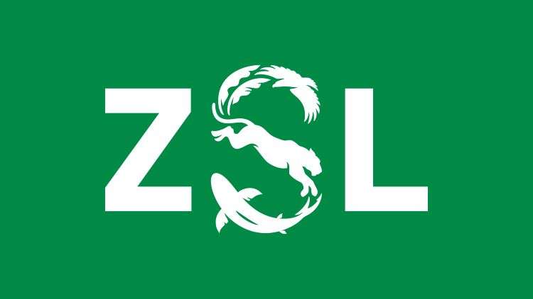
ZSL’s new logo aims to bridge the gap between two different aspects of the organisation: its “innovative, science-driven” conservation work and its “rich history”, according to Concar. He describes how the S – which features silhouettes of an eagle, lioness, shark and banana leaves – represents “a journey of recovery”, reconnecting with ZSL’s heritage by bringing in elements of the past in a contemporary way.
The studio worked with type designer and lettering artist Rob Clarke on the final logo design. Concar says “one of the trickier nuts to crack” was making sure the silhouettes had “a high level of craft” to avoid them looking “too iStock”.
The key element to ZSL’s graphic language is the circle, which is used across the brand in a variety of ways. Concar says that it symbolises “the whole ecosystems that the brand works in” as it brings imagery and patterns to life as a framing device.
Rbl opted to use Proxima for the brand’s master typeface, which is a versatile geometric sans font designed by Mark Simonson. The typeface helped Rbl to build an identity with a “strong core” that ZSL can “flex” to suite the diverse disciplines and audiences that they work around, says Concar.
While the “hard-edged, corporate” Proxima Nova is used on the science and conservation side of the brands, Concar says Proxima Soft’s “warm, welcoming” style is more family-friendly and suited to the zoos.
The influence of ecosystems continues into ZSL’s new colour palette, as Rbl took cues from nature in “a slightly offbeat” way, Concar adds. Its new logo is seagrass green, as seagrass has the ability to absorb carbon and is vital to marine life. The unconventional green also has the ability to hold together the rest of the “vibrant palette”, explains Concar.
ZSL’s updated website was designed by TPXimpact. Rbl worked with the consultancy early on in the process to ensure that the graphic language would translate seamlessly onto the digital touchpoints.
The new identity has launched internally and on ZSL’s website and will continue to roll out in the coming months.
Recommended Posts
Norfolk Coast logo and identity by Lantern
November 23, 2023
SeidrLab visual identity by Mubien Brands
October 16, 2023
Jarrolds logo and identity by The Click
October 5, 2023
