NB invites local designers centre stage for Vineyard Theatre rebrand
by IBRAHIM
NB invites local designers centre stage for Vineyard Theatre rebrand
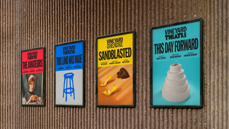
NB Studio created a brand system for the theatre that features 25 guest-designed typefaces and counting, each representing a different show or genre.
NB Studio has rebranded the Vineyard Theatre in New York with a flexible typography-led identity that showcases independent designers and type foundries local to the city.
The studio rebranded the Almeida Theatre in Islington, London a few years ago and was encouraged to submit its approach to Vineyard Theatre after being recommended by a connection from the Almeida. NB founder and creative director Nick Finney says that it must have been “a wild card from the UK” but ended up creating the winning pitch.

Vineyard Theatre’s new strategy embodies the concept of being “Fearlessly Made In New York”, says NB strategy director Dan Radley, adding that it seeks to “shift the emphasis to Vineyard as a place where daring art is cultivated”. Another reason behind the rebrand is to mark the theatre’s 40th anniversary.
Early in the design process, NB senior designer Reuben Alghali says that the studio team was questioning how it could characterise a theatre whose performances “can’t be defined with a single typeface or logo”. The answer was to use a wide variety of different typefaces across the identity. While the word Vineyard remains the same for every logo, the word Theatre changes font to represent different productions and genres.
Each of the 25 typefaces in the brand system was created by a New York designer or type foundry, “chosen to surprise and delight”, says Alghali. He adds that although the idea of collaborating with New York based designers and typographers “grew naturally” from the theatre’s new strategic focus, persuading the Vineyard Theatre team to adopt “such a convention-defying approach” was a challenge.
Vineyard Theatre’s new bank of logos includes typefaces by Sharp Type, p22, General Type Studio, Tobias Frere-Jones, Brandon Nickerson, Simon Type, Nick Sherman, XYZ Type and bespoke theatre typefaces by members of the team at Vineyard, who collaborated with Pentagram New York partner Eddie Opara. Over the coming months, NB hopes to foster further collaboration with New York designers and and invites those interested to get in touch to build on this collection.
The colour palette is another aspect of the branding that offers flexibility. Alghali says that the colours used across the brand are picked out from “key art” in the theatre’s shows. This aligns with the strategy which involves “each show being about the makers and making of each performance, rather than the Vineyard itself”, he explains.
The new identity officially launched at Vineyard Theatre’s 40th Gala event earlier this month. NB is still open to submissions from New York-based designers as the theatre’s brand continues to develop throughout its new season.
Recommended Posts

“AI revolution” will change way design studios look within three years
February 24, 2023
Rbl rebrands ZSL with ecosystem-inspired identity
February 23, 2023

Uncommon CX cooks up interactive cost-of-living cookbook
February 23, 2023