The Mean Tomato puts a spin on classic New York pizzeria branding

by IBRAHIM
The Mean Tomato puts a spin on classic New York pizzeria branding

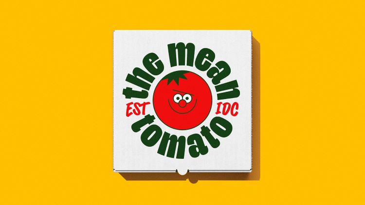
The food brand’s new identity features a mischievous and unconventional tomato mascot.
Designer and lettering artist Alec Tear has collaborated with studio Kuba & Friends to create an unconventional new pizza brand for US delivery service Gopuff.
The Mean Tomato, a food company which sells New York-style pizza and will be delivered by Gopuff, has been designed to stand out in a crowded market.
Tear led the project creatively while Kuba & Friends founder Kuba Wieczorek managed it, working closely with the team at Gopuff. Tear also enlisted a team of independent collaborators to help bring The Mean Tomato to life.
While branding plays on classic New York pizzeria tropes – incorporating the colours of the Italian flag, for example – the design team aimed to attract attention through an eye-catching and mischievous mascot.
This mascot is central to the branding, and the company takes its name from him. In line with his mischievous personality, the tomato character seeks to “ruin as many brand touchpoints as is physically possible”, says Tear.
To create the cartoon, the team commissioned illustrator Dan Woodger, who was tasked with crafting a character that is instinctively “mean, cheeky, and absolutely full of himself”, but also still lovable, Tear explains.
He adds, “Put simply, this mascot is less of a sidekick and more of a ‘sidedick’. He’s a catalyst for humour and storytelling and allows the brand to have a dialogue with itself, or with the consumer.”
Tear adds, “There is a lot of visual nuance in this mix of personality traits, and Dan expertly captured them in his delightfully squishy style.” The designers then worked together to produce a variety of poses and animations that could be used flexibly throughout the brand.
The designer says that typography plays an important role in this identity. “With two very different voices fighting for attention, we needed two typefaces that could embody their personalities,” Tear adds.
Representing the brand’s tone of voice is the chunky Deep Pan Sans, a custom typeface by Glasgow-based type foundry Polytype. This is meant to visually contrast with the Sandwich Maker Pro typeface by Mathias Zimmerman, which is used for The Mean Tomato’s handwriting, Tear explains.
One is consistent, heavy and curvaceous while the other is loose, much lighter and scrawled, according to Tear. He adds, “These contrasting typefaces are accompanied by an equally contrasting colour pairing of green and red, which utilise some well-known semiotics.”
These two tones make up the brand’s core colours and intend to reference the classic Italian tricolour of a New York pizzeria. The design team also wanted to ensure the brand felt “energetic and joyful” so added pink and yellow to the colour palette. This intends to soften the meanness of the tomato mascot, according to the designers.
Another significant component of this brand is its lifestyle and product photography. This was captured by New York-based photographer Davide Luciano and his team, who chose to use the pizza boxes as a central branding device in the images.
The intention was to picture the consumers in colourful settings as they are either taunted by the mascot or adopting some of his personality traits themselves.
The new branding will roll out across packaging, apps, the website and socials.
What do you think of the branding? Let us know in the comments below.
Recommended Posts

NB invites local designers centre stage for Vineyard Theatre rebrand
February 24, 2023

“AI revolution” will change way design studios look within three years
February 24, 2023

Rbl rebrands ZSL with ecosystem-inspired identity
February 23, 2023

