Stormbrands overhauls Morrisons’ three own-label ranges
by IBRAHIM
Stormbrands overhauls Morrisons’ three own-label ranges

Morrisons’ Free From, Counted and Organic ranges have been repositioned, each with their own unique packaging, colour palette and typography.
Strombrands has partnered with Morrisons on the strategic repositioning and rebrand of its three own-label ranges in a bid to “rejuvenate” them into “destination brands” that inform “consumers’ lifestyle choices and habits”.
The studio received three separate briefs which together led to an overhaul of Morrison’s health and wellness portfolio. The supermarket’s Free From, Counted and Organic ranges “needed bold, vibrant identities to appeal to an increasingly diverse spectrum of consumers”, says Stormbrands creative director Zoe Phillipson.
Free from “compromise”
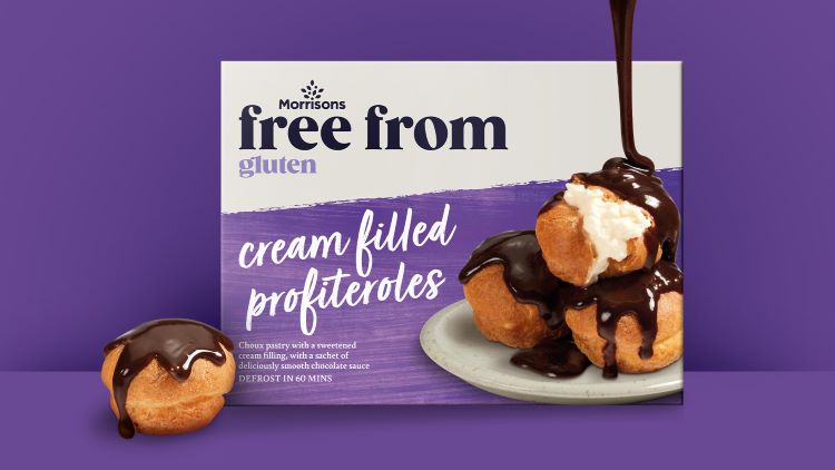
As well as having to make Morrisons’ ranges stand out among other “major players”, Phillipson says timing was also a challenge that the team had to work around. The brief for the Free From range gave the studio “just five months” to work on everything including the initial concept, development, guidelines, art direction, artwork, retouching and final release across more than 100 SKUs, she adds.
It was also challenging to “evolve” due to the nature of the range, says Phillipson, as it is often about “serious dietary requirements” rather than “preferences”. She adds that the Free From ranges new branding is all about balancing “trust and taste”, which is attempted through pairing “expressive typography” with clear “nutritional signposting”.
Phillipson explains that the range was “not living up to its name” when it came to the design as it lacked the “spirit of liberation”. While the top third of the packaging takes on a “more serious” tone through its authoritative typestyle, Phillipson says that the bottom two thirds of the pack incorporate “bright, rich textured backgrounds”, “an evocative hand script”, and “mouth-watering food photography” to debunk the notion that a controlled diet means a “compromise” on flavour.
“Confident” counted range
“Packaging cues” around dieting ranges often go down “a path of diluted taste and satisfaction” and can look “quite retro and pharmaceutical”, according to Phillipson. In an effort to move away from this, Phillipson says Stormbrands opted for “a loud, proud and vibrant” design system, with a “powerful” typography at its centre.
She adds: “Clear calorie messaging is still at the heart of the proposition to keep the consumer in control, but it’s now celebratory rather than apologetic, and the photography dials indulgence up to the max.”
The overall tone of the range has also been repositioned in a bid to fit in with “broader lifestyle and design trends around health and wellness”, say Phillipson. By implementing a “clean and uncluttered design system”, Stormbrands sought to enable “informed choices and encourages positive action” towards health and wellbeing goals.
The revised and more positive tone also links with the fact that “many consumers will dip in and out of diets”, says Phillipson. The identity is designed to be “inspiring and empathetic”, rather than feeling like it is “part of a strict regime”.
The “spirit” of organic
Standing out from the “sea of green” and “down on the farm” semiotics that “dominate” the organic food category was a key driver behind the repositioning of the Organic range, says Phillipson. The result is a “fresh and contemporary” design system combined with “a beautifully crafted logo” Phillipson adds.
She further explains how the illustrations nod to the “rich, diverse layers of the soil”, while the “natural earthy” colours link to the hues of a farming landscape. The flexibility of the layout means that each variant has its own colourway to “aid navigation and differentiation”, which Phillipson says comprises three tones: “a light top layer, an earthy core and a rich base”.
Its new position seeks to present the “organic proposition” as a “mindset or lifestyle” where consumers are invited to “play their part” in looking after the earth, says Phillipson.
Free From was the biggest range and will roll out over more than 100 SKUs, followed by Organic with over 80 SKUs and then Counted with around 25 SKUs with “an ever-ongoing list of new product developments to rollout”, says Phillipson. Each identity will be introduced across in-store points of sale including shelf strips and hanging posters as well as Morrison’s digital and social platforms.
Recommended Posts

NB invites local designers centre stage for Vineyard Theatre rebrand
February 24, 2023

“AI revolution” will change way design studios look within three years
February 24, 2023
Rbl rebrands ZSL with ecosystem-inspired identity
February 23, 2023