Royal Mail honours legendary stamp designer David Gentleman in new collection
by IBRAHIM
Royal Mail honours legendary stamp designer David Gentleman in new collection
Hat-Trick has designed the six-stamp set, which aims to show the diversity of the designers many stamps issued in the 1960s and 1970s.
Royal Mail has unveiled a set of stamps honouring David Gentleman, the designer which it says “changed British stamp design” in the second half of the 20th century.
The collection features six stamps, each sporting a different design from Gentleman’s 103-stamp back catalogue.
This is the first time Royal Mail has dedicated an entire issue to a designer of its own commemorative stamp collections.
Hampton-based design studio Hat-Trick has designed the collection, in close consultation with Gentleman. Hat-Trick creative director Gareth Howat calls the project a “dream brief”.

“Gentleman recommended much more interesting subject matter”
Gentleman’s influence on modern stamp design is undeniable. Prior to his entry into the field in 1962, Royal Mail says stamp design was “largely symbolic”. There had been few issues of commemorative stamps, and none of the special themes which the public has come to know now.
However Gentleman turned the tide when he wrote to the then-Postmaster General Tony Benn, in response to a general invitation for ideas about stamps. As Royal Mail recalls: “Gentleman recommended much more interesting subject matter than had been featured previously.”
With the Queen’s assent, Gentleman was then commissioned to produce an album of “experimental designs”, Royal Mail says, which would become a source of inspiration for the next 20 years. His portfolio included potential designs covering ideas like regional landscapes, trees, birds, famous people, bridges and the Industrial Revolution.
During this process, Gentleman also proposed a new size of stamp and introduced a small cameo-style portrait of the Queen – instead of a more detailed portrait – based on her profile as depicted by Mary Gillick on coins in 1953.

“We wanted to convey the sheer breadth of his talent and range”
As a fan of Gentleman’s pioneering work, Howat says the trickiest part of the project was deciding which of the designer’s extensive collection made it to the new set. “We could have made a set of 50 and still not have covered everyone’s favourites,” he says.
Hat-Trick’s team worked with Royal Mail and Gentleman himself to make the final selection. Since the designer had given over all his previous works to the Royal Mail archive, this involved lots of digging, Howat says.
The final line-up is a diverse one – there is a mix of nature-themed stamps, alongside historic and commemorative ones. “We wanted to convey the sheer breadth of his talent and range,” Howat says. “He was just as comfortable hand illustrating trees as he was more ambiguous topics.”

A selection of favourites
Gentleman’s first accepted stamp release, to commemorate the National Productivity Year in 1962, makes an appearance. It features symbolic arrows and a detailed depiction of the Queen – having been issued before Gentleman’s cameo came into use.
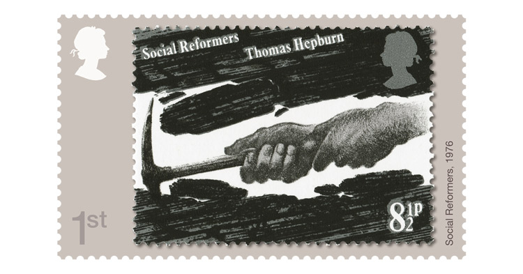
Also featured is one of Gentleman’s own favourite stamps, commemorating the Social Reformers from 1976. The stamp is a good example, according to Howat, of how the designer was able to tackle complicated ideas in such a small canvas. It features a black and white sketch, depicting two hands and a pickaxe.
Howat’s own favourite stamp, from Gentleman’s collection commemorating the 25th anniversary of the Battle of Britain in 1965, is also included. Another one featuring a full portrait of the Queen, the stamp depicts an airplane in flight, using several outlines to convey the idea of motion.

“Phenomenal at being able to incorporate so much detail onto such a tiny canvas”
While the stamp set features six vastly difference stamp designs, Howat says they are linked in their detail. “Gentleman was just phenomenal at being able to incorporate so much detail onto such a tiny canvas,” he says.
Wanting to honour this, the team went in with a very light touch. “We wanted to make sure the stamps were the star of the show,” Howat explains.
The resulting collection appears in a picture-in-picture style, with the stamps as close to the originals as the team were able to get. The background colour of beige allows the colours of each stamp to stand out further.

“It was really just our job to not get in the way”
Alongside the collection, Hat-Trick has also developed supporting materials like a presentation pack and cover. In keeping with the “neutral” approach, the pack features muted colours to ensure Gentleman’s stamps are front and centre of the reader’s attention.
Two articles are also included: one from Postal Museum senior curator Douglas Muir, who provides a philatelic perspective on Gentleman’s work, and another from designer Brian Webb who discusses his contribution from a design perspective.
With so much information, commentary and insight, Howat says the neutral approach was a sensible one. “It was really just our job to not get in the way,” he says.


What do you think of the new collection? Let us know in the comments below…
Recommended Posts

NB invites local designers centre stage for Vineyard Theatre rebrand
February 24, 2023

“AI revolution” will change way design studios look within three years
February 24, 2023
Rbl rebrands ZSL with ecosystem-inspired identity
February 23, 2023