How ITN launched its first major rebrand since 1969
by IBRAHIM
How ITN launched its first major rebrand since 1969
Rudd Studio and Undivided share the process of repositioning the factual television production company as “a global production powerhouse”.
ITN’s rebrand looks to reflect its evolution from a “legacy British news organisation to a global player in news, factual, sports, education and branded content” with a new animated logo that responds to its environment.
ITN was founded in 1955 and is known for its news programmes, current affairs series and digital services across the ITV network, Channel 4 and Channel 5. However, the company now has multiple divisions across TV sectors including business, education, newsrooms, news production, post-production, productions and sport.
Rudd Studio was suggested for the rebrand pre-pandemic by Ben Haynes, ITN head of brand communications off the strength of the studio’s ITV rebrand in 2012. Founder Matthew Rudd suggested partnering with Undivided after speaking to ITN and realising “there was a need to think strategically” about the production company’s future. Alongside Stefan Terry and Laura Farrell of Undivided, Rudd collaborated with animator Oscar González-Diez, print designer Iancu Barbarasa and graphic designer Eleanor Ridsdale Colussi.
Rudd explains that the Undivided team’s “clear thinking and understanding of where ITN was in the past and where it’s going in the future”, made developing a direction for the visual identity “very clear”.
ITN logo evolution from Undivided on Vimeo.
While ITN is known for its “truthfulness and trustworthiness”, he explains, it became clear that there had also been “emotional intelligence and a kind of humanity” to its work, with early innovations including pioneering the use of live and on-screen newscasters, employing women reporters and presenters and producing warzone coverage.
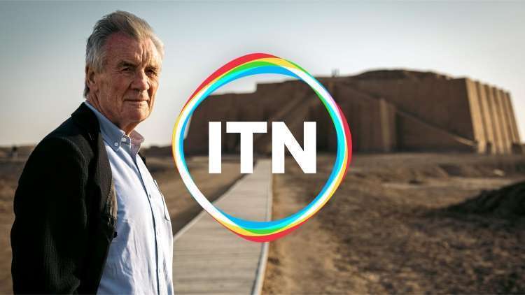
The core of the visual identity is the replacement of ITN’s static logo of joined letters, with a new animated logo. Rudd explains that the logo had only been tweaked four times “to a pretty small extent” since its creation in 1969, but “We felt that the logo did not reflect the humanity and almost chameleon-like quality that ITN has to react to things in an emotional way”, he says.
After months spent tweaking the old logo, Rudd felt the approach took away from its “gravitas” without adding anything new. Nor did it lend itself to animation, due to its solidity and lack of curves, he explains. With encouragement from the then-CEO Deborah Turness, he proposed two different creative options, with the chosen option the “more radical” of the two.
The new logo includes monocoloured letterforms for “ITN”, which are “typographically similar” to the previous logo, and reminiscent of 1960s media logos by Chermayeff & Geismar, Rudd suggests. This element of the logo, he says, “as it always has done, reflects, truth, solidity and trustworthiness”, but around this is a soft diamond shape which becomes a “living” cell, “which is responsive to its environment”, reacting to mood or physical stimulus within the content, he adds.
When animated, the cell splits into red, green and blue – “the primary colours of light and the essence of everything we see in the world and on screen”, Undivided says. “And, in fact, what you realise as you’re looking at the animations is that that simple mono logo is actually made up from a mixture of those primary colours of light, RGB”, Rudd adds.
This links to the positioning and strapline of “Truth to Life”, which Stefan Terry, Undivided strategy director says “sets ITN apart as a brand that can create magnetic, factual content for all kinds of audiences – from Channel 4 current affairs viewers to true crime lovers on Amazon Prime.”
The logo will be used in the end boards of programmes for UK and international broadcasters and streamers; across billboards, ITN’s new website, social media; and for meeting rooms, business cards and letter heads.
For the wider brand an “atmospheric” dark grey is the background from which the coloured version of the logo “glows”; alternatively, when headline text is used with highlight words picked out in red, green or blue, the mono version of the logo will be used, Rudd explains.
 The main font family is Lynstone, itself a new design but based on the London Underground Typeface Johnston, retaining a “Britishness” even as ITN is becoming increasingly global, Rudd explains.
Rudd comments that the rebrand is important in communicating ITN’s expanded role as the production side of ITN continues to grow, the new branding is “a way of showing how ITN constantly evolves and connects with different audiences without undermining its commitment to the truth”, he says.
Recommended Posts

NB invites local designers centre stage for Vineyard Theatre rebrand
February 24, 2023

“AI revolution” will change way design studios look within three years
February 24, 2023
Rbl rebrands ZSL with ecosystem-inspired identity
February 23, 2023