Exploring the typographic worlds of M/M (Paris)
by IBRAHIM
Exploring the typographic worlds of M/M (Paris)

We speak to designer Paul McNeil about his new book on the experimental typefaces created by M/M (Paris), which have helped communicate counterculture for the last 30 years.
Over the course of thirty years, French art and design studio M/M (Paris), made up of Michaël Amzalag and Mathias Augustyniak, has created complex visual worlds for an impressive array of theatres, musicians (most notably Björk); fashion brands and magazines, artists and arts institutions.
Embarking on a process of in-depth collaboration for each of these clients, M/M considers its work part of “a deeper cultural exchange and wider platform for communication, says Paul McNeil.
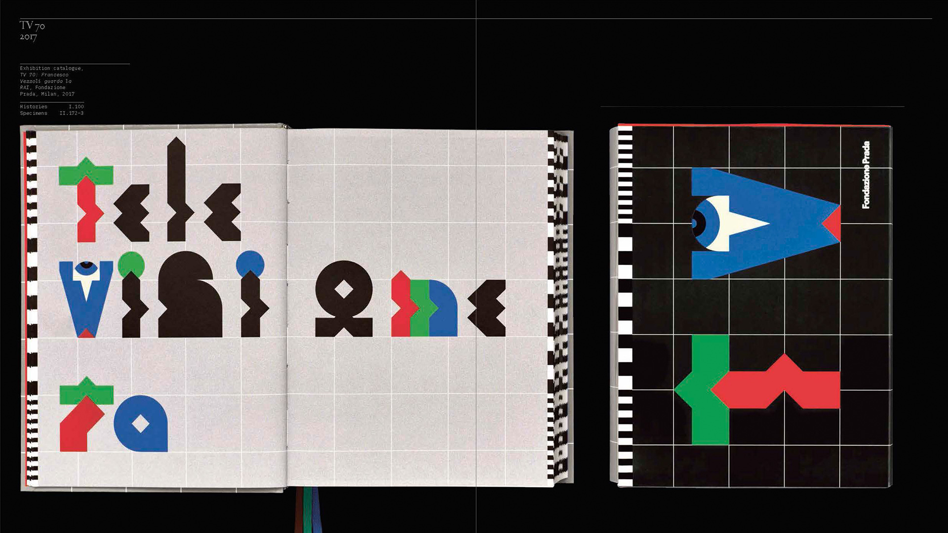
The cornerstone of these projects, McNeil argues, are the 90 typefaces the studio created during this time. His new book, Letters from M/M (Paris), published by Thames & Hudson, invites you into the “diverse, fertile and exuberant landscape” of that typographic world, starting with a typeface created for the eDen fanzine in 1992, celebrating electronica, house music and the French rave scene, and ending with one created for the department store Galeries Lafayette Champs-Élysées in 2019.
McNeil explains that he first came across the duo’s work in the 1990s, but “my attention was particularly drawn by their designs for Björk’s albums such as Vespertine and Medulla – specifically the way they used type and lettering to create powerfully distinctive identities”.
As a typographic designer and one half of MuirMcNeil alongside Hamish Muir, McNeil comments on his trade’s customary role “to convey messages convincingly on behalf of others […] often regardless of the designer’s personal beliefs”.
What makes M/M distinct, he argues, is a rejection of “the limitation and inauthenticity of this position”, throughout a career where “a personal responsibility underpins every project, every mark and every decision”, resulting in “a unique practice that continuously resets the boundaries of graphic communication”.
Graphic design as a tool to engage
Having approached McNeil after he included an M/M typeface in his 2017 book A Visual History of Type, McNeil says M/M gave him “a completely free rein” for the design of the book. Through “long, fascinating conversations with both of them about the ideas and philosophies that underpin everything they do”, he explains, “I started to recognise that, in addition to presenting M/M’s visual material in a clear, accessible manner, their stories about the development of each project were equally engaging and should also take pride of place”.
McNeil says that M/M’s process of developing a typeface was often “as much about their relationships with clients and collaborators as they are about design”.
The depth of such relationships can be seen in the foreword for the book written by Björk reflecting on her long working relationship with M/M, calling the duo “the method actors of letters [who] transform seamlessly from one award-worthy role to another”.
For her album Biophilia, Björk describes M/M achieving “the heroic task to invent graphic vessels” for a project then at an early abstract stage, where she “was talking esoteric for hours about how this was the end of separation between, midi, digital scores, mp3… discussing element tables, children’s education, musicology for days”.
Elliptical and equivocal
“M/M (Paris) designs can be elliptical and equivocal, inviting the viewer or reader to extract what they can from complex graphic constructions”, McNeil says. “Line drawings may be nested within photographs, photographs may be embedded in texts or vice versa, or any such elements may be partially erased, or may be allowed to break out of the confines of their frames.”
One of the typefaces McNeil highlights is The Alphabet (2001), created for American fashion magazine V in 2001, which uses photographs of models by Inez van Lamsweerde and Vinoodh Matadin cut into “rudimentary letter shapes” following the models’ bodies, with white apertures forming “typographic counterforms”, McNeil explains.
Suggesting that it points to the possibilities for typographic design “as it moves “out of print technologies towards media-rich territories, McNeil describes it as “an extraordinary collection of letters which play with relationships between reading and looking, while also commenting ironically on the commodification of the female form”.
With precedence in Erté’s Art Deco illustrations of female figures posing as letters of the alphabet, or Anton Beeke’s1969 Body Type (or Nude Alphabet), the alphabet’s letters correspond to the letters of each model’s name: “D for Sophie Dahl, H for Hannelore, S for Stephanie Seymour and so on”, but unusually, the typeface gets a starring role; the feature presenting, as the magazine text puts it, “twenty-six faces and a typeface”.
A different departure from typographic norms is Spike (2006), created for an exhibition catalogue for the Welsh conceptual artist Cerith Wyn Evans. Reflecting the artist’s “frequent use of visual codes and wordplay”, its letterforms are constructed specifically for palindromes – words, phrases or sequences that read the same forwards and backwards.
“Exploiting principles of mirror symmetry, transposition and layering, sets of both standard and reversed characters are included in Spike so that words and sentences can be typeset to be read in different directions”, McNeil says.
However, when layered the text becomes “progressively more illegible, unstable and disruptive”, he adds, raising questions “about the nature of literacy by asking whether text must be required to serve as a vessel for words in order to qualify as text”.
In contrast, McNeil highlights PCA (2004) “visually one of the least complex typefaces that M/M have ever produced”. Originally designed for architectural firm Production Conception Architecture, the geometric sans serif typeface resembles “the precise product of a ruler, set square and compass”.
“Completely devoid of ornament or superfluous forms”, McNeil says, it “amplifies the principles evident in Paul Renner’s 1927 Futura or Herb Lubalin’s ITC Avant Garde Gothic from 1970, their common feature being the elimination of any reference to their origins in handwriting”.
Readers can skim, dive deep or cross-refer
McNeil describes the design of the book as a “transparent window through which to view M/M’s work rather than obscure it”. It has an explicit tripartite structure – first describing the typefaces, then displaying, and finally showing them in context – which invites readers “to choose what they might wish to explore, whether text, type or image; to either skim, to dive deep or to cross-refer at will.”
Beyond this, design choices aim to create a “gently ironic contrast” to M/M (Paris)’ “mischievous, enigmatic and disruptive” work, McNeil explains, “by evoking a French neoclassical or Baroque sensibility” with silver pages and a typeface which reinterprets the Roman du Roi, dating from 1692.
While typography may be small as a tool compared to films, or opera sets as M/M has said, with this publication McNeil looks to show how typefaces are the “single powerful element” at the core of M/M’s rich symbolic mythology, and its “unique, expansive identities for collaborators, institutions, events and environments”.
Letters from M/M (Paris) by Paul McNeil, with a foreword by Björk, is published by Thames & Hudson, £50.
Recommended Posts
Pilo Hotel logo and identity by 5.5, Paris
June 30, 2023

NB invites local designers centre stage for Vineyard Theatre rebrand
February 24, 2023

“AI revolution” will change way design studios look within three years
February 24, 2023