Design Week’s most popular news stories of 2022
by IBRAHIM
Design Week’s most popular news stories of 2022
From M&M’s rebrand to Peter Saville’s Aston Martin logo, these were our biggest news stories of the past year.
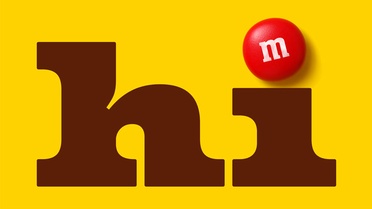
In January M&M’s revealed its global redesign, which was led by Jones Knowles Ritchie (JKR). The JKR team chose the ampersand to lead the new identity and signify “togetherness” and symbolise people’s desire to belong.
M&M’s new identity also featured a bespoke typeface – All Together serif – which took cues from the lentil shape of the sweets. Owner of the brand Mars confirmed that the well-loved mascots had been given “more nuanced personalities” – as well as new shoes.
 After updating Visa’s wordmark in 2021, international design studio Mucho unveiled its work on Visa’s wider identity earlier this year.
The studio says the main aim was to balance the heritage of the 60-year-old company with innovation, resulting in tweaks to the colour of the wordmark that made it perform better in a digital setting. Its new modular system of icons follows the same recognisable colour system and can “scale into illustrations” when needed, according to Mucho.
Mucho also developed a humanistic bespoke typeface called Visa Dialect, designed to be digitally compatible and highly legible across all of Visa’s platforms.
In conjunction with its internal restructuring, pharmaceutical company GSK rebranded to better reflect its “biopharma innovation” goals. Wolff Olins was responsible for the company’s new logo, motion assets and bespoke typeface, designed to include curved forms which “evoke the highly adaptable nature of the human immune system”, according to the studio’s global executive creative director Emma Barratt.
GSK also increased its accessibility focus, opting for an uppercase wordmark developed by Manchester-based type foundry Face37 that was tested for legibility across digital and print uses.
This year saw the rebrand of several football clubs, with Norwich City’s move towards a heritage-inspired look being the most popular among Design Week readers.
London-based studio Someone took inspiration from the story of Dutch refugees called The Strangers who arrived in Norwich in the 16th Century. As well as bringing the tools and techniques that would bolster the city’s position as a leader in the textile industry, The Strangers brought canaries that would sing while they worked. The birds and the weaving industry play into the club’s new crest, typeface, icons and colour palette.
Bulletproof studio rebranded Toblerone chocolate this summer with a retouched wordmark and brand new bespoke typeface called Tobler for the signature.
After trawling through the Toblerone archives, Bulletproof creative officer Nick Rees says the studio came across “a wonderfully characterful version of the Toblerone logo from 1908”, which influenced the new signature. Notably, a photographic chunk was added into the packaging for the first time, giving a flavour of what’s inside.
Belgium chose to highlight its comic book lineage through its new passport designed by French design and engineering consultancy Thales Group and Belgian tech company Zetes.
Hergé’s The Adventures of Tintin – which depicted the capers of a young newspaper reporter and his faithful white Fox Terrier – feature heavily in the new passport designs, as do the mischievous blue Smurfs, created in 1958 by Belgian comic book artist Peyo.
UV light reveals some characters in more detail while also serving a practical purpose, as according to Belgium’s Ministry of Foreign Affairs, the document was developed “in close cooperation with anti-fraud specialists of the Federal Police”. The new passport was released in February of this year.
British car brand Aston Martin underwent its first major update in 20 years, led by well-known art director and graphic designer Peter Saville. Saville called improvements made to the brand’s winged logo “subtle but necessary”, as Aston Martin sought to appeal to a new digitally focused audience.
Aston Martin chief creative officer Marek Reichman revealed that a physical logo – crafted in Birmingham’s Jewellery Quarter – will be applied to Aston Martin’s new vehicles, describing it as “the first step to the wings taking centre stage on [its] next generation of ultra-luxury performance sports cars”.
In February we reported on details shared by the Museum of London about what visitors can expect from the new museum, and which designers have been appointed to work on it.
As well as opting for the more central West Smithfield location, the museum assigned Atelier Brückner to design The London Story exhibition space, which will house much of the museum’s collection and span 10,000 years of history.
From architectural and interior design to exhibitions design projects also worth millions of pounds, the move is set to position The Museum of London as a “world-class, 24-hour cultural destination” within the city.
The museum closed its old location at the start of this month, and the new location is set to open in 2026.
Brighton-based studio Baxter & Bailey won a competitive tender to design this year’s Royal Mail Christmas stamp set, working with Kent-based illustrator Katie Ponder to bring the “jewel-like” nativity stamps to life.
The studio’s creative director Matt Baxter said that Ponder’s “colourful style” and use of “clean graphic shapes” were a perfect match for the style that was required. Light is used an important device within the stamps, emitting from a central point in each tiny image.
The nativity story is told chronologically across the set, which is bookended by the characters facing inwards on the stamps to the far left and far right.
In a bid to move away from dental hygiene cues, Wrigley’s Extra hired brand consultancy Elmwood to give the brand a new look centred around its variety of flavours.
One of the most noticeable changes was the star-like symbol above the wordmark, which was simplified into more of a diamond shape, as well as changing the E in Extra to lowercase. Now known as the “ding system”, the reinvented diamond shape is exercised across the brand as a graphic device.
Recommended Posts

NB invites local designers centre stage for Vineyard Theatre rebrand
February 24, 2023

“AI revolution” will change way design studios look within three years
February 24, 2023
Rbl rebrands ZSL with ecosystem-inspired identity
February 23, 2023