BrandOpus rebrands Cathedral City – Design Week
by IBRAHIM
BrandOpus rebrands Cathedral City – Design Week
The cheddar brand’s new look aims to deepen connections with consumers at a time of widespread uncertainty.
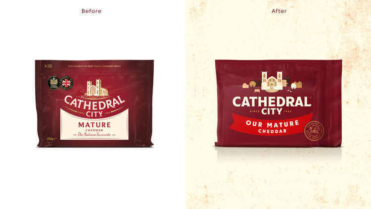
BrandOpus has overhauled the branding for Cathedral City cheddar cheese, incorporating influences from screen-printed illustration and sign painting.
The consultancy’s work includes a new logo, type system, packaging as well as motion video and sound assets. Cathedral City was founded over 50 years ago, and to this day the cheese is made in Cornwall.

According to BrandOpus senior designer Nicole Hammersley, the brand wanted to strengthen its market position at a time of unpredictability. “The brand knew that with everything uncertain going on in the world (Brexit, COVID, inflation etc), it was more important than ever to deepen its connection with consumers,” Hammersley says.
“The rebrand aims to build on the brand’s rich heritage and package that in a more emotive and meaningful way, that will last today and tomorrow,” the designer adds. Another ambition was to appeal to new customers, she explains.
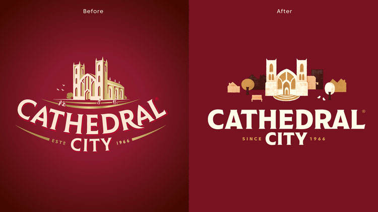
The updated packaging features a new typeface – inspired by sign painting – and a redrawn cathedral. “By shifting the angle to be front on and at the heart of a bustling city, we could better reflect everyday life,” says Hammersley.
The various elements, from the trees and birds to new characters, bring a “bustling liveliness” to the branding, she adds.
The illustration style was inspired by block screen printing, while the scene can be expanded to show a wider cityscape. Stamps have been designed – which denote where ingredients have been sourced and other quality checks – which resemble “carefully crafted and stamp-like makers’ marks’”, the design team says.
BrandOpus has also introduced a new navigation system which indicates the different ranges through a series of brightly colour banners. Each of those products is referred to as ‘Our…’ which aims to bring a “sense of pride to the product”, the team explains. The primary burgundy tone has been retained, and paired with shades of creams, golds and deeper burgundies for an injection of “breadth and warmth”.
The design consultancy has also crafted animations and a sonic identity for the new branding, which seek to convey a “vibrant community and city bursting with life,” says BrandOpus. The resulting sound design features a pizzicato movement (the technique of plucking strings) and the sounds of daily life.
“Heart and soul are rooted deep in Cathedral City’s DNA,” says BrandOpus CEO Nir Wegrzyn, “and it’s now threaded through the identity, distinctive assets, and the entire brand experience in a more meaningful way.”
What do you think of Cathedral City’s new branding? Let us know in the comments below.
Recommended Posts

NB invites local designers centre stage for Vineyard Theatre rebrand
February 24, 2023

“AI revolution” will change way design studios look within three years
February 24, 2023
Rbl rebrands ZSL with ecosystem-inspired identity
February 23, 2023