Tropic Skincare’s new typeface is designed for dyslexic readers
by IBRAHIM
Tropic Skincare’s new typeface is designed for dyslexic readers
Lewis Moberly has created a typeface for the vegan band which targets neurodiverse consumers.
Tropic Skincare has introduced a new dyslexic-reader-friendly typeface across its branding after discovering that customers were experiencing difficulties reading its website and communications.
Lewis Moberly, which has a longstanding relationship with the brand, was tasked with designing a new typeface without drastically changing the well-established identity. The studio’s creative director Emily Fox says, “We were given the brief of designing Tropic their own bespoke typeface that was going to be much more accessible to dyslexic readers.
“What really excited me about this project is that we are moving into being much more inclusive in terms of products and designs.”
The project is driven by a piece of research which points to 25% of workers within the beauty industry being dyslexic and across all industries one in seven people having difficulty reading and writing.
Fox adds, “When we spoke to a few charities and got really into the subject, we realised that these days its not just about dyslexia, but about neurodiversity in a much broader sense.”
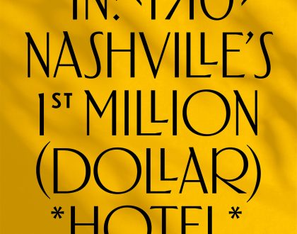
Typefaces that are accessible to people in the neuro-diverse community have lacked in variety and imagination, but both the brand and the design agency says they did not want to compromise on sophistication and stylishness with this project.
“A lot of typefaces designed for the dyslexic reader are very plain,” says Fox. “What was unusual about this as a project was that it had to be a script, which is trickier in terms of legibility.”

According to the studio, it was constantly testing and refining the script to ensure legibility, while not compromising on its expressive design.
Fox says, “We have quite a flexible team and very trusted experts in lots of areas, so we collaborated with a type designer who has worked on many projects with us, and also did a lot in house.”
Untangling the letters of the script produced open and approachable forms with textured irregularities. It also includes several alternative versions of letters to align with the handwritten feel, according to Lewis Moberly.
The new typeface is named after the founder of Tropic, Susie, and is the first intentionally inclusive script type to cater to neurodiverse readers, Fox claims. The studio says it has also considered how the Susie typeface will appear against more complex backdrops and has accommodated for this in the design.
Founder of Tropic Susie Ma says the new typeface compliments the current branding and resonates with “our overall core values around inclusivity.”
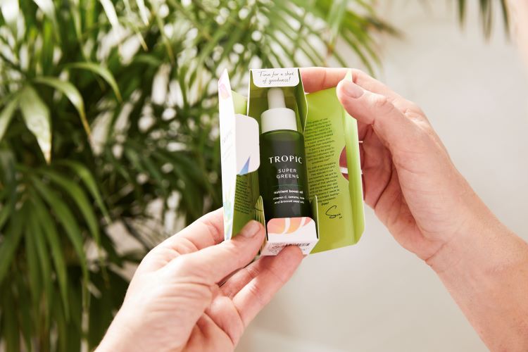
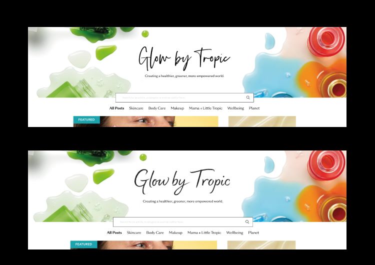
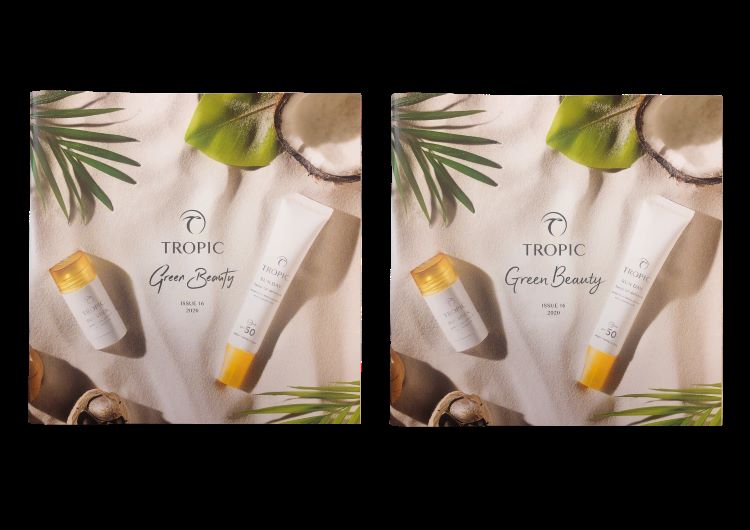
The new typeface will roll out across product packaging, the consumer facing website, and the free magazines that are sent out with every order.
Recommended Posts
The Hermitage Hotel, designed by Mucca
March 19, 2023

NB invites local designers centre stage for Vineyard Theatre rebrand
February 24, 2023

“AI revolution” will change way design studios look within three years
February 24, 2023