Six Cinquième crafts an adaptable logo for TV show Revenge of the Black Best Friend
by IBRAHIM
Six Cinquième crafts an adaptable logo for TV show Revenge of the Black Best Friend
Tasked with branding the satirical show, Six Cinquième has looked to classic logos from films such as The Godfather and Pulp Fiction.
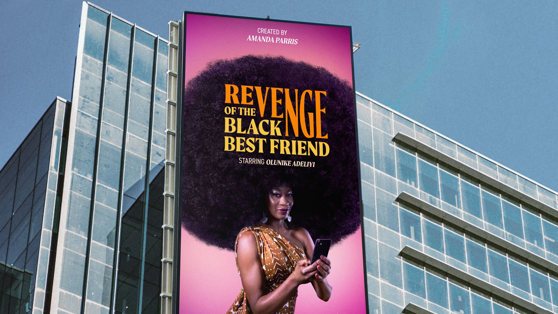
Montreal-based studio Six Cinquième has branded new television show Revenge of the Black Best Friend (RBBF), with an adaptable logo designed to be “worn with pride by fans”.
In collaboration with the show’s creator Amanda Parris and a producer, the studio worked on the RBBF’s visual identity and strategy.
RBBF follows Dr. Toni Shakur (played by Olunike Adeliyi), a TV presenter and self-help guru who’s attempting to take down the entertainment industry’s use of token Black characters. With a satirical tone and topical subject matter, the show blurs the lines between “reality and the fantasy of revenge”, explain Six Cinquième co-founders Ash Phillips and Miro LaFlaga.
The design team initially looked through some of the show’s scripts and its visual influences (such as its set design and lighting) and then worked with Parris on some finer details. They also had a chance to see rough cuts of episodes.

The centrepiece of the identity is the logo, which can adapt to the themes of each episode. “We wanted to make sure it had the potential to exist outside of the context of the show,” Phillips and LaFlaga say, namechecking recognisable designs featured in Pulp Fiction, Seinfeld and The Godfather.
The designers ended up using Moret, which they describe as a “sharp vengeful serif font” for the logo. It’s been stretched to achieve the stacked look. They explain that this design aims to reflect the show more widely rather than just the main character, which had originally been the focus. “It had to be bold, stylish, but also meaningful,” say Phillips and LaFlaga.

Six Cinquième has also created logo variations for different episodes, which vary significantly in terms of visual style. This meant that the logo had to be versatile without losing any emphasis on its most important word, ‘Revenge’. “We treated the variations like Easter eggs that would foreshadow some of themes and references used in each episode,” the designers say.
The first episode has a reference to cheerleading film Bring It On – making a point about how many Black characters in teen films are tokenistic – and so the design team created a “varsity style” version of the logo. Another variation has a nod to horror films, the designers explain, as the episode deals with the genre trope of the Black character dying first.

The colour palette is directly inspired by the set for The Toni Shakur Show, the programme’s show within a show. The character’s wardrobe was also influential on the creative direction, Phillips and LaFlaga explain. “It was important for us to create something that was visually cohesive with the show,” they add.
Finally, Six Cinquieme also designed the poster for the show. “We really wanted to capture the hyper realism in the show,” Phillips and LaFlaga say, as well as conveying its comedic and surreal tone. Working with the production team, they managed to get a shot of Toni sitting with a phone in her hand with a “warm yet mischievous look on her face”.

Recommended Posts
Norfolk Coast logo and identity by Lantern
November 23, 2023
Jarrolds logo and identity by The Click
October 5, 2023
Pilo Hotel logo and identity by 5.5, Paris
June 30, 2023