ThoughtMatter designs identity for misshapen food range
by IBRAHIM
ThoughtMatter designs identity for misshapen food range

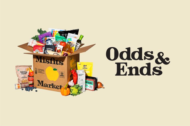
Odds & Ends’ visual identity, name and strategy seeks to embody the “playfulness and wit” of its parent brand Misfit Market.
ThoughtMatter has named and created the visual identity for US online grocer Misfit Market’s new private-label brand Odds & Ends, aiming to highlight the unique nature of its misshapen products.
As well as making high-quality food more affordable and accessible, Misfit Market is also working toward breaking the food waste cycle. Odds & Ends fits into this goal as the range is made up of discounted, slightly odd-looking products that are usually discarded, despite being high in quality.
Misfit Market was founded as a subscription box service before creating its own private label of “pantry staples”, says ThoughtMatter strategy director Phillip Lauria. He adds that the studio received a two-part brief: to help Misfit Market “position and develop” what is now called Odds & Ends, and to “help define what that relationship between the Misfit Market subscription offering and the new private label should look like going forward”.
The relationship with the parent brand was an important consideration during the naming process, as was the number of food categories, according to Lauria. ThoughtMatter’s creative director Ben Greengrass further explains that the look and feel is “crafted to have a synergy with the master brand, while “directly connecting to create a cohesive, trusted and reliable brand experience”.
Odds & Ends was chosen as the name because it has “a similar playfulness and wit” to Misfit Market and for its “evocative and memorable” quality, says Lauria. The new private label’s logomark also seeks to match the soft rounded typeface and letterforms of Misfit Market’s brandmark.
Greengrass says that the illustrations were designed to “represent abundance and accessibility” and created collaboratively by ThoughtMatter’s team and Misfit Market’s’s own illustrator. He adds that the studio opted for “warm, approachable” hues for Odds & Ends’ colour palette, using the master brand’s palette as a foundation.
During ThoughtMatter’s development of the brand strategy, the onset of the COVID-19 pandemic caused an increase in demand for online grocers. After revisiting their original immersion work and looking at it in the context of the pandemic, Lauria says the team found that their “original insights still held up” with the addition of “a few new inputs”.
Odds & Ends’ new identity will roll out across its range of coffee, nuts, snacks, olive oil, canned goods and more.
Recommended Posts
Norfolk Coast logo and identity by Lantern
November 23, 2023
SeidrLab visual identity by Mubien Brands
October 16, 2023
Jarrolds logo and identity by The Click
October 5, 2023