Robata, logo and visual identity by Mucho
by IBRAHIM
Robata, logo and visual identity by Mucho

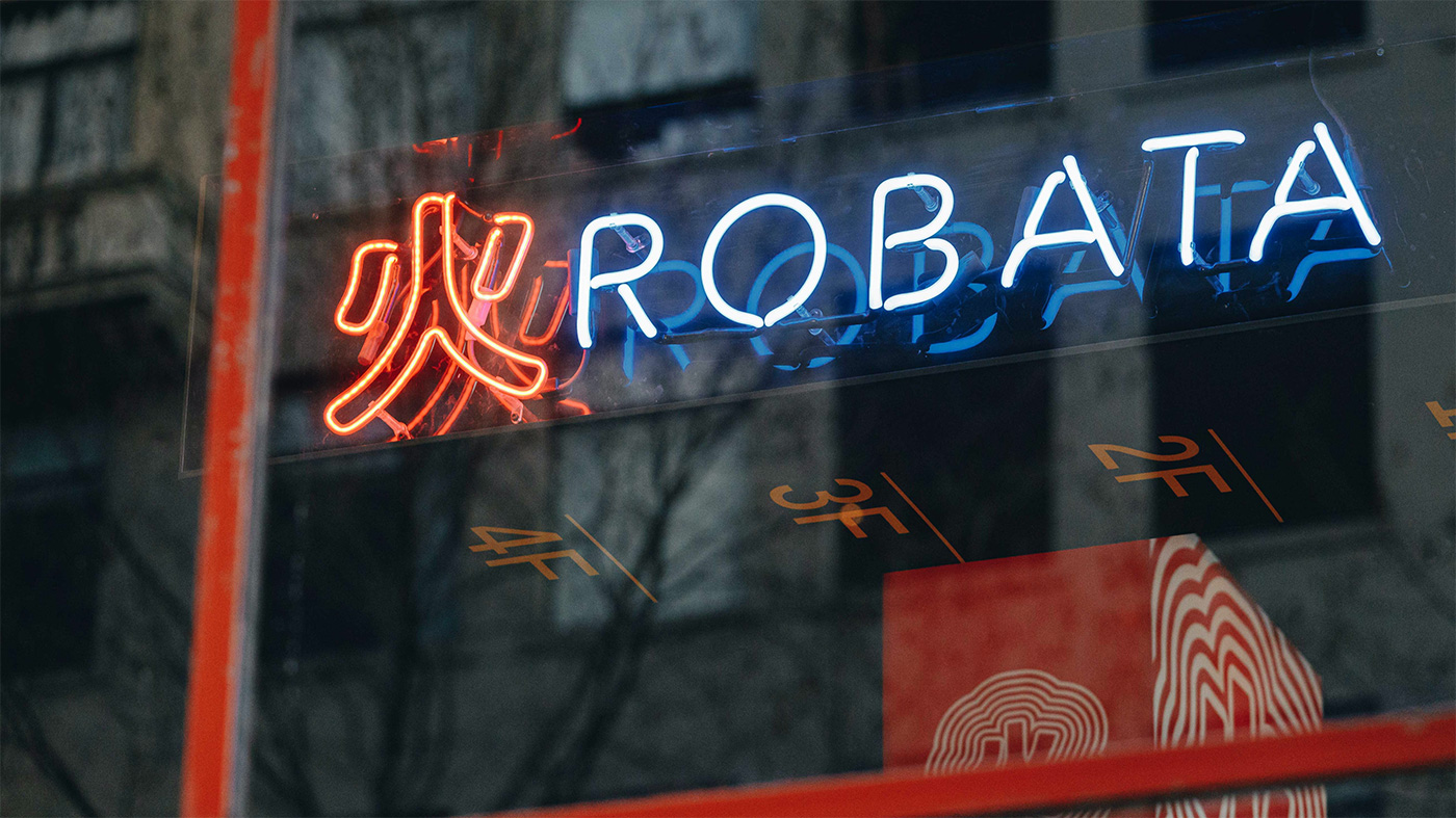
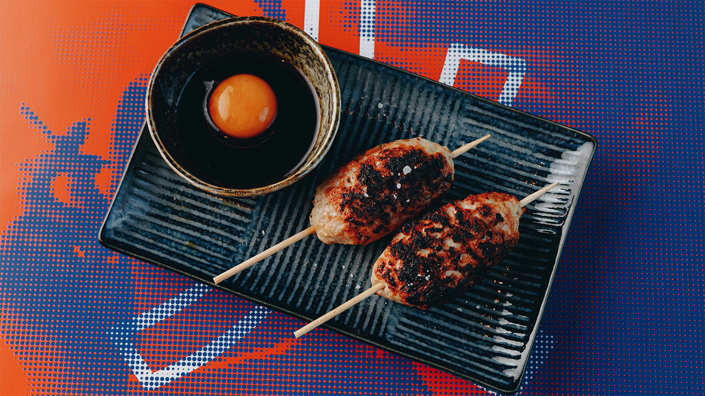
Robata is an izakaya-style restaurant located in the iconic Herald & Weekly Times Newspaper building in central Melbourne. The name is a common abbreviation of robatayaki, a Japanese charcoal-grilling technique that translates literally to “fireside cooking.” Much like sake, robata is embedded in Japanese culture where it has been a cooking tradition for centuries. The restaurant’s ambition is to deliver an interpretation of this unique style of cooking, informed by local culture and expertise, delivered in a relaxed ‘Melbourne’ style of dining.

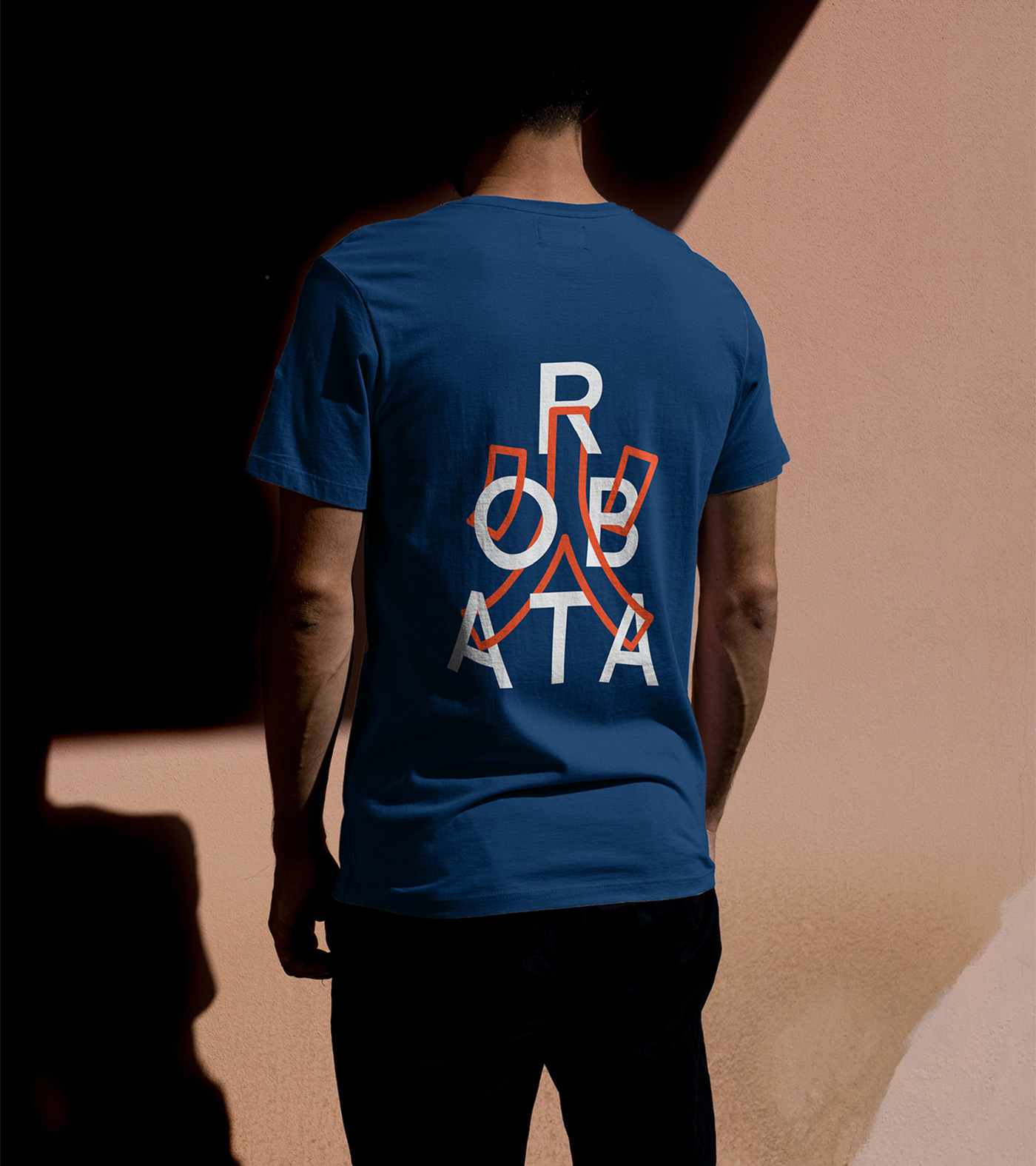
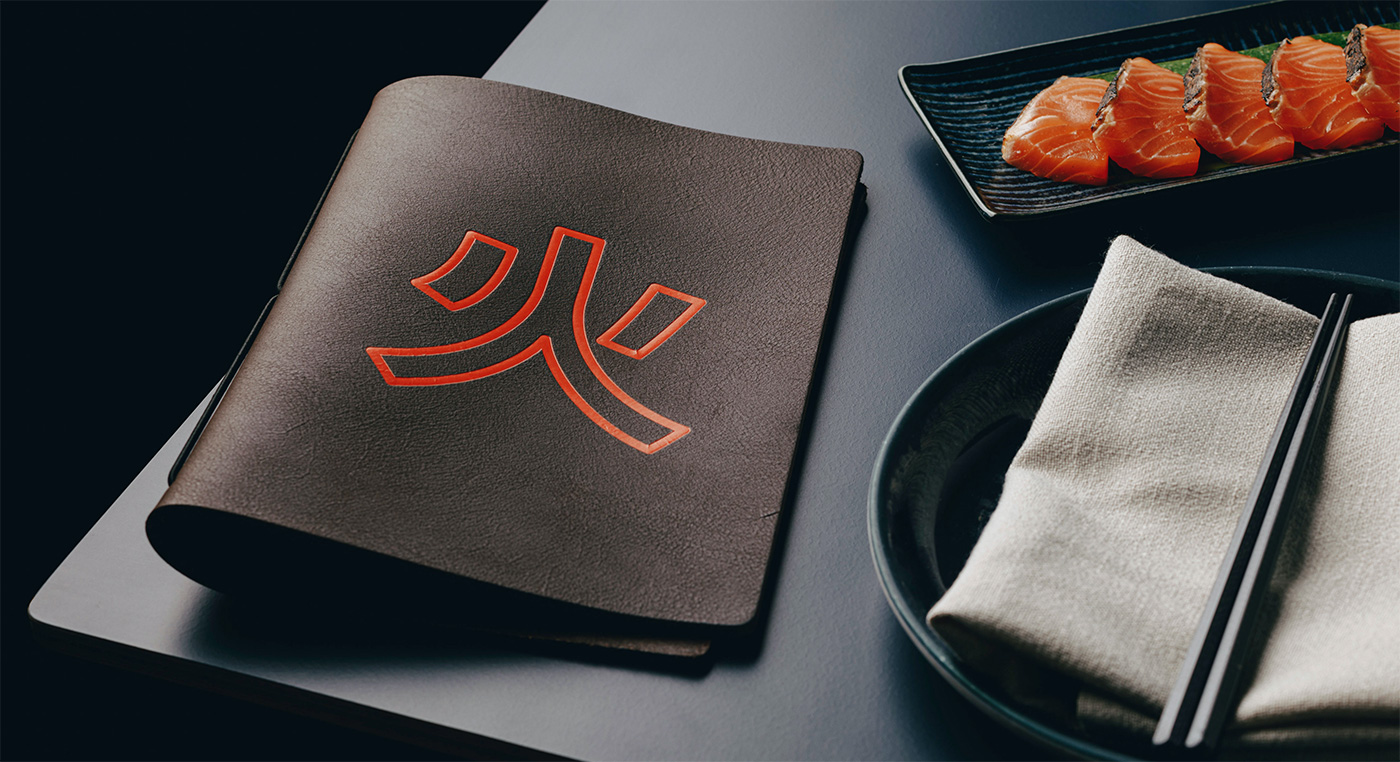
The Japanese kanji character for fire was adopted as a symbol for the restaurant’s identity, supported by bold typography and a playful visual language. Inspired by the neon glow of Tokyo’s night-scapes, the interior experience is futuristic and cinematic. A key component of our brief was the design of a dramatic lightbox installation that transports patrons to the streets of a Japanese super-city.


More from Mucho.
Recommended Posts
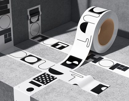
Donut Shop by TwoPoints.Net | Identity Designed
March 11, 2024
LiveKit by The Collected Works
February 9, 2024
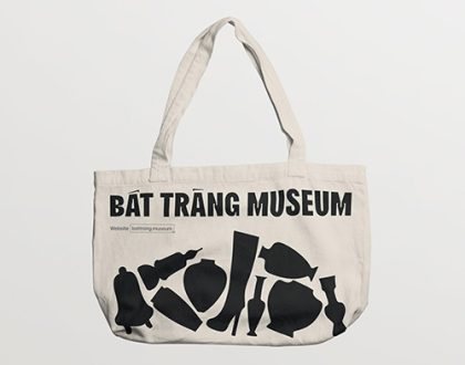
Bát Tràng Museum by M — N Associates
February 4, 2024