Ragged Edge designs algorithm-inspired identity for gaming lab Homa
by IBRAHIM
Ragged Edge designs algorithm-inspired identity for gaming lab Homa

Homa’s whole identity is underpinned by a grid structure, which also acts as a framing device for surreal digital environments created by Ragged Edge to serve gaming characters.
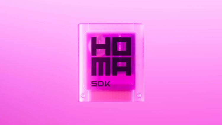
Ragged Edge has rebranded gaming technology lab Homa with a “symmetrical and precise” algorithm-inspired logo and a world of “surreal landscapes” to house gaming characters, which are part of the brand.
Homa works by giving independent game creators the tools and knowledge to turn ideas into profitable games. After accumulating a team of 200 people, 1 billion downloads of its games and $165m (£136.6m) in funding, Homa wanted to take the next step and build a brand to appeal to three different audiences.
Its new identity had to position Homa as “an ally for independent game developers, attract the world’s best engineers”, and gamers, says Ragged Edge co-founder Max Ottignon. The studio’s creative director Luke Woodhouse adds that targeting three audiences with “wildly different needs” was one of the most challenging aspects of the design process.
Taking data as a central theme, the studio generated a bespoke logotype made up of algorithmic forms. This was drawn from scratch using “a grid system with symmetrical and precise proportions”, says Woodhouse. When animated, the wordmark blinks into action and demonstrates an algorithm sequence through geometric forms, before becoming static when the brand name appears.
The underlying grid system formed the foundations of Homa’s identity, making it feel “precision engineered”, according to Woodhouse. The grid acts as a framing device for the surreal landscapes designed by Ragged Edge, in which Homa gaming characters roam.
Though the characters visible across the branding already exist from Homa’s games, Ragged Edge was tasked with building the dream-like worlds and environments that they inhabit. Woodhouse says that the challenge was “creating a world that could accommodate any conceivable character”, even characters that might be invented in the future.
Homa’s new identity is also expressed via a new tone of voice, which Woodhouse says brings the brand’s core idea to life “verbally as well as visually”. He explains that how the brand language seeks to convey an “intelligent attitude” by merging “the laser-focus you’d expect of technical expertise with the quick wit and imagination of creative genius”. The notion that “it’s not cheating if anyone can do it” features frequently across the brand, aiming to encourage independent game creators to get involved.
Ragged Edge also opted for a brand-new suite of colours and typography for the Homa rebrand. Its new vivid electric pink was chosen to bridge the gap between “techy and creative”, says Woodhouse. A typeface called Aeonik Fono, by London-based foundry CoType – chosen for its “bold technical feel” – is applied across the brand and set in different weights.
The studio worked with Homa to recreate its website from scratch, building it to inspire its three respective audiences: developers, talent, and the gamer community. “From playful interactions, to injecting Homa’s voice into the most functional of copy”, Woodhouse says every detail of UI and UX design was “painstakingly considered”.
As one of the core touchpoints, the studio redesigned Homa’s website and wrote all of the copy from scratch. Homa’s new identity is live across all physical and digital assets, from the Homa platform and its Web3 presence, right through to Homa’s four HQs.
Recommended Posts
Norfolk Coast logo and identity by Lantern
November 23, 2023
SeidrLab visual identity by Mubien Brands
October 16, 2023
Jarrolds logo and identity by The Click
October 5, 2023