London Fire Brigade reveals new typographic identity

by IBRAHIM
London Fire Brigade reveals new typographic identity
Inspiration has been drawn from images of old fire engines and Victorian horse drawn carriages in London Fire Brigade’s archives.
Type foundry The Foundry Types and Studio Sutherlad have collaborated on a new headline typeface for London Fire Brigade (LFB) using a 3D drop shadow style.
The typeface pays homage to the hand-painted lettering seen on old fire engines and this informs the wordmark of the organisation.
LFB’s previous typeface, Foundry Sans, was created by The Foundry Types’ co-director and designer David Quay and type designer Freda Sack in 1990. More than 20 years later, LFB approached the studio again as it needed a “headline typeface” with “unique features bespoke to LFB”, according to the foundry’s co-director and designer Stuart de Rozario. Studio Sutherland became involved in the 18-month project at the end of 2021 to help with its development.

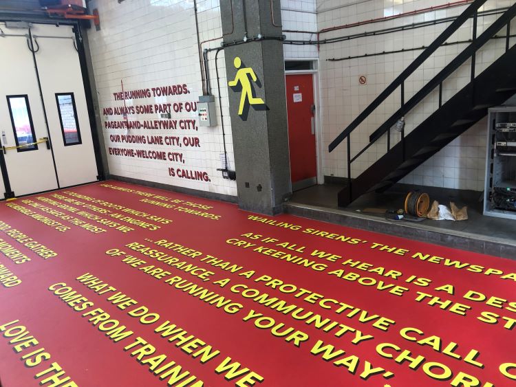
After “thorough research into the LFB archives”, Rozario says he found that many of the old fire engines, fire stations, and even Victorian horse drawn carriages featured 3D lettering. Using this as a starting point, Rozario decided to employ similar techniques “with a modern twist” to design LFB’s bespoke Fire Brigade Headline typeface.
The old designs bore similarities to what Rozario envisioned for the new typeface. He says, “We wanted to create something strong and bold that has a presence to it but also wanted it to appear caring and not too aggressive, so it echoes the nature of what the fire brigade does.”
The geometric grotesque type style aims to embody the characteristics of the LFB team; “unique but familiar, human and approachable, strong and robust”, says Rozario. He adds that it was “well received” by the LFB team.
Rozario explains how applying the 3D drop shadow style to rounded characters, like O and S, proved to be “technically tricky”, as pixelated areas were appearing around the edges. Realigning the letters and “modifying the shapes” eventually solved the problem, Rozario adds.
The new typeface will be used across the fire stations, on products and in LFB’s new museum, which is planned for a site on Albert Embankment. A new running man icon in the same drop shadow style will also be applied across physical and digital spaces.
Red, yellow and gold is “synonymous” with signs and lettering on fire engines, says Rozario, which is why these colours are used widely across the new applications of the typeface, including on the exterior and interior of Shoreditch Fire Station.

Since Fire Brigade Headline will be used predominantly as a graphic device, LFB also required an update to their original font, Foundry Sans, which will now be used across communications, especially longer form writing.. The Foundry Types crafted a “more accessible bespoke font” called Fire Brigade Sans, says Rozario.
He adds “legibility is emphasised” in this new font, using the example of the letter l to demonstrate how certain characters now feature slight curves which aim to make them more distinct.


The new typefaces were launched in an exhibition at Shoreditch Fire Station during London Design Festival 2022, that will run until this weekend. More than 40 studios have contributed to the exhibitions, interpreting the new headline typeface into posters and danger signs.
Supple Studio created a poster titled Love and Ladders, which depicts a version of the running man holding a red ladder made up of three hashtags in the Fire Brigade Headline typeface. The hashtag is part of “a series of alternate glyphs”, according to Studio Sutherland partner Jim Sutherland.
Graphic design studio Alphabetical’s poster features the number 77 in the headline font with text inside in Fire Brigade Sans, detailing the number of seconds that it takes LFB to respond to emergency calls.

Worcestershire-based carpet manufacturer Brintons designed a bespoke Quickweave wool carpet for the exhibition, which features the running man icon alongside the universal fire exit arrow symbol in the 3D drop shadow style. As well as being a creative interpretation of the new typeface, the carpet is also meant to draw attention to the fact that wool as a naturally fire-retardant material due to its high water and nitrogen content. Another benefit of wool is that it does not produce smoke or fumes when set alight, which is one of the main causes of serious health issues following a fire.
Recommended Posts
Norfolk Coast logo and identity by Lantern
November 23, 2023
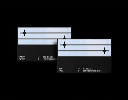
SeidrLab visual identity by Mubien Brands
October 16, 2023
Jarrolds logo and identity by The Click
October 5, 2023