HiRaw! visual identity, by M — N Associates
by IBRAHIM
HiRaw! visual identity, by M — N Associates
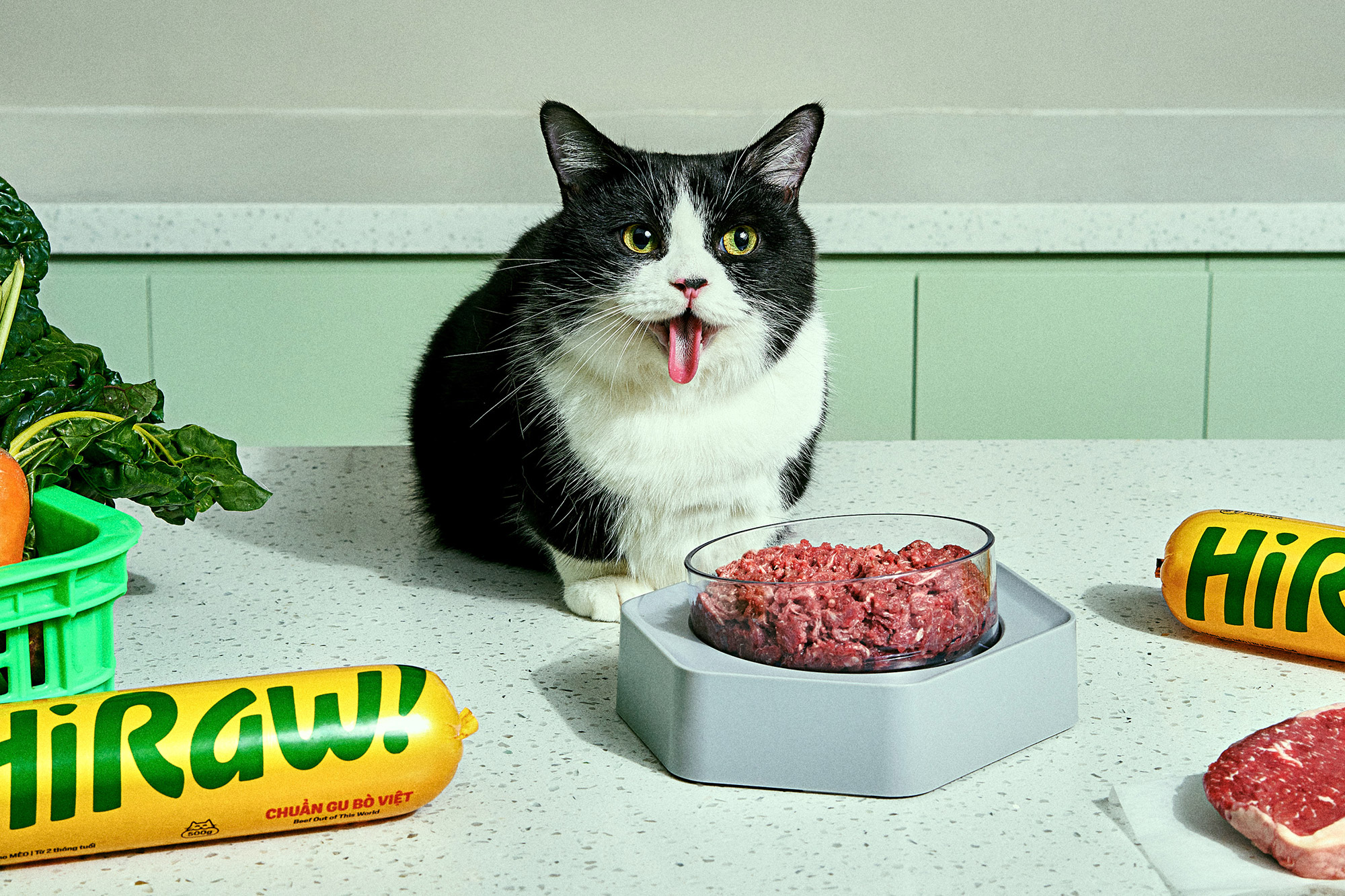
In 2018, HiRaw! set out on a bold mission to transform the way raw pet food is perceived in Vietnam. Their dedication to excellence propelled them to become a leading pet food manufacturer by incorporating advanced European technology, meticulous cold storage practices, and functional chub packaging. Their commitment to providing tasty and nutritious meals quickly made them the top choice for pet owners throughout Vietnam.
Challenge
As HiRaw! experienced rapid growth, they faced the need for a brand overhaul. Their existing system had become chaotic, making it vulnerable to imitation from competitors, and failing to make a strong impact on store shelves. To address these challenges, HiRaw! sought to embark on a rebranding journey.
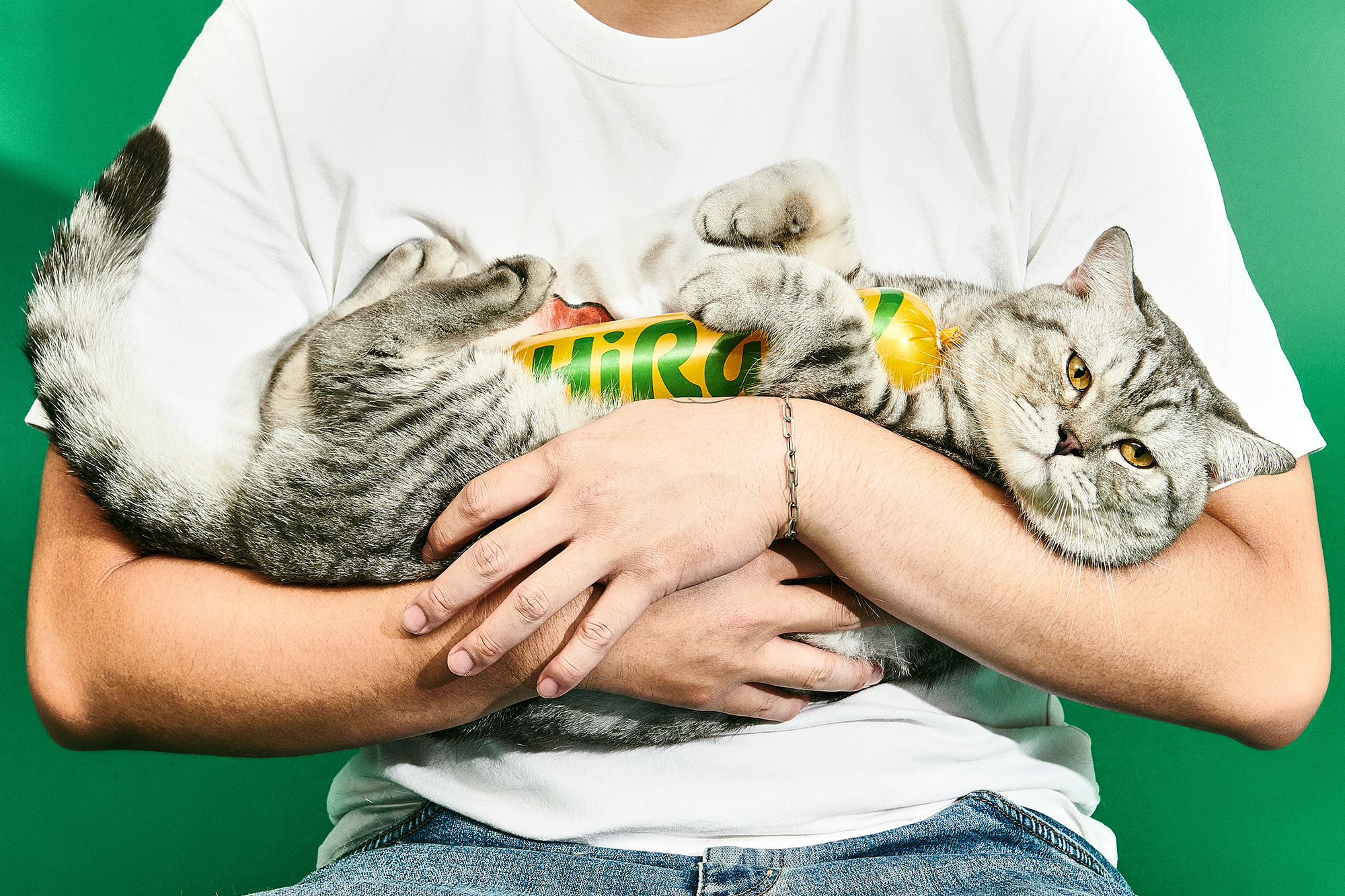
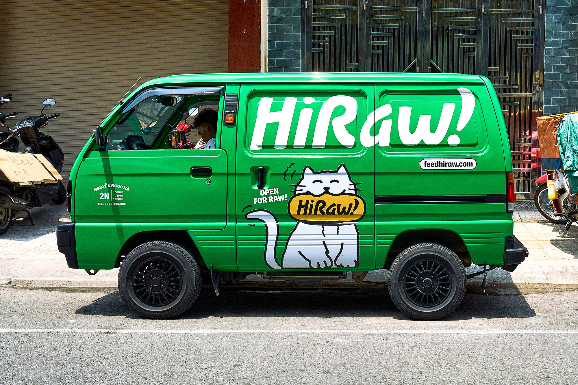
Together, we collaborated to develop a strategy that would embody their core values of compassion towards all dogs and cats. Our goal was to create an identity system that exuded boldness, strength, contemporariness, and a touch of humor. We aimed to establish a strong connection with their target audience, raise awareness about the brand, and reinforce consistency in visual and verbal language.
Brand strategy
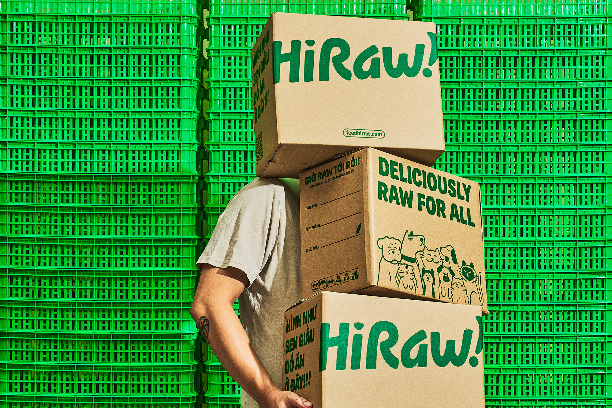
The guiding principle of HiRaw! revolves around the concept of “Deliciously Raw for All.” This ideology inspired us to create a strategic, cohesive brand platform that unites and celebrates the love, joy, and individuality of dogs and cats within HiRaw’s brand universe.
Our identity system is built on an inclusive platform that fosters a deep connection with pet owners and their beloved companions. By incorporating raw and authentic touches, we capture the playful and affectionate nature of pets, evoking a sense of warmth and excitement. This approach reinforces our dedication to promoting the well-being and happiness of all pets, showcasing our commitment to their care and nourishment.
Brand identity
Grounded in the creative idea of “Raw for All,” the identity system is fuelled by the vibrant energy of pets coming together in celebration of the exceptional HiRaw! chub. It serves as a manifestation of their love for raw food.
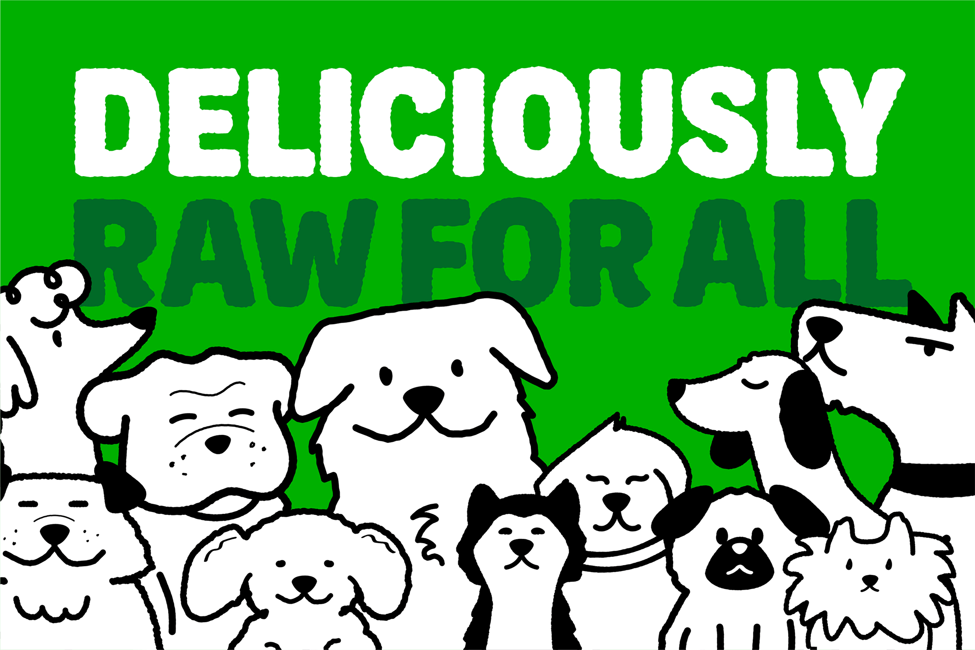
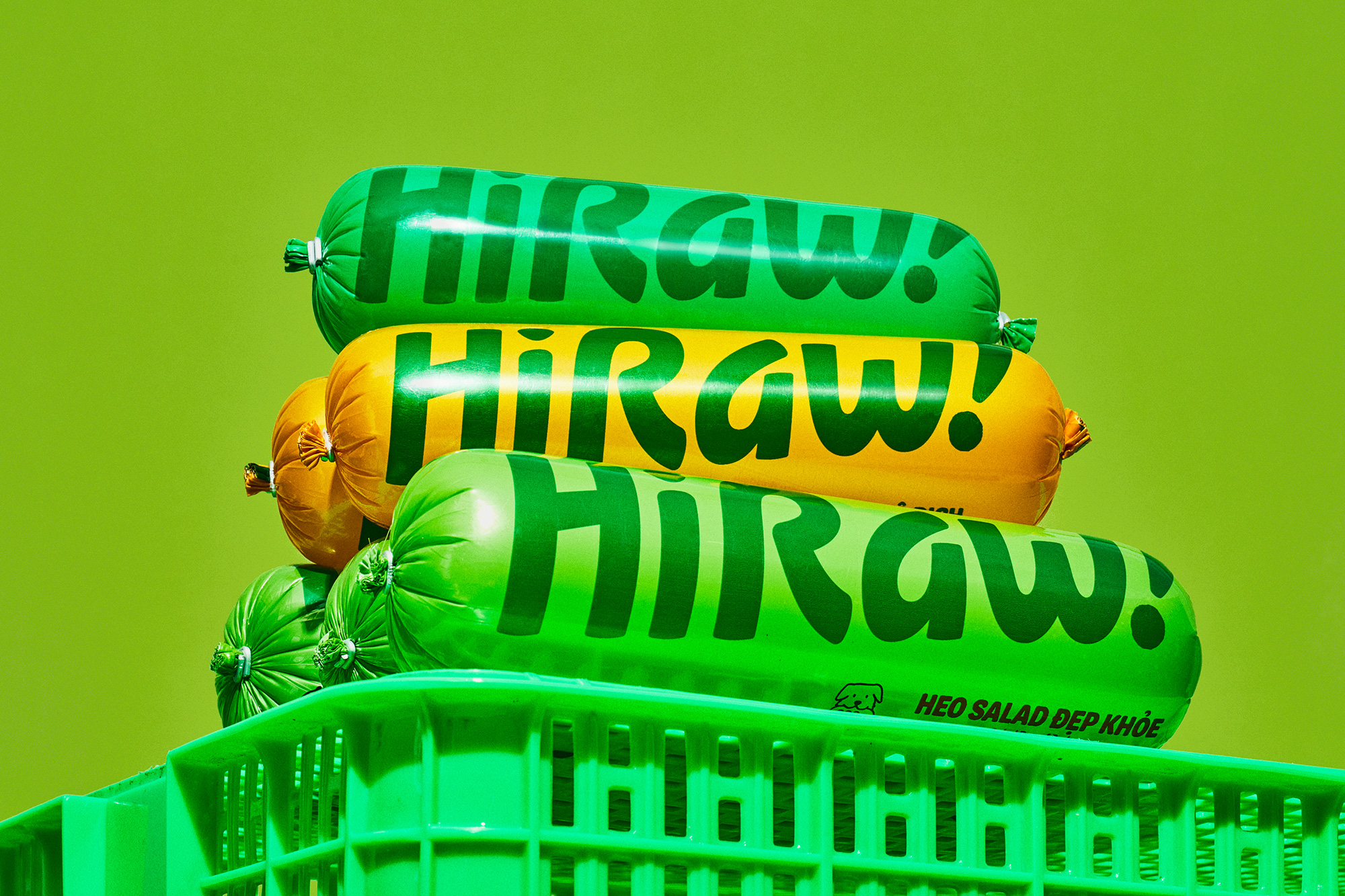
The essence of rawness takes center stage, resonating throughout the entire system, including typography, graphic elements, illustrations, and art direction for photography. This infusion of raw authenticity imbues HiRaw! with a distinctive and lively personality. The custom MN Raw font incorporates the texture and essence of mixed food, further enhancing the raw aesthetic.

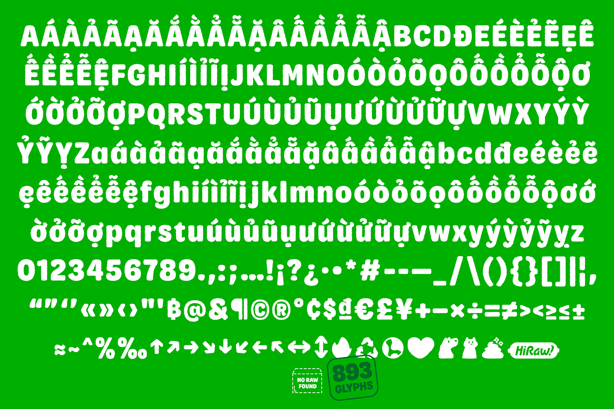
Alongside MN Raw, we utilized NaN Holo Narrow and Condensed as complementary fonts for context display. With rectangular counters and rounded curves, this font adds a delightful touch like the chub. Its intentional mix of rounded and squared details brings surprise, character, and warmth when used. It exudes a reliable and original human touch, without overpowering the overall design.
Tone of voice
We reworked each recipe name to make our packaging even more playful, welcoming, and relatable to customers. Our goal was to create a fun and engaging experience that resonates with pet owners on a human level. By infusing our packaging with a touch of playfulness and making the recipe names more memorable, we aimed to leave a lasting impression and to forge a strong connection with customers.

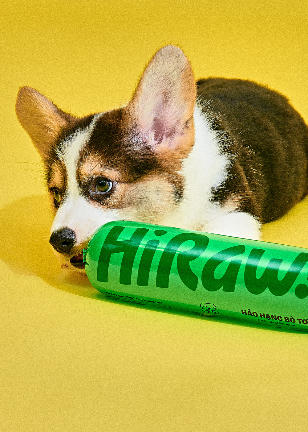
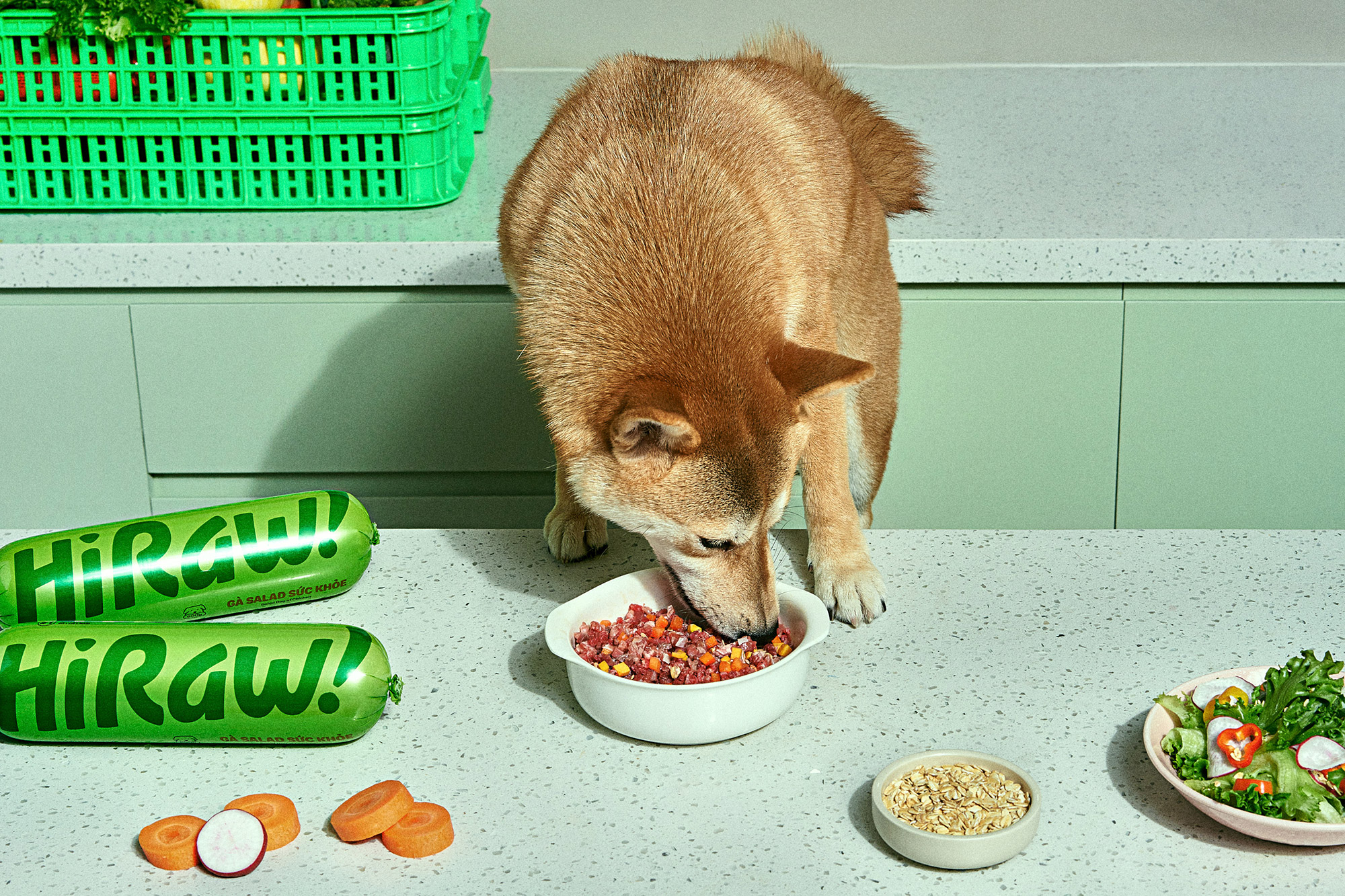
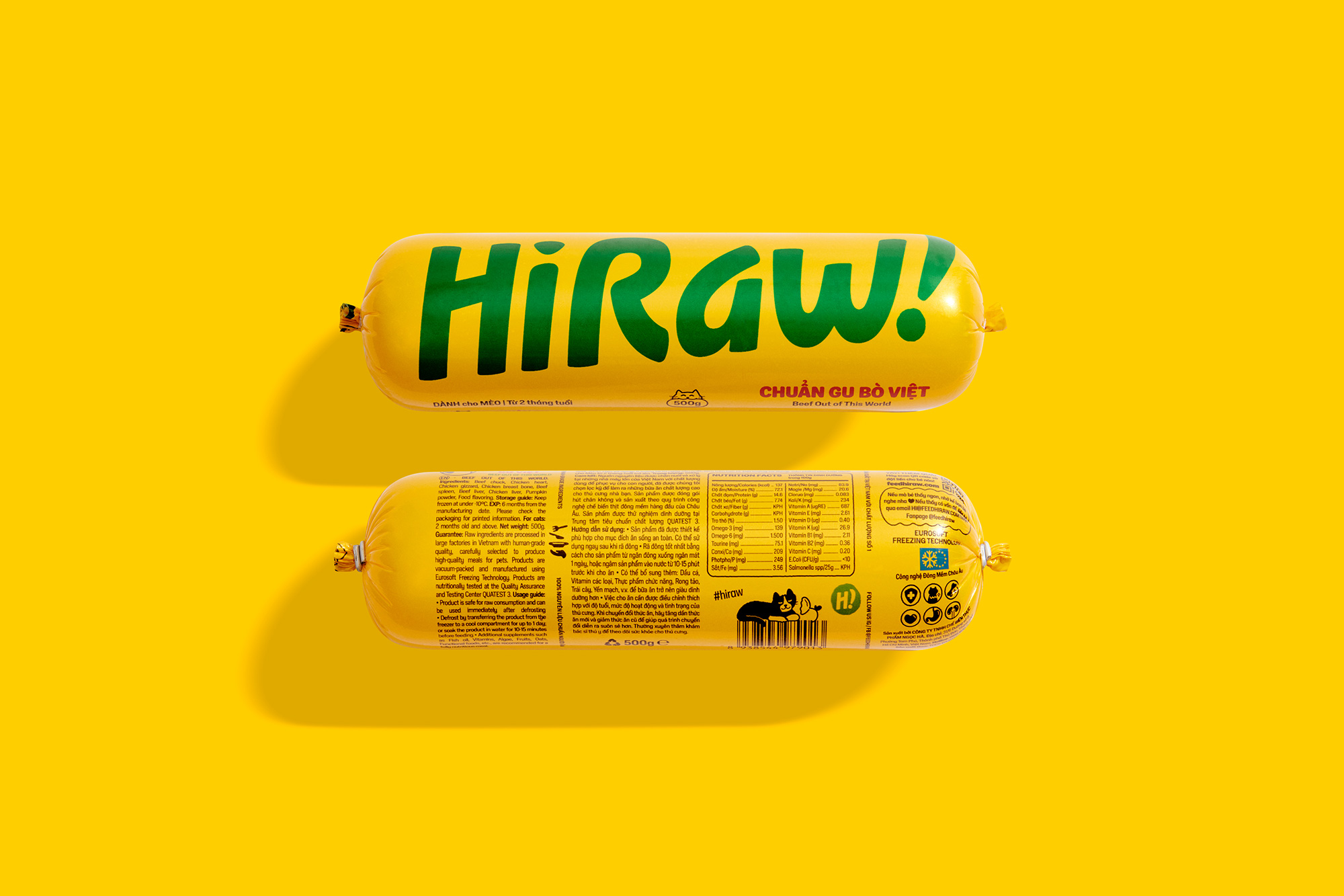
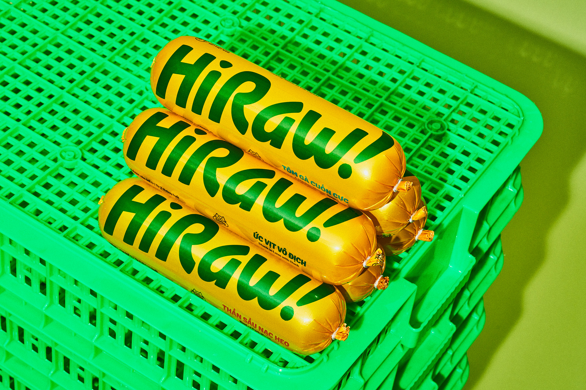
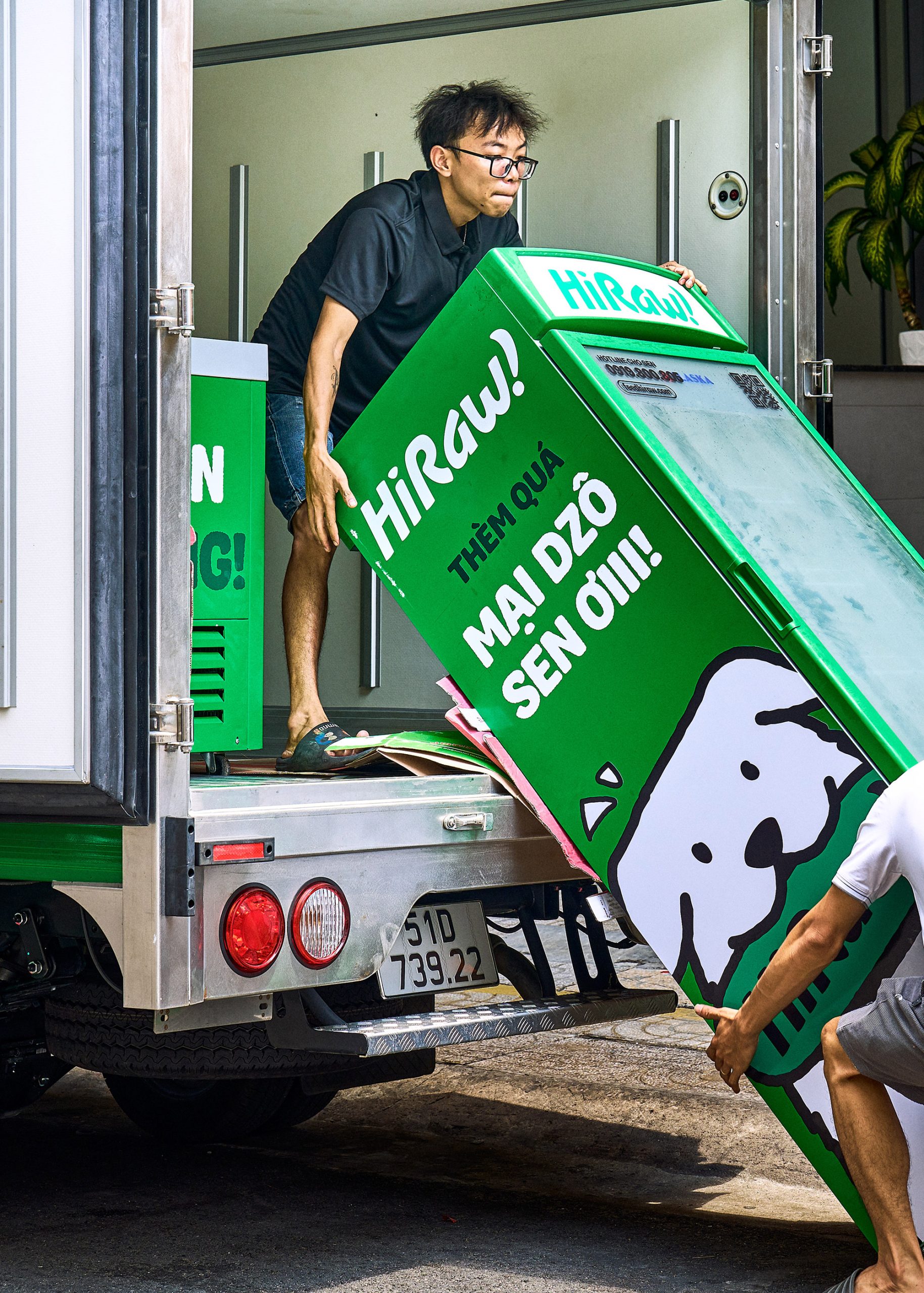
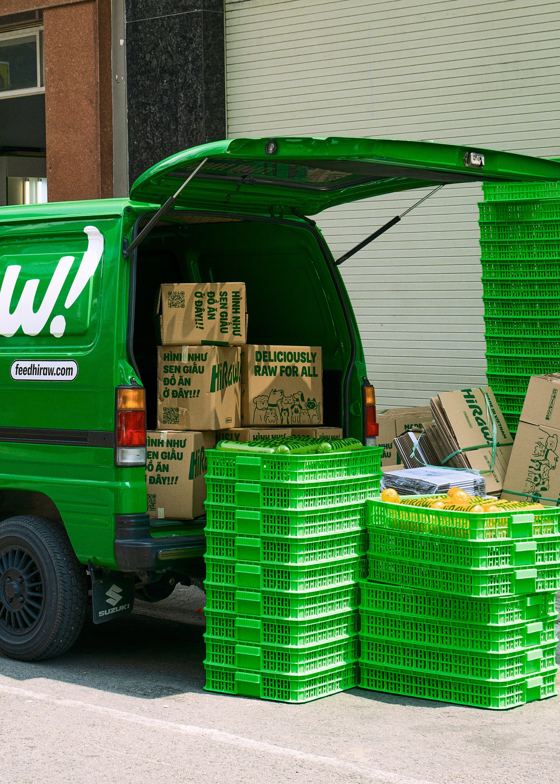
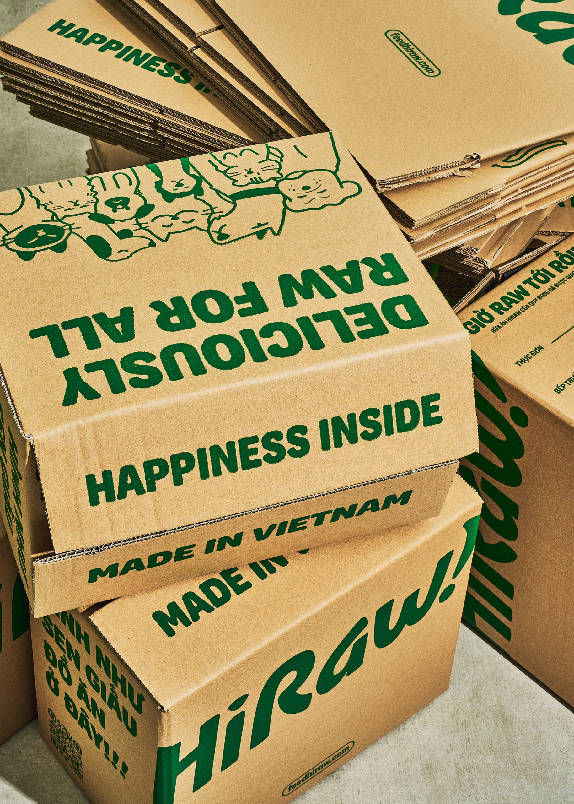
Packaging
With a focus on enhancing shelf presence, our packaging is strategically divided into two panels. The front panel takes center stage, showcasing the HiRaw! logotype in a prominent and eye-catching manner. This ensures that the brand stands out among the competition. On the back panel, we have thoughtfully incorporated all necessary English and Vietnamese content. In addition, we added humorous touches to the barcode, injecting a sense of joy, excitement, and personality into our HiRaw! pet characters.


M — N elsewhere on ID: Guta Cafe.
Recommended Posts

Champ by Jesús López, Hermosillo, Mexico
April 29, 2024
Donut Shop by TwoPoints.Net | Identity Designed
March 11, 2024
LiveKit by The Collected Works
February 9, 2024