Earthfoam identity, by Michael Mitzman

by IBRAHIM
Earthfoam identity, by Michael Mitzman
Earthfoam is a sustainable sleep brand aiming to raise the standards of quality, comfort, durability, and transparency within a misunderstood category.
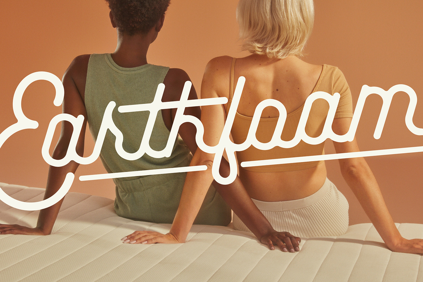
The visual identity was originally inspired by retro Airfoam ads (the original foam rubber mattress) from the 1950s. They featured bright colors, space-age curves, bold lettering, and an old-school script logo.
We wanted to give a nod to that time, when foam rubber was seen as this luxe natural material, but in a design system that was much more modern and reflective of what our brand stands for.
The initial designs took on a retro feel. Playing off a bright color palette, use of drop shadows and textures almost gave the feel of a baseball team.
At this point, we discussed having different foam types for customers to choose from (I believe it was a way of labeling firmness), and we created a badge for each type.
We also discussed using “Made and Known” as a tagline. But we eventually realized that it wasn’t a good idea as latex foam mattresses weren’t widely made or known about.
We experimented with the use of leaves from old botany drawings of rubber trees, using them to define the brand. But it became pretty tough to have any sort of design flexibility, and everything was just too heavy. So we evolved into having more breathing space, but this is where our current look and feel got its start.
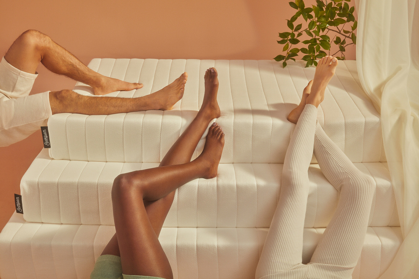
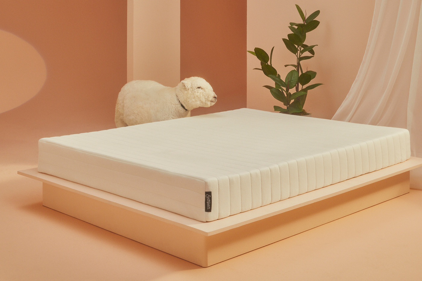
Combining elements of Japanese minimalism with photography and illustration styles that border on surreal, we ultimately created a dream world that lives within simple and clean compositions. Each one is meant to evoke that wonderous moment when you find yourself falling asleep.
When we mixed the script logo within this system, and incorporated some Sinhala — the language primarily spoken by the Sinhalese people of Sri Lanka where the Earthfoam rubber is sourced — everything worked together in this almost illogical way. It was much like the way dreams make perfect sense while you’re in them.


Not only are our products fully sustainable, but so is almost all of the packaging (we’re still trying to figure out how to wrap our toppers in paper).
From the cardboard boxes to the paper wrapping we aim to apply our principles to everything we do.
Within the fields where our latex grows, the farmers also cultivate ceylon tea and pure bee honey. To further support the farmers, we created wake-up kits that will come with each of mattress.
The kits include a tin of 25 teabags and two jars of the pure bee honey, as well as a magazine telling the Earthfoam story.
Creative direction and design by Michael Mitzman.
Photography by Stephanie Gonot.
Illustrations by Myriah Fuerstenau.
Visit Earthfoam.
Recommended Posts

Champ by Jesús López, Hermosillo, Mexico
April 29, 2024
Donut Shop by TwoPoints.Net | Identity Designed
March 11, 2024
LiveKit by The Collected Works
February 9, 2024