Big C Charters, logo and brand identity, by Mucho
by IBRAHIM
Big C Charters, logo and brand identity, by Mucho

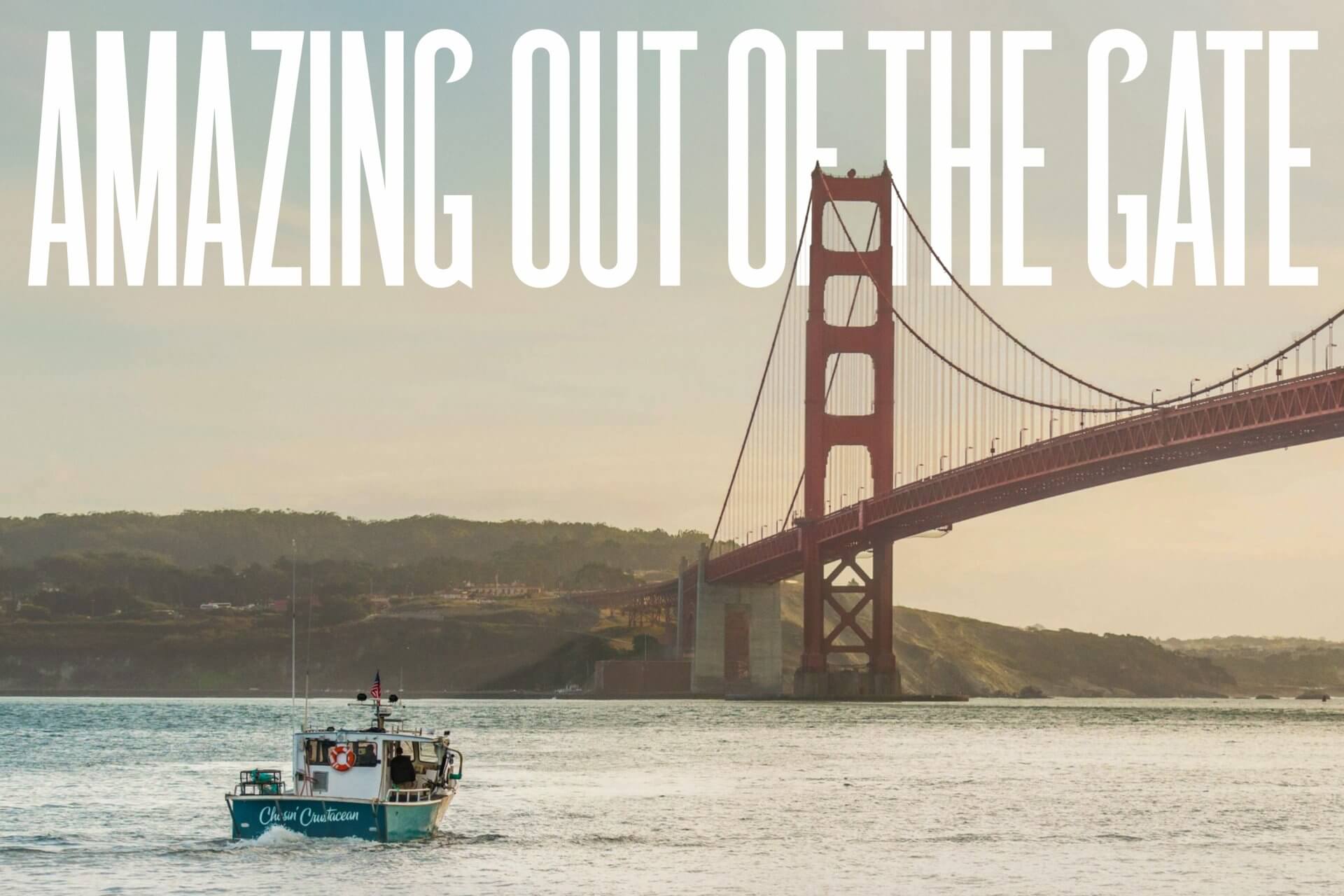
Big C Charters is the premier charter service in the San Francisco Bay Area offering hands-on fishing trips and excursions. Founded by 6’8″ former professional basketball player Christian Cavanaugh, Big C gets its name from the big man himself and his local reputation for the biggest catches.
With a growing fanbase and fleet, Mucho were commissioned to rebrand the company to appeal to its expanding business and audiences — the resulting visual identity consisting of a new logo, colour palette, typeface, photography, and brand collateral.
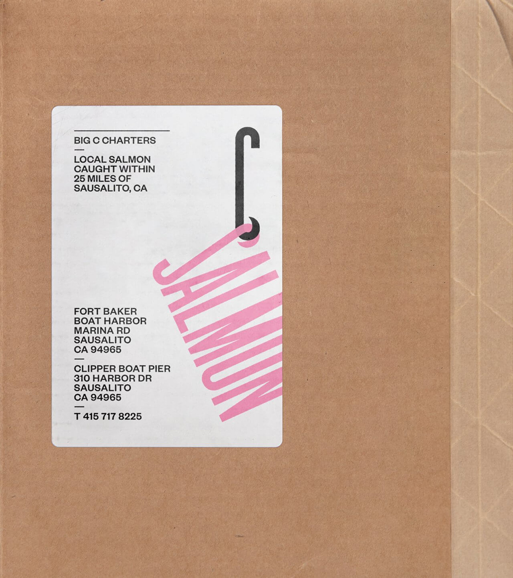
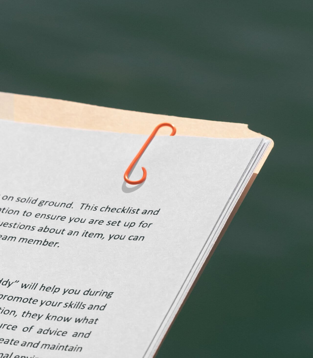
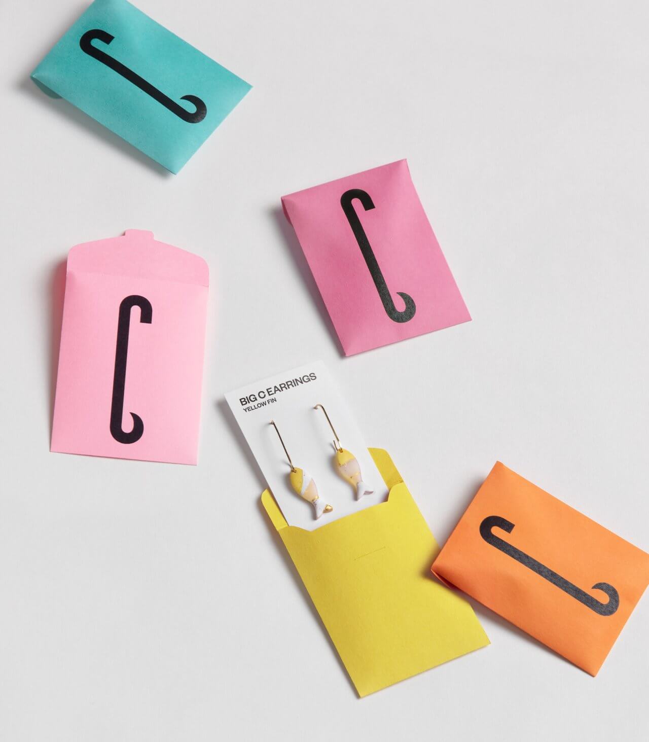
The name Big C Charters presented an opportunity to create an iconic logo — an unforgettably tall, hooked ‘C’.
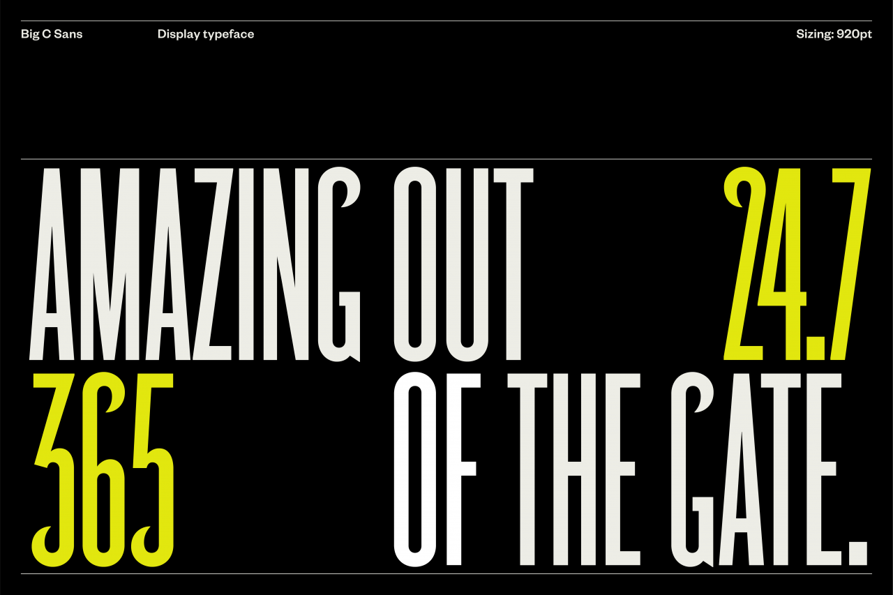
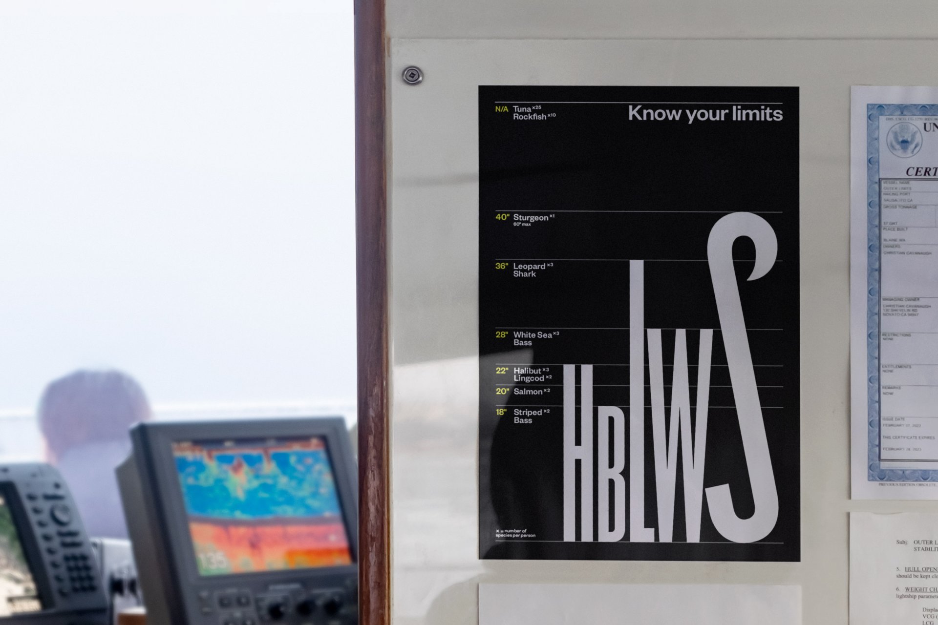
Alongside the Big C symbol, a display typeface, Big C Sans, was developed for the brand.
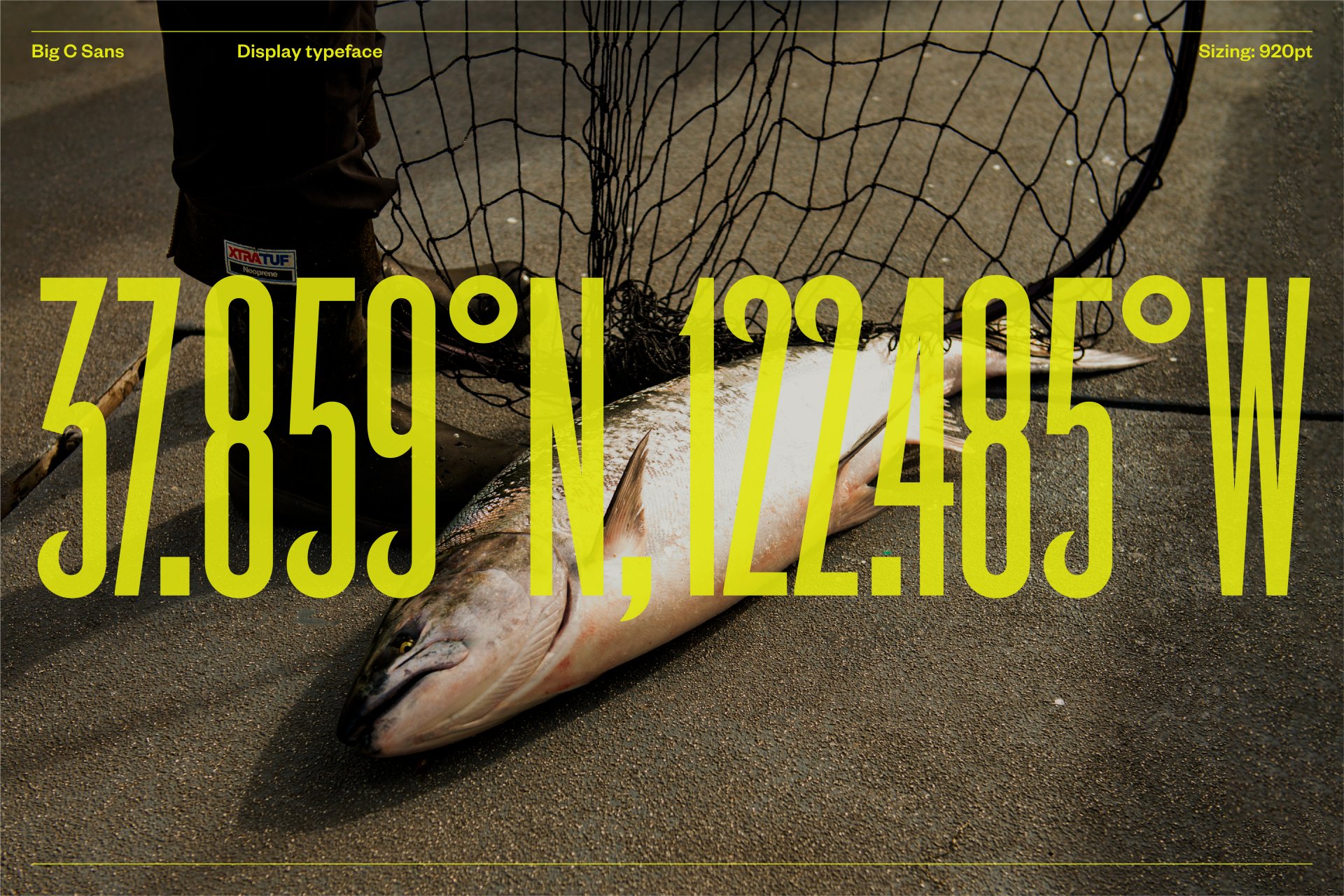
Inspired by the vernacular of the ocean and fishing, the custom typeface extends the language of the symbol. It features elongated letterforms with characteristic fishing hook/wave-like terminals that fuse antiquities of early san-serif lettering with a contemporary typeface. Its usage makes for a high impact, boutique look that’s recognisable and visible in all weather conditions.


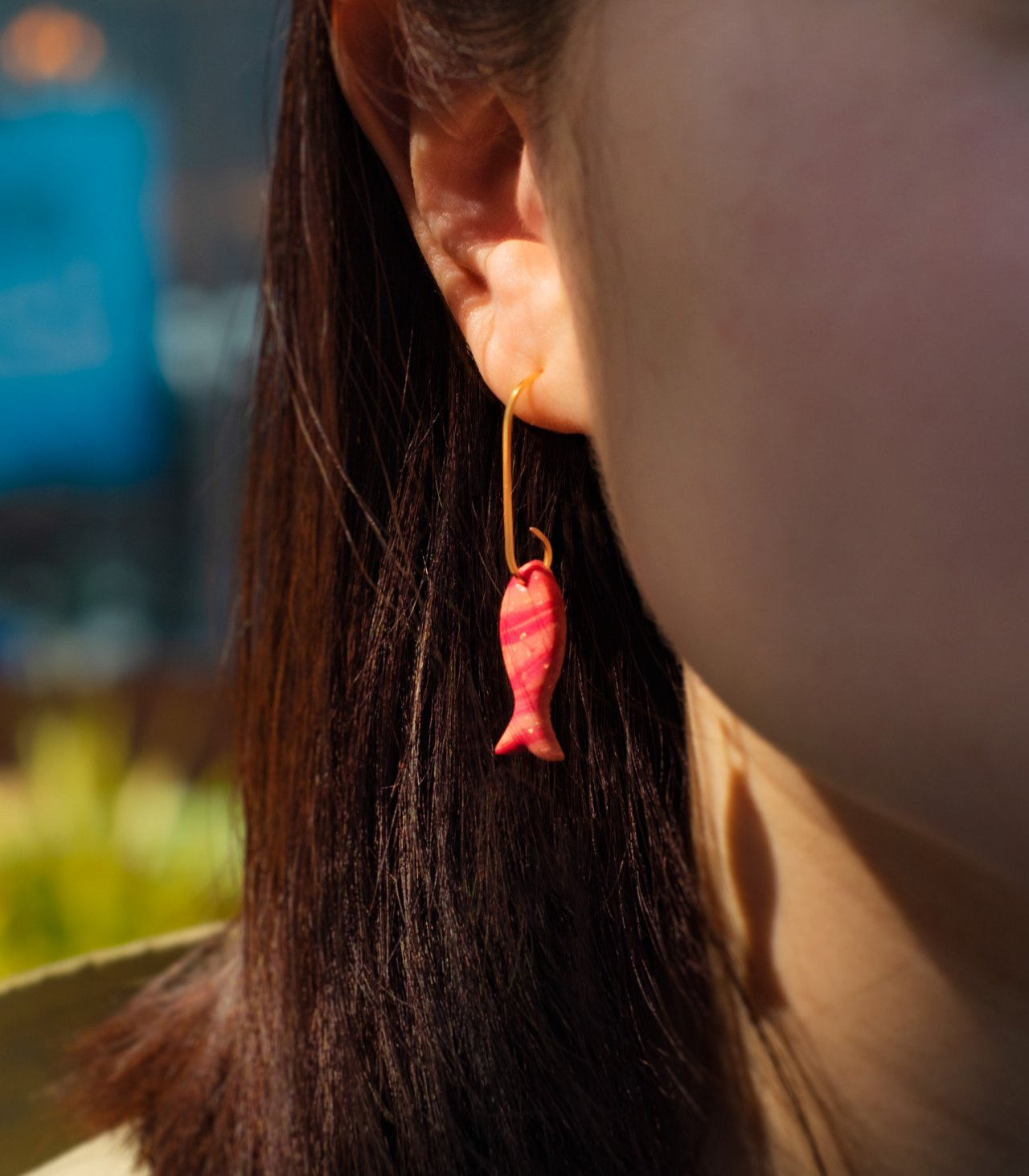
The visual language uses a vibrant palette inspired by the pop of colours found onboard their boats (hi-vis clothing, bait flashers, and hooks). These colours buck the category cliché of “ocean blues” to help challenge the old-fashion perspective around fishing.
Accompanied by reportage style photography capturing real moments on the sea, the elements come together to form a compelling identity, created to appeal to a younger audience while not alienating a more experienced angler. Visually, this sets it apart from all of the other charter companies in the Bay Area.


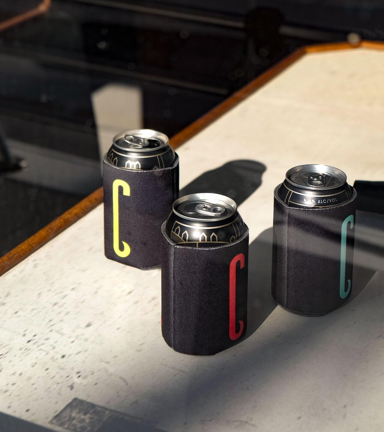

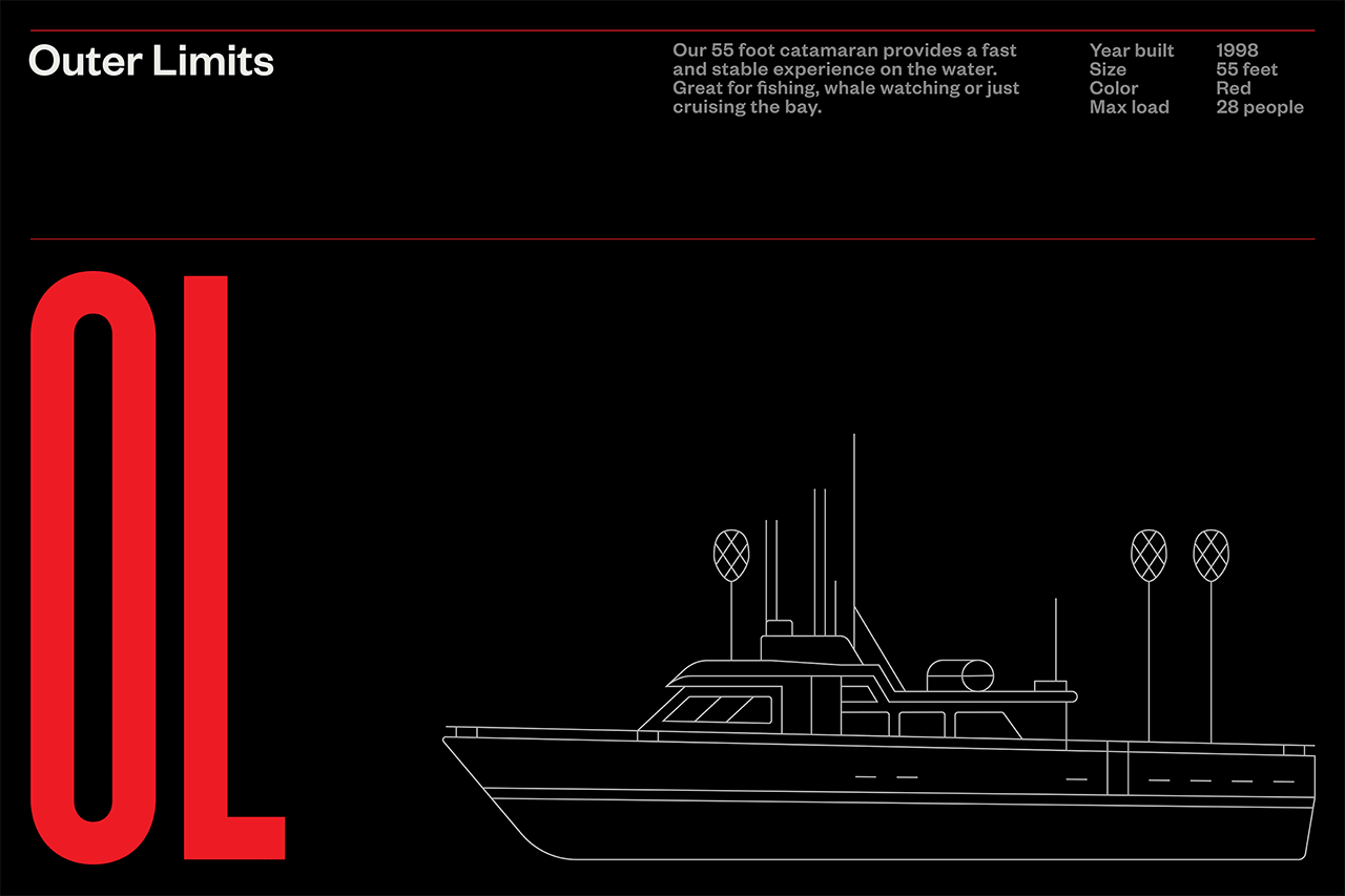
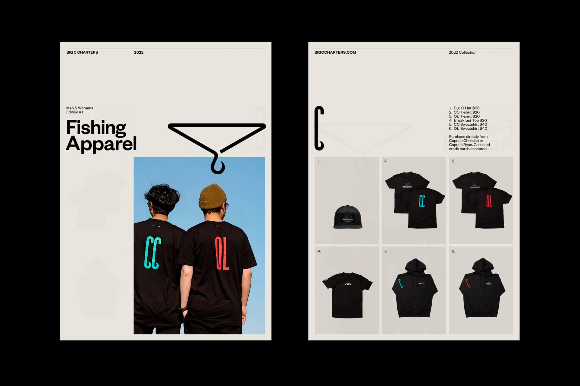
The visual identity champions the individual crew members and boats that make Big C Charters’ service beloved.
Crew are given custom jackets with their initials, reinforcing their value to the team and helping passengers identify and put names to faces. Their fleet is also differentiated since passengers often have an attachment to a particular boat and the unique experience on the water it offers.


When rolling out the identity, Mucho looked to create fun and memorable moments within brand collateral. This included playful use of scale with the ‘Big C’ logo and typeface as well as extending the language of fishing hooks in unexpected ways.


More from Mucho.
Recommended Posts
Donut Shop by TwoPoints.Net | Identity Designed
March 11, 2024
LiveKit by The Collected Works
February 9, 2024
Bát Tràng Museum by M — N Associates
February 4, 2024