Wrigley’s Extra chewing gum rebrand
by IBRAHIM
Wrigley’s Extra chewing gum rebrand
Elmwood has redesigned the international gum brand’s identity, with a focus on its “ding” symbol and pop art-inspired visuals.
Wrigley’s Extra chewing gum has rebranded to move away from dental hygiene cues and instead focus on its variety of flavours.
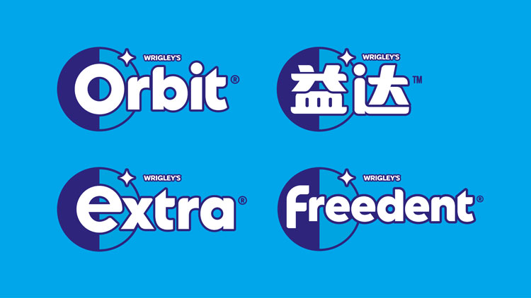
Brand consultancy Elmwood has crafted the new look, which will roll out across Wrigley’s Extra products around the world. The product is known by various names overseas, including Orbit and Freedent.

The ambition for the rebrand was to drop the “traditional look built around dental hygiene and refreshment” and focus on flavours, explains Elmwood studio creative director Craig Barnes. “We created a distinctive, forward-thinking identity for Extra that radiates confidence well beyond the packaging,” Barnes adds.
One of the main focuses for the rebrand is Extra’s “ding” symbol. The star-like symbol has been refined with softer curves and a new look, explains the design team. It’s featured within a circular frame (which Elmwood describes as a “shield”).
This lock-up can be used in isolation, but also on multiple touchpoints. A particular focus is its digital application, as the updated icon system can give “the brand potential in the digital age”, according to the design team.
The most familiar touchpoint however is likely to be the chewing gum’s packaging. On pack, the first letters of the brand name (such as Extra) will be highlighted in the shield and ding lock-up.

The circular imagery can also be seen in the updated typography as well as the flavour framing device, Elmwood explains. The aim here is to focus on “flavour and moments of confidence”, the team says. In the UK, this is the first time Extra will feature this spotlighting technique – an attempt to create greater clarity for consumers, the team explains.
The ding system also takes centre stage on the rebrand’s digital and social campaigns. Elmwood has designed a series of visual assets – involving animated work – which have been inspired by pop art and feature playful taglines.

There’s a set of hearts and lips made from what the design studio calls “Lichtenstein-esque ding patterns”, for example. They’re paired with copy such as ‘Share Ding is Caring’.
Barnes adds: “With a choiceful amount of new assets taking centre stage in storytelling, there is now a strong system in lay that can still be flexed creatively to meet any market’s needs.”
Last year, Design Week explored the trend in chewing gum branding, as designers turned their eye to a new generation of gum brands.
What do you think of the new work for Wrigley’s Extra chewing gum? Let us know in the comments below.
Recommended Posts

NB invites local designers centre stage for Vineyard Theatre rebrand
February 24, 2023

“AI revolution” will change way design studios look within three years
February 24, 2023
Rbl rebrands ZSL with ecosystem-inspired identity
February 23, 2023