Wolff Olins repositions US instant grocery brand Instacart

by IBRAHIM
Wolff Olins repositions US instant grocery brand Instacart

Instacart’s new look is positioned around a new strategy focused on affordability and accessibility.
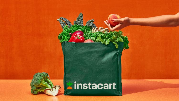
Wolff Olins has repositioned US grocery tech company Instacart with a reworked carrot symbol, which is part of a new identity designed to reflect value and innovation.
Instacart aims to make online grocery shopping affordable and accessible to people across the US and Canada. Its in-house team worked on the project alongside Wolff Olins.
Central to the project is the new arrow-shaped carrot, which has been designed to point consumers to the shopping service’s different functions, according to Wolff Olins.
As the demand for online shopping increased during the pandemic, Instacart felt that a new direction was needed to stand out among the competition, according to Wolff Olins. Grown from Instacart’s roots, the new direction seeks to build on the existing, assets to support its new business goals.
The studio says that Instacart’s “north star” is its newly developed “Shop+Saver” ethos, which Wolff Olins says combines “product innovation with the emotion, satisfaction and value that the service adds to people’s lives”. Instacart’s new visual design system is inspired by this ethos, “from the crave-worthy typography to the transformation of the beloved Instacart carrot into a dynamic symbol”, Wolff Olins senior creative director Daniel Renda explains.
Displaying the now-streamlined illustrations, the central carrot symbol’s green top doubles as an arrow. By pointing at different objects and photography across the website, it is designed to show that “you can add anything to your cart, not just food”, says the studio. The carrot serves as a nod to the brand’s grocery-centred origins and is in-line with the brand’s “aspirations of modernity and familiarity”, according to Instacart’s executive creative director Kevin Byrd.
Bespoke new typefaces – Instacart Contrast and Instacart Sans – were designed for the repositioning in collaboration with Brooklyn-based type and graphic designer Ryan Budgen. An updated colour palette features the signature orange of the carrot icon alongside a dark and light shade of green.
Wolff Olins and the Instacart creative team’s ultimate goal is to transform the Instacart experience and allow the brand “to stretch, flex, and play an even bigger role” in the lives of both its team and its users, says the studio.
Recommended Posts

NB invites local designers centre stage for Vineyard Theatre rebrand
February 24, 2023

“AI revolution” will change way design studios look within three years
February 24, 2023

Rbl rebrands ZSL with ecosystem-inspired identity
February 23, 2023

