Wolff Olins reflects on London 2012 ten years on
by IBRAHIM
Wolff Olins reflects on London 2012 ten years on
Wolff Olins global CEO Sairah Ashman discusses the design process, backlash and legacy of the London 2012 Olympics brand on its tenth anniversary.
Just before Wolff Olins launched its brand for the London 2012 Olympics, the studio refreshed its website in anticipation of a “a little bit of traffic”, recalls global CEO Sairah Ashman. The consultancy had perhaps underestimated the amount of attention it was about to receive – within half an hour, its website crashed. It was just the start of a backlash so extreme that some of its designers had to be rehoused.
The design process leading up to that point had been exciting if a little unusual, Ashman explains. She was a team member on the £400,000 project, along with former Wolff Olins chairman and project lead Brian Boylan. Patrick Cox was the most senior designer involved. Given the top-secret level of the job, the team was sectioned off at the office, meaning that the work was carried out in isolation.
Unsurprisingly, this created difficulties. “A big part of doing great creative work is to get to bounce ideas around,” Ashman says. The team worked like this for the best part of a year, locked away and only emerging for breakfast and lunch. The rest of the studio cheered them on, but they didn’t entirely know what they were up to. Another complexity was working with the raft of stakeholders an Olympic project inevitably brings: the London Organising Committee of the Olympic and Paralympic Games (LOCOG) and the International Olympics Committee (IOC).
Olympic branding is a sweet spot for many designers. From Lance Wyman to Yusaku Kamekura, Olympic masterminds hold a special place in the industry. But the legacy of the Games wasn’t particularly helpful for Wolff Olins. Neither was London’s more obvious iconography; there wasn’t going to be any reference to Big Ben. “This was to be an Olympics like never before,” Ashman says, “so you can’t draw down on history.” Instead the team hoped to engage with a young crowd, showcasing accessibility. The ambition was to sum up the city’s vibe at the time – what Cox would refer to as “my beautiful, disobedient London.”

While the Olympics took place in 2012, the branding was designed five years earlier. London in 2007 was a very different place from today – a time before the 2008 recession, Brexit and coronavirus. “We had to take a run at what the world was going to feel like then, and to our minds we were optimistic about that,” Ashman says about designing the brand in advance. With guidance from LOCOG president Sebastian Coe, the aim was to go for a look that would attract younger people and “not be so elitist” in its focus. “It had traditionally been about Olympians, incredible human beings competing, and not really about us on the street,” she adds.
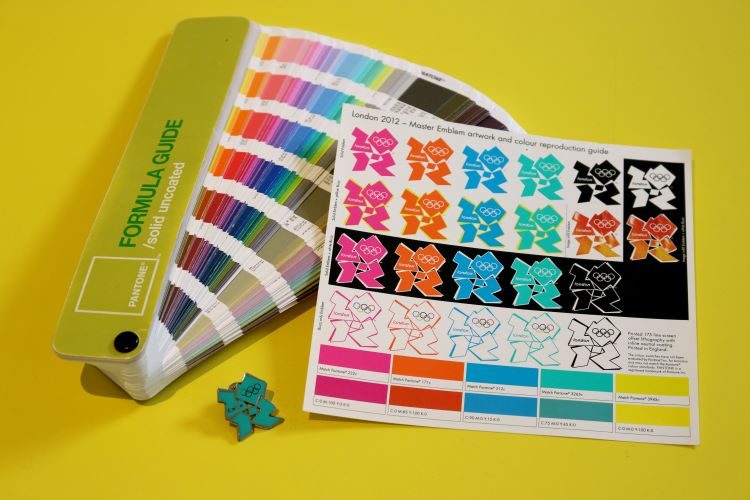
Wolff Olins now describes the colourful, jagged logo as “bold, spirited and dissonant, reflecting London’s modern, urban edge”. Opinions differed at the time. People condemned it as dated, illegible or too ‘80s. Thousands signed a petition to scrap the logo, brand footage was withdrawn amid fears it triggered epileptic fits and politicians called for a rethink. While the branding had some champions, the immediate response was overwhelmingly negative. How did Wolff Olins feel? “You can’t expect everyone to love what you’re doing,” Ashman says. “And we didn’t expect them to, but we did want people to notice it.” Some journalists were “particularly savage”, Ashman notes. For the general public, she believes the “shock of the new” had an impact.
“You’d love to grab a microphone and be able to tell the whole story”

One of the frustrations at the time was that Wolff Olins was not able to discuss the work publicly. “Obviously, you’d love to grab a microphone and be able to tell the whole story,” Ashman admits, while noting that there were good reasons not to – chiefly that while they had worked on the design, the branding didn’t belong to them. But an explanation from the studio may have helped people understand the work – which was part of a wider brand, and not simply the logo which most people focussed on.
She also believes that it elicited some of the best and worst behaviour in the design industry. On the positive side, there was thoughtful, constructive feedback about what it takes to create good work, Ashman explains. But the negative reaction went beyond the now-standard internet takedowns which follow a controversial logo reveal. Designers were chased and doorstepped. Ashman says that they had to move people out of their homes temporarily to give them a break. “It was a strange moment in time.” It hasn’t hurt Wolff Olins in the long-run; Ashman says that clients often “want an Olympics” and designers have joined the studio on the back of the work.

It’s impossible to talk about the London 2012 logo without discussing Lisa Simpson – many noted how the logo looked like the cartoon character engaged in a sex act. “We could see the humour back then,” she says. “And we photographed a lot of it for posterity to make sure that we always stay grounded.” There were of course, less amusing interpretations – including comparisons to a swastika and SS symbols.
Lost among the controversy was a key feature of the logo: its flexibility. One of the main reasons people came round to the branding, Ashman believes, is because they were able to see the logo in context with branding. For example, the designers were particularly proud of the branding’s adaptability – the logo could be easily adapted by taking on a sponsor’s colour, like the black and white tones of Adidas. It was also rare in that it embedded the Olympic rings inside rather than outside the logo – a feature only shared with the Mexico 1968 Olympics – which afforded another degree of flexibility. If an organisation did not have the permission to use the rings, they could be dropped.
“It got a whole world talking five years before the event was even happening”

By the time the Olympics rolled around five years later, the brand had been developed widely by other design studios. The branding was applied to tickets, retail spaces and Olympic venues. This marked a shift in perception for the much-maligned work, according to Ashman. “As some of the other pieces came together, so did the big idea behind it – participation,” she says.
Amid the backlash, was there ever a moment when the designers felt like they had made a mistake? Ashman, ten years later, is resolute that it was the right way to go. “I don’t want that to sound arrogant, I just think we felt confident about the idea and didn’t feel like a lot of people had had enough time to get used to what was a very new idea for the Olympics,” she explains. It also helped that they had the full backing from the various organising committees. “I wouldn’t feel nearly so proud if we’d done something that we couldn’t be talking about ten years after the event,” Ashman adds, pointing out that London has never been home to “boring or forgettable” culture.
But perhaps the biggest boon to the brand was just how fondly everyone viewed the Games that summer. It’s hard to gauge an overall mood-lift an Olympics provides for a nation, but LSE research found that the 2012 Games had “a sizeable but short-lived effect on happiness”. According to a new survey, 81% of people believe it was right to invest in the Olympics and 79% are proud of its legacy. To mark the ten-year anniversary, London mayor Sadiq Khan is leading a celebration at the Queen Elizabeth Olympic Park, which will be a focal point for anniversary celebrations. It’s likely that Wolff Olins’s logo will be in the public imagination once more, if it ever even left.
“We’re not proud of the controversy, but in retrospect, it’s great that it got so much attention in a way that these things never normally do,” Ashman says. It’s true that the saga piqued an interest in design and its value. And in terms of attention and PR, the logo was a runaway success. “It got a whole world talking five years before the event was even happening,” she adds. “I’m not sure that has happened before – in terms of generating eyeballs and interest.”
Recommended Posts

NB invites local designers centre stage for Vineyard Theatre rebrand
February 24, 2023

“AI revolution” will change way design studios look within three years
February 24, 2023
Rbl rebrands ZSL with ecosystem-inspired identity
February 23, 2023