What will graphic design look like in 2023?
by IBRAHIM
What will graphic design look like in 2023?
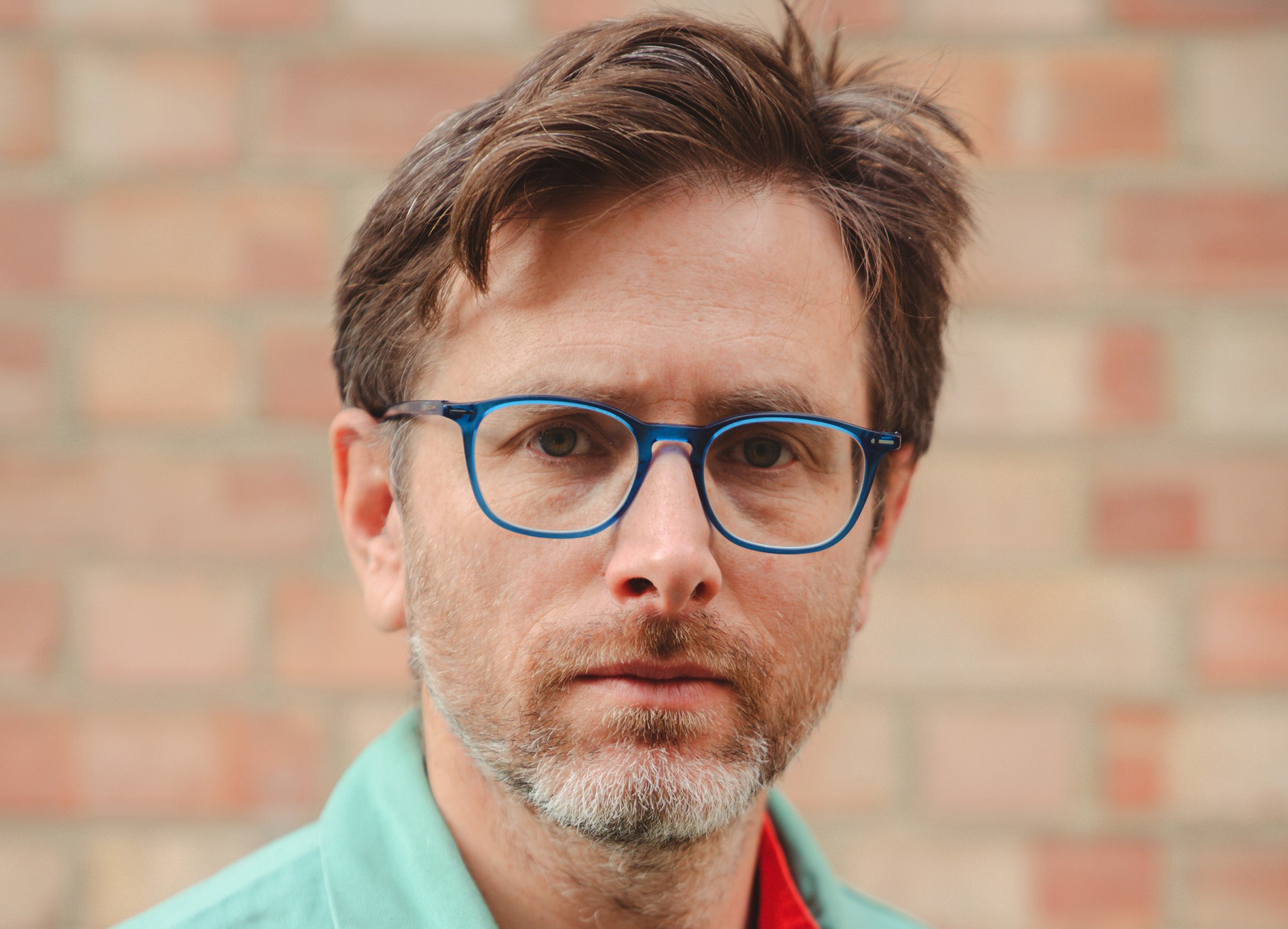
As part of our series on design in 2023, Fraser Muggeridge offers his take on what he wants graphic design to look like this year.
What will graphic design look like in 2023?
There will be a huge gap between what I want graphic design to look like, and what it will actually look like in the coming year. Rather than focusing purely on aesthetics, I would like to see improvements in how content is supplied, questioning of the design process itself, with clear responsibility for every aspect from those with specific training, and knowledge acquisition.
Print is permanent and so editorial graphic designers need to be responsible not only for the design, but also for copy editing and proofreading so as to ensure that all the words, punctuation, and spaces are in the right place and in the right order. It’s a difficult task that nevertheless comes with all the advantages of being in control. However, we need to know what we are doing, be deliberate, and assume responsibility for our actions. Micro and macro details are as important as the big idea, that can, at times, suffocate the work. Reading, questioning, knowing, and upholding standards is what’s needed to advance and save the discipline.
A good place to start is ‘Stop Sitting Around and Start Reading’ (Eye Magazine, no. 11 vol. 3, 1993) by Paul Stiff, one of my teachers at the University of Reading in the 1990s.
What was your favourite graphic design project from 2022, and why?
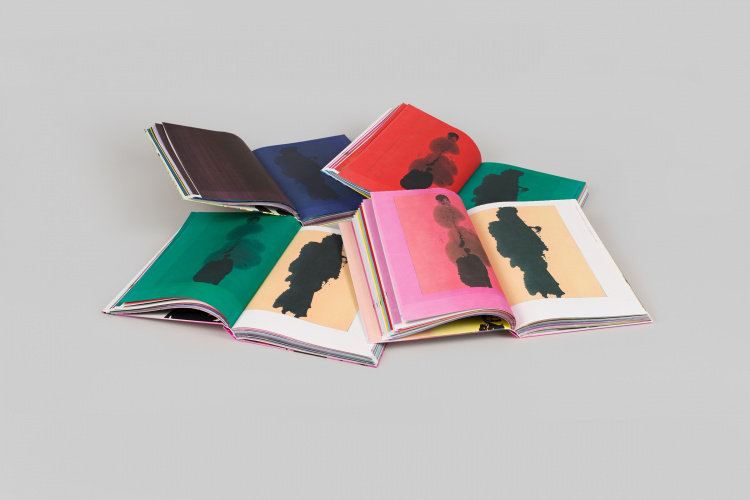
Singapore-based WERK Magazine, spearheaded by Theseus Chan, is something to behold. Every issue challenges the notion of a publication through a forward-looking blend of designing, printing and making. STEIDL–WERK No.30: KUNSTHAUS GÖTTINGEN, featured in the installation Printing Futures as part of documenta 15, is a collaboration between Theseus Chan, Gerhard Steidl and Kunsthaus Göttingen.
The cover, unassuming grey boards covered with cloth, is attached to the book block inside-out, thus exposing the binding process of hardback books; it is wrong but, at the same time, beautifully right. Described as “printed anarchy” by WERK and Steidl, the book’s inside pages playfully showcase the possibility of introducing variations while the press is running. Inconsistencies are created by turning off the water supply during the printing process, a technique similar to that used by Dieter Roth in his Collected Works, Volume 38, 1980. Each copy is therefore unique, contradicting the typical process of offset printing that aims to produce identical copies.
These kinds of projects are only made possible through the close collaboration and co-operation of the designer, printer and publisher, who ought to work towards a common goal. Equally, they need to be willing and prepared to embrace the risk that comes with this kind of design and print production process. The workmanship of risk, a term coined by David Pye, resonates here. He defined it as “using any kind of technique or apparatus, in which the quality of the result is not predetermined, but depends on the judgment, dexterity and care which the maker exercises as he works”.
It is no surprise that I purchased two copies.
Banner image of STEIDL–WERK No.30: KUNSTHAUS GÖTTINGEN courtesy of Steidl.
Recommended Posts

NB invites local designers centre stage for Vineyard Theatre rebrand
February 24, 2023

“AI revolution” will change way design studios look within three years
February 24, 2023
Rbl rebrands ZSL with ecosystem-inspired identity
February 23, 2023