Underexposed designs Fermento’s visual identity
by IBRAHIM
Underexposed designs Fermento’s visual identity
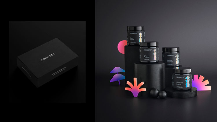
Underexposed’s branding for Fermento contrasts dark and bright tones to evoke a “flourishing probiotic landscape”.
Liverpool-based design studio Underexposed has designed a new identity for probiotics brand Fermento while positioning the brand as a range of products with specific therapeutic properties.
As well as the visual identity, Underexposed has worked on the art direction, tone of voice, website design, and packaging for Fermento.

Fermento’s range of pill-based products are designed to target specific health conditions, from gut health to skin care. It calls these offerings “precision probiotics”.
According to the company’s manifesto, the health brand aims to differentiate itself from other probiotic companies which “tend to target generic gut issues, and often have undecipherable labels on them”.

“Fermento are busting myths and creating a stir,” says Underexposed creative director Andy Broadwood. “They needed a brand that sets them apart from the sea of ineffective probiotic cocktails.”
One problem in the probiotic sector is that consumers face confusion about what the products actually do, he explains. “Many people don’t know enough about them, and some companies are selling ineffective probiotic products,” Broadwood says.
The ambition for Fermento’s branding was to show how “health-conscious people can actively improve their wellbeing, and to bust myths,” he adds.

The branding work aims to evoke a “rich, bright, flourishing probiotic landscape” by contrasting a black background with multi-coloured visual elements, Broadwood explains. This nods to the “dark conditions needed to cultivate the products”, he says.
As the designer explains: “The brand’s rich, bright colour palette is inspired by the idea of working in the dark to create something incredible, as darkness provides the best environment for developing probiotics.”
The rainbow-hued icons which appear on packaging are inspired by specific strands used in different products, explains the designer. For example, on the Gut Protect label, the shapes are inspired by the specific probiotic strains in that pill.
This visual metaphor hopes to draw attention to the specific strains and how “every Fermento tablet contains billions of living micro-organisms”, Broadwood adds.
The design studio has crafted a range of these icons which appear throughout the identity. They can also be animated for digital applications.
What do you think of the branding for Fermento? Let us know in the comments below.
Recommended Posts
Norfolk Coast logo and identity by Lantern
November 23, 2023

SeidrLab visual identity by Mubien Brands
October 16, 2023
Jarrolds logo and identity by The Click
October 5, 2023