Twinings tea targets millennial consumers with new branding
by IBRAHIM
Twinings tea targets millennial consumers with new branding
As well as making the brand more recognisable on the shelf, the tea company’s new colour palette and illustrations aim to appeal to a younger audience.
Butterfly Cannon has rebranded Twinings tea with new packaging that aims to appeal to a younger audience by drawing on themes of travel.
The new design intends to translate the brand’s history into a “cool new London luxe” rather than the “souvenir of old London” that Twinings had become, explains Butterfly Cannon creative director Arron Egan.
It is also supposed to help customers navigate the range of flavours and blends through a more cohesive brand-wide colour palette and aesthetic.

As well as being inconsistent and difficult to navigate, Butterfly Cannon co-founder Jon Davies says that the old branding “did not appeal or fit in with its target consumer’s lifestyle”. The overall purpose of the repositioned is to “better target the younger more affluent millennial”, he adds.
The new packaging is also meant to be accessible for Twining’s South East Asia market. Davies says, “As English is not their first language, it is essential to communicate the flavour and ingredients without the need for words.”
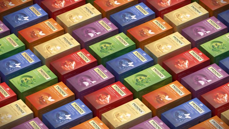
Across all Twinings ranges – from green teas, flavoured black teas and infusions – the circular window on the front of the box will now be split into two, with “hand-crafted graphic illustrations on both sides”, explains Egan. The left-side depicts the ingredients of a particular flavour while the right-side attempts to give a nod to the more traditional aspects of the brand with iconography based on its history.
For example, on the Earl Grey blend there are tea leaves on the left of the window and an illustration of top hats being thrown in the air at a garden party. This is a nod to the quality of the ingredients and to the earl that inspired the blend.

Other illustrations across the packs are designed to illustrate the country which the blends and flavours correlate to.
Davies adds that there has also been “a complete reinvigoration” of the colour palette and typeface library. A “bold and vibrant” two-tone palette is now applied on the packs, working with hues that are meant to complement each other as well as correlate to the flavour of the blend.
The brand’s wordmark has also been straightened up in an attempt to modernise the look. Beneath the wordmark, the blend names and body copy are now left-aligned “to create pace against centralised assets” – another attempt to make the packaging appear more modern, adds Egan.

Davies says that the difference between the “old more haphazard range” and the “fixed architecture” of the new packing is clear. He adds, “We amplified all of the new brand assets across Twinings comms to ensure it had a harmonious and recognisable identity, so consumers knew what to look for before they even entered the retail stores.”

Butterfly Cannon also created the launch campaign for Twinings, which utilises a roundel to pair depictions of ingredients and flavour cues with the brand’s iconography. The new branding has rolled out across all physical and digital assets.
Recommended Posts

NB invites local designers centre stage for Vineyard Theatre rebrand
February 24, 2023

“AI revolution” will change way design studios look within three years
February 24, 2023
Rbl rebrands ZSL with ecosystem-inspired identity
February 23, 2023