Studio Texture overhauls identity and renames children’s charity ICAN
by IBRAHIM
Studio Texture overhauls identity and renames children’s charity ICAN

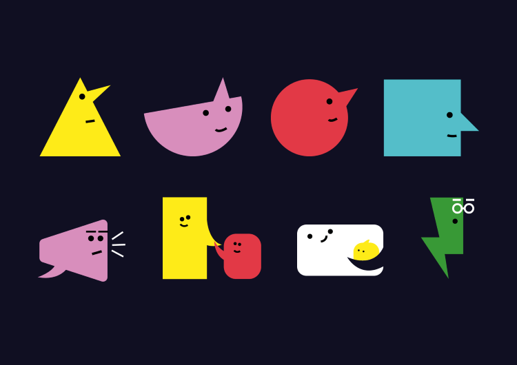
Studio Texture has rebranded and renamed charity ICAN – now Speech and Language UK- with an identity which uses characters and speech bubbles.
The charity’s goal is to reach more of the 1.7 million children who have difficulties with talking and understanding words. According to Studio Texture creative director Stuart Youngs, finding a new name for the charity was a challenge because “nothing that’s obvious is available, and almost anything ambiguous will fall at the first hurdle”.
The ambiguous nature of the charity’s original name meant that “those who needed it, couldn’t find it”, says Youngs. He explains that this is the reason for “a re-emergence of more descriptive names” in the charity sector.
Though simplifying the name solved one problem, Youngs says that it put more “pressure” on the studio “to dial up the emotion in the expression of the brand”. He adds that the idea to use speech bubbles to “express emotions in more than words” came from insights provided by qualitative research, which the studio carried out in collaboration with Breath Research.
“When a young person is struggling with speech and language, they often use pictorial symbols to express themselves and their emotions,” says Youngs. In response to these findings, the “speech bubble family” was created, which Youngs says is designed to show a range of emotions “from frustration and anxiety to happiness and success”.
Mimicking real life situations through the speech bubble characters is also meant to help connect with the target audience. Throughout the identity, they are put into “pairs and teams” and even given “parents and coaches”, says Youngs.
The charity’s original identity had a plainer speech bubble as its marque. Youngs says the studio “thought it wise to retain something” but decided that evolving it into something “much wittier” would inject “a playful element right at the core of the identity”.
Previously, burgundy and orange were used as the charity’s main colours, which “made the identity feel flat and bored”, says Youngs. The new colour palette aims to offer “different signals”, with “bold and punchy options”, alongside a weightier navy hue, he says, adding that using a variety of colour combinations across the identity enables it to be “flexible and fresh”.
Similarly, the studio sought to add more “personality” to the identity through its typeface choices, according to Youngs. Pairing off-the-shelf fonts – Gilroy by Radomir Tinkov with Doyle Medium from Sharp Type – added “the confidence and character” that the charity needed, says Youngs.
While the sans “has character” and provides “a simple clarity, which feels childlike, but not childish”, Youngs says the more “grown-up” serif adds “weight” to the identity and seeks to “underline the seriousness of the challenges facing those affected”.
Studio Texture also carried out an overhaul of the website design, working with Speech and Language UK and Brace Digital on the UX and UI development. “It’s a phased approach with an initial re-skin for the brand launch, and the full site then being rolled out later next year,” says Youngs.
The new identity has launched alongside a new brand campaign which shows “a child in a classroom struggling to understand her teacher, and the impact of the experience”, Youngs adds. The new identity roll out will continue over the next 12 months across all brand touchpoints.
Recommended Posts
Norfolk Coast logo and identity by Lantern
November 23, 2023
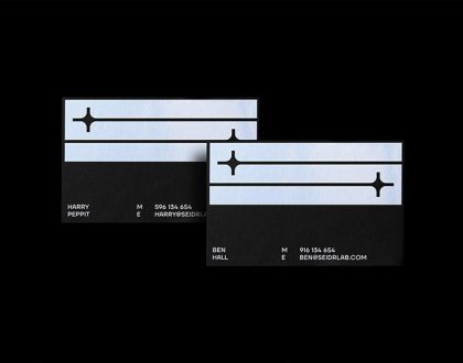
SeidrLab visual identity by Mubien Brands
October 16, 2023
Jarrolds logo and identity by The Click
October 5, 2023