Studio Koto introduces “fresh and exciting” visuals to Mystudenthalls.com
by IBRAHIM
Studio Koto introduces “fresh and exciting” visuals to Mystudenthalls.com
The student accommodation search engine has rebranded with a flexible graphic logo and a brighter, more extensive colour palette.
Studio Koto has rebranded student accommodation search engine Mystudenthalls.com (MSH) with a graphic system that revolves around its new building-shaped logo.
The platform launched in 2011 as the first purpose-built student accommodation search engine. Though MSH has become a “respected name in the sector”, Studio Koto’s creative director Fred North says the website and brand “felt dated” and no longer stood out in the competitive space.

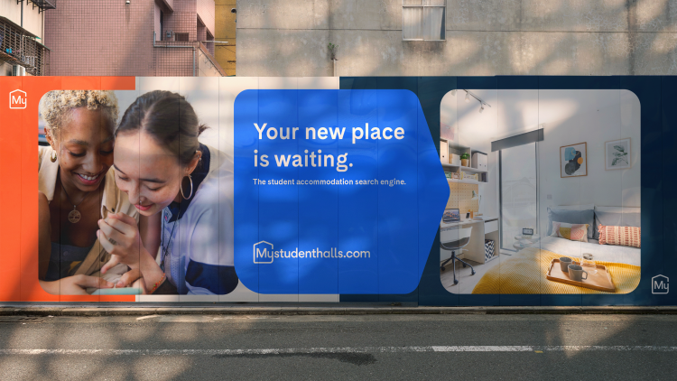
Since its “primary demographic is very visually aware”, North says “fresh and exciting” visuals were key to the new branding. MSH’s new icons were created with two themes in mind: place and discovery. Standing as “a power moniker” for the brand, its new logo was designed to work digitally at all sizes, according to North.
For the logo, North explains that the “My” from Mystudenthalls.com has been placed inside a simplified representation of a building, aiming to balance “immediate visual representation with upwards movement, representing the idea of progression”. The new logo has also been adapted into graphic shapes which MSH can use as framing devices for text or imagery, or to emphasise specific features within its photography.
The new colour palette also seeks to better reflect MSH’s target audience. In its previous branding, colour did not play a significant role apart from an “apologetic light pink colour combo within the logo”, says North. He adds that MSH’s new bright suite of colours aims to “better represent its personality” and help it to stand out among the competition.
For the brand’s new typeface, Studio Koto chose Cadiz by Luzi Type Foundry for its “confident, modern characters”, says North, adding that it complements “the new tone of voice”. He explains that the MSH tone of voice strategy aims to strike a balance between communicating that students are not alone in the process of finding halls, reassuring them that help is there when needed and “creating less fuss and more fun”.
As a digital platform, the website is the primary touchpoint for the new branding, but it will also be rolled out across billboards, social media and more B2B-orientated materials, such as presentation templates.
Recommended Posts

NB invites local designers centre stage for Vineyard Theatre rebrand
February 24, 2023

“AI revolution” will change way design studios look within three years
February 24, 2023
Rbl rebrands ZSL with ecosystem-inspired identity
February 23, 2023