Start-up advisor True Altitude’s new “psychedelic” identity
by IBRAHIM
Start-up advisor True Altitude’s new “psychedelic” identity
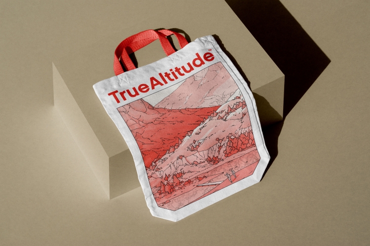
Setting out to reject fintech clichés, Studio Morfar designed an identity to set True Altitude apart featuring illustrations by Liam Cobb.
Global creative agency Studio Morfar has rebranded start-up advisory firm True Altitude with a “psychedelic, surrealist” identity featuring a minimal, stamp-like logomark” and “Japanese woodblock style” illustrations.
True Altitude invests in tech start-ups to help them grow and upscale their business. It describes its client approach as hands-on and “skin in the game”, which is an important part of the brand identity, according to Studio Morfar founder and creative director Torsten Power.
Although True Altitude works primarily with tech and finance start-ups, Power says the studio wanted to move away from the “cliche blue and green webpages with a 3D graphic of a rocket launching, or stock photos of businessmen shaking hands” usually associated with fintech brands. Instead, the identity was underpinned by an artwork of a mountain scene that “represents the up-hill battle that is building a start-up”, according to the studio, created by British illustrator Liam Cobb.
Cobb is behind the illustrations for the animated American Netflix series Midnight Gospel, which is about a “space caster” – like a podcaster who travels between trippy universes of his own making to interview his guests. Power says he sought out Cobb after watching the series as he thought his “psychedelic, surrealist style” would help set True Altitude apart in the market.
Studio Morfar had to consider that much of the audience would be “older users from more corporate backgrounds”, says Power, so the team were conscious of not alienating anyone by “pushing it in too wild of a direction”. He adds that while Cobb’s style is “beautifully unique” and somewhat futuristic, it is also “oddly similar to the old Japanese woodblock style”, giving True Altitude’s identity a “nostalgic” familiarity.
The new logomark loosely references Cobb’s illustrations with its “minimal, stamp-like depiction” of a mountain, says Power. Studio Morfar found that the existing logomark – which it had previously designed – was too abstract. Feedback indicated that some people did not understand what it was, so a more literal route was taken for the redesign.
The studio prioritised warmth when it came to True Altitude’s colour palette, choosing off-white rather than bright white for the background colour, according to Power. Other colours used in the identity are black, for legibility, and a “warm red tone” which Cobb used as “a highlight shade” within the illustrations.
For headlines and primary copy, Studio Morfar opted for Grenette Pro by Colophon Foundry, which Power describes as “the goldilocks porridge of quirky-but-serious-enough-for-corporate-eyes typefaces”. Poppins by Indian Type Foundry was chosen for its legibility to be used for paragraphs, buttons and annotations.
Studio Morfar also designed True Altitude’s website, with a focus on keeping everything “super clear, simple and punchy”, says Power. He adds that there are also occasional “elements of delight” such as “a beautifully animated parallax effect on the hero mountains”, which moves with the cursor. For corporate users who are accustomed to word documents, emails and spreadsheets, Power describes the website as “a visual breather designed for the sake of fun”.
Power says that agencies and freelancers are “often uninterested in working with more corporate companies” because they feel there is less opportunity for creativity. On the contrary, he thinks that “limitations and a good challenge consistently produce better creatives in the end”.
True Altitude’s new identity has rolled out across its website, stationery, clothing, social media and ads.
Recommended Posts
Norfolk Coast logo and identity by Lantern
November 23, 2023
SeidrLab visual identity by Mubien Brands
October 16, 2023
Jarrolds logo and identity by The Click
October 5, 2023