Seventh Generation redesigned to stand out in a “landscape of increased greenwashing”
by IBRAHIM
Seventh Generation redesigned to stand out in a “landscape of increased greenwashing”

Design Bridge rejuvenates Unilever’s long-running eco-friendly home and personal care brand to reflect its position in a growing sustainable market.
Design Bridge has redesigned Unilever’s sustainable and eco-friendly home and personal care brand Seventh Generation to better communicate its mission and 30+ years of experience in an increasingly crowded sustainable product market.
Seventh Generation “has been rooted in this incredibly sustainable world and purpose right from its inception, which when it came to market […] was genuinely new” says Natalie Bradbury, design director at Design Bridge. However in the current market the brand needed to differentiate itself. “When we think of the brief,” Bradbury says, “there was a famous quote that the CMO gave our head of strategy: ‘They know us, but they choose to ignore us’.”
Design Bridge started by taking a “broad look at green codes”, Bradbury explains.
“The [existing] design […]was tapping into quite a lot of residual codes of greenness […] and actually what they were doing was so much more than what their pack and their brand promised”, she says.
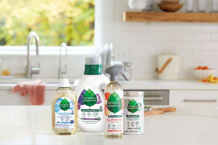
Despite the “360” nature of the redesign, Design Bridge decided to “build” rather than “dismantle”, explains Michael Stride, Design Bridge creative director. Its longstanding reputation within the market, particularly in the US, meant that Seventh Generation was keen to maintain its brandmark: “We knew that consumers saw us as ‘the green leaf brand,’ and we didn’t want to confuse or lose our dedicated consumers”, says Tomlynn Biondo, art director of packaging at Seventh Generation.
The brandmark was updated to confer the brand’s purpose and strength, according to Design Bridge. The seven generations of the brand’s name – the idea that you need to look after the world not only for the present but for the seven generations that come after – are now symbolised by the seven layered leaves within the new brandmark’s ‘single’ leaf.
An added stem, meanwhile, helps to ground the mark wherever it is used, rather than the “wavy” bottom that made the previous brandmark appear to “float”, Bradbury explains.
A key issue facing the sector is a perceived trade-off between a product’s green credentials and the efficacy of the product. This was compounded by the wide range of products produced by Seventh Generation across home care and personal care, Bradbury says.
A new wordmark balances the dual emphasis of nature and science with the use of two fonts; one representing functionality and one appearing more organic, Stride explains.
Meanwhile the collaborative process with Seventh Generation allowed Design Bridge to draw on the company’s extensive experience to ensure “we were always staying on the right track”, and that the design “lived up to the unique brand vision”, Bradbury says. This led to simple finishing, for example. “As soon as you start adding foils or glosses or anything you immediately can’t recycle it […] so it was about trying to be clever with what we had which was often really quite simple”.
While packaging is the main touchpoint, wider “building blocks” of the design allow it to be easily applied across digital, ads and socials.
“Those other touch points are so important to them [as] that’s where they can really talk about purpose,” Stride says. “There’s only so much you can do on the pack, especially when you need to dial up efficacy”.
Recommended Posts


NB invites local designers centre stage for Vineyard Theatre rebrand
February 24, 2023

“AI revolution” will change way design studios look within three years
February 24, 2023