Retail project by Mucca references the site’s fish market past
by IBRAHIM
Retail project by Mucca references the site’s fish market past

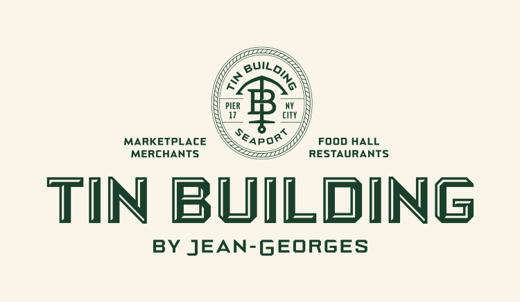
Tin Building has a bespoke typeface applied cross more than 575 touchpoints for its venues, packaging, signage and merchandise.
Michelin Star chef Jean-Georges Vongerichten’s food market Tin Building has opened in New York City with an identity and custom typeface by Mucca inspired by the site’s former tenant, Fulton Fish Market.
The new 53,000 sq ft (4,900 sq m), two-story culinary marketplace houses four full-service restaurants, six fast-food counters, four bars and eight marketplace vendors, where Tin Building’s product line of 24 collections and over 400 SKUs will be sold. As well as developing Tin Building’s central identity, Brooklyn-based studio Mucca also designed the brand identity for all the marketplace’s sub-venues, the packaging for every Tin Building product, 153 signs and all of its merchandise.
Mucca designer and typographer Sean O’Connor says that Mucca “dug through many archives” and uncovered old photos of the Fulton Fish market. The team was drawn to the typography on “the vender signs of the family-owned stalls”, he adds.
Distinguishing characteristics of the signage were the “bevelled corners” and the fact that the letters of longer names had been condensed to fit the space, while shorter names featured “wider characters”, O’Connor explains. As a “contemporary take” on this style Mucca created a “custom variable font with multiple weights and widths” called NoExit Octagonal, he says.
Though the bespoke typography started as an “aesthetic homage”, Mucca’s founder and creative director Matteo Bologna says it served “technically” when longer names had to be applied to small labels. Despite there being a vast number of touchpoints site wide, Mucca used variations of NoExit Octagonal across all of them, including the sub-venue wordmarks and packaging.
To ensure that the hero Tin Building wordmark is “customised to some degree”, O’Connor says a 3D drop shadow has been applied to make it “more than just a font”. The type has been also customised and “embellished” for the venue wordmarks and “ornamentation” has been added to some of the more premium product packaging through application of crosshatching or drop shadows, O’Connor adds.
Paired with the more “high-end luxury elements” that are part of the “culinary ethos of Jean-Georges” is what O’Connor calls the “raw, utilitarian aesthetic”, connecting the site’s history with its future.
Initially, because of the enormity of the project, Mucca attempted to simplify the identity by starting with one font and two hues of green, but realised more colours were needed when “designing product lines with multiple flavours”, O’Connor says.
The solution was a “simple change in materiality or colour”, says O’Connor, such as adding foils over the typography or including background illustrations that ran parallel with the overarching identity. Bologna likens this to “creating different variations of the melody while still [making] it feel like the same song”.
Mucca was also heavily involved with the naming of the site and its sub venues, a process which Bologna describes as “very personal and idiosyncratic for clients”. The name Tin Building was chosen to remember the 1907 building which housed the Fulton Fish Market and for the sub-venues, ideas were presented in “conceptual groupings” relevant to the “main core brand strategy”, he adds.
Bologna says that for such an “ambitious project” working on the proposal “took longer than doing the job”, explaining that Mucca had to “think organically” about how it could “give the right amount of space to every venue, product, and brand” under one roof.
The identity has started to roll out across Tin Building’s core brand and sub-brands, as well as menus, signage, merchandise and packaging for more than 400 products. The identities for Tin Building’s three “invader venues” – candy store Spoiled Parrot, Chinese speakeasy-inspired restaurant House of the Red Pearl and Japanese sushi restaurant Shikku – are currently being developed by Mucca.
Recommended Posts
The Hermitage Hotel, designed by Mucca
March 19, 2023

NB invites local designers centre stage for Vineyard Theatre rebrand
February 24, 2023

“AI revolution” will change way design studios look within three years
February 24, 2023