Plant-based cheese brand seeks to “change consumer behaviour” with new identity
by IBRAHIM
Plant-based cheese brand seeks to “change consumer behaviour” with new identity

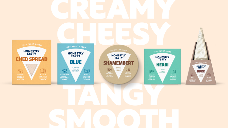
Baggi’s rebrand of Honestly Tasty features a new bespoke wordmark incorporating its hero “wedge” symbol as the letter A.
Brand and design consultancy Baggi has rebranded and repositioned plant-based cheese brand Honestly Tasty using cheese cues and an emphasis on flavour with the view of “changing people’s attitude and behaviour” towards the product.
Since the market for plant-based food products has grown in recent years, the brand felt it had to “scale up and reach a wider audience”, a goal which its previous identity did not fulfil, according to Baggi founder Mark Baxter. The wedge device is used as a motif throughout the identity, appearing at the centre of the packaging, in the wordmark and graphically across print and digital.
It is both applied in its static form and elsewhere becomes animated as “a living, breathing thing”, says Baxter. He adds that its inclusion in the wordmark – “neatly housed” as the letter A in “tasty”– acts as “a shorthand signifier for cheese”.
To assimilate Honestly Tasty with dairy cheese, Baggi included the familiar feature of “cheese strength factors” on the packaging, says Baxter. This aims to make the brand come across as “a high-quality, premium artisan cheese, particularly on-shelf”, he explains.
Honestly Tasty’s wordmark was crafted in collaboration with lettering artist and type designer Dan Forster and freelance design director Esther Lawrence and seeks to “reflect the full flavour you get” from the product, says Baxter. Its “bold weight and curvaceous details” convey the brand’s playful personality, Baxter adds, while the main brand font, Rustica – “a chunky sans serif” – also aims to represent the “fullness” of the taste.
“Further away from the shelf, we had the opportunity to be even more flavoursome and playful through imagery, typography and tone of voice, and set out to make a brand that is accessible, not worthy”, says Baxter. He explains that changing consumer behaviour means creating a “great tasting product”, but it also has to “look like it’s packed full of flavour”.
A “generous, vibrant” suite of images photographed by Kathryn Armitage seeks to “celebrate” the food, according to Baxter. He adds that it uses a “bright colour palette, distinctive prop styling and authentic moments” of people enjoying the product.
The brand’s wider colour palette is inspired by “the tasty colours of cheese, accented with blue and white to give a nod to dairy cues”, says Baxter. “When it comes to product variants, careful consideration is given to reflect the particular flavour or cues of the style of cheese”, he adds.
Honestly Tasty’s new identity will roll out across its packaging, print, website, social media and events.
Recommended Posts
Norfolk Coast logo and identity by Lantern
November 23, 2023
SeidrLab visual identity by Mubien Brands
October 16, 2023
Jarrolds logo and identity by The Click
October 5, 2023