Period product and wellness brand Cora rebrands to “feel more like self care”
by IBRAHIM
Period product and wellness brand Cora rebrands to “feel more like self care”
Mother Design worked with Cora’s in-house team to craft a look which embraces a more “emotionally driven” feel.
Period product and wellness brand Cora has revealed its new identity, which aims to stand out in an increasingly crowded market and also adopt self care cues.
Mother Design’s London office worked with Cora’s in-house creative team on the design, which includes a new wordmark, packaging, tone of voice guidelines and updated positioning.

Cora launched in 2016, with a range of period and hygiene products ranging from pads to tampons as well as reusable options. With all Cora purchases, the company provides period care and informational resources to those without them. According to Cora, it has provided over 17 million period products to people in need around the world.
It faces growing competition; according to one estimate, the global sustainable female care category will be worth over £1.15 billion by 2027.

“The sector straddles a practical need to work and be efficient and the cultural conversation to do with our bodies and our identities,” says Mother Design managing director Kathryn Jubrail. “Consumers want an empathetic approach and understanding of their experiences that offers both emotional and physical comfort.”
The design team says it sought to address that tension by incorporating elements that “convey authority, clarity and support but also feel relatable”. That meant looking to a wide range of human experience, it explains.

“We set out to provide comfort both at a product level but also on an emotional level,” Mother Design design director George Wu says. Wu explains the new branding allows Cora to champion consumers’ wellbeing and also to celebrate them culturally – tapping into the idea that “bodies and experiences are unique and ever-evolving”.
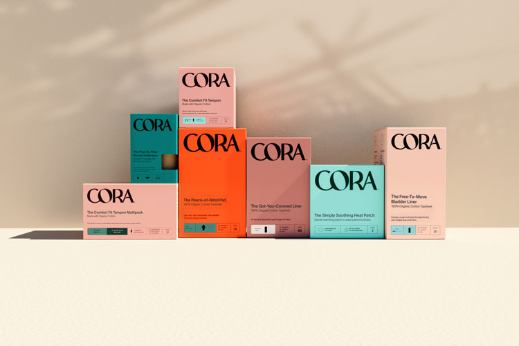
The design team says it went for an oversized look for the new logo – which uses a bespoke typeface – in the hopes of “conveying authority”. It’s balanced by features which seek to give the logo a rounded and fluid look, the team explains, such as the sloping bar that extends from the bowl of the ‘R’. Overall, it “feels human and denotes comfort through its curves”, the designers say.

The brand’s previous white-centric packaging has also been updated with what the team calls “earthy tones”. The designers hope this helps to differentiate Cora from “the array of pastel-toned newcomers” while also remaining functional and easy to find on the shelf. The new colour system also denotes the different levels of absorbency among products.
Beyond the wordmark, Mother has used two typefaces – pairing a “clean and sophisticated” choice with a “characterful editorial” alternative. Together, these are used to spotlight certain phrases and once again embrace a “sense of duality and individuality to the brand’s expression”, the designers say.
![]()
The names of Cora products have also been overhauled. Mother Design has adopted an “emotionally driven tone of voice” which aims to contrast with more medically-focused products and align more with self-care products, the design team adds. The range now has products like the Peace-of-Mind Pad and The Got-You-Covered Liner, for example.
“We want to evolve period care to feel more like self care,” says Cora vice president of brand and creative Andrea McCulloch. “Branding inspired by skincare and beauty-packaging worthy of belonging on your bathroom countertop, not hidden away in the drawers below.”
Recommended Posts

NB invites local designers centre stage for Vineyard Theatre rebrand
February 24, 2023

“AI revolution” will change way design studios look within three years
February 24, 2023
Rbl rebrands ZSL with ecosystem-inspired identity
February 23, 2023