PepsiCo adds “zesty citrus” flavour to 7UP’s new visual identity
by IBRAHIM
PepsiCo adds “zesty citrus” flavour to 7UP’s new visual identity

7UP has debuted a new look can with a 3D drop shadow design, supported by a “comedy-centric” tone of voice.
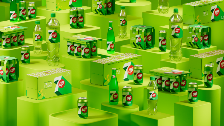
PepsiCo has redesigned 7UP’s visual identity introducing a 3D drop shadow effect and “zesty citrus” colourways.
This is the first time in more than seven years that the lemon-lime flavoured drink has been rebranded. Its new can design, motion graphics and strategy centre around what PepsiCo senior vice president (SVP) and chief design officer Mauro Porcini calls “Upliftment”.
The drop shadow on the can has also been applied across motion graphics to phrases like “New get up, same 7UP” and to the red circle housing the word “up”.
The shadow space is accentuated by the citrus colours, which appear alongside its signature green on the main body of the can. The colourway on the packaging is reversed on the 7UP Zero Sugar range, with the lime green on the main body and the darker green in the drop shadow.
Porcini explains how the addition of new highlight colours creates “distinct high-contrast lines that portray a feeling of upward energy”.
7Up is now positioned around a “comedy-centric” tone according to PepsiCo and is supported by new brand language.
The repositioning also seeks to put more emphasis on the Zero Sugar alternative, in a bid to drive consumers towards healthier choices.
The new designs will roll out worldwide from March 2023. They will be visible on 7UP and 7UP Zero Sugar bottles and cans, as well as a digital and outdoor campaign.
Recommended Posts
Norfolk Coast logo and identity by Lantern
November 23, 2023
SeidrLab visual identity by Mubien Brands
October 16, 2023
Jarrolds logo and identity by The Click
October 5, 2023