PayPal reveals a “people first” brand refresh
by IBRAHIM
PayPal reveals a “people first” brand refresh
To increase accessibility, the new branding took influence from colour scheme of the existing PayPal payment button.
PayPal has revealed a refreshed visual identity and strategy which aims to “build stronger connectivity” between the brand’s mission and communications.
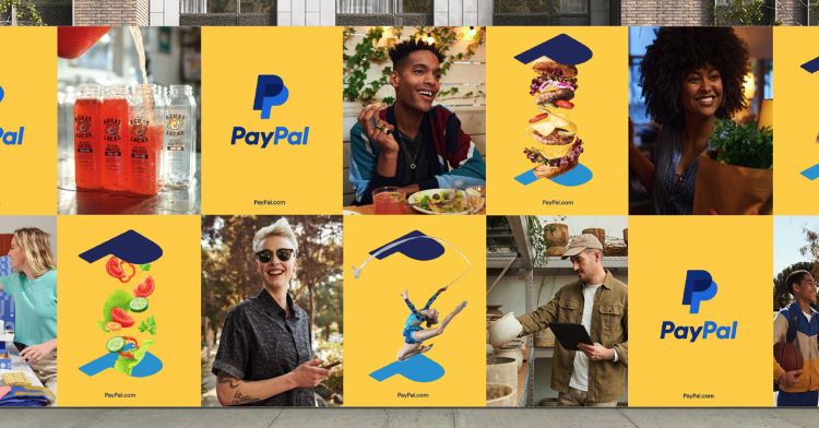
PayPal’s in-house design team collaborated with New York-based studio Gretel on the project. The new visual identity – made up of a more consistent colour palette, redesigned logo, and new set of photography guidelines – has been informed by the design teams’ strategy-first approach.
PayPal’s senior director for brand marketing strategy Emanuele Madeddu explains that the new strategy aims to “champion the needs and wants” of PayPal customers while being inclusive of any “geography, gender, income, values, and demographic”.
The PayPal payment button – which Madeddu says is “one of the most recognisable assets of the brand” – was the baseline for the new colour palette. It comprises the PayPal wordmark and monogram set against a gold background.
In the old branding, the “prominent gold colour” did not feature anywhere else other than the button, which is only visible on online checkout pages. The new visual identity aims to “leverage [the] powerful equity” of this colour more widely across the brand, says Madeddu.

Setting the blue hues of the wordmark and monogram against a gold background also reflects the design team’s attempt to make them easier to read. Madeddu says, “We went to extra measures to ensure that our refreshed logo met the ADA (Americans with Disabilities Act) standards.”
He adds that the contrasting tones and brightness of the new wordmark and monogram now match the ADA’s highest requirements (Level AAA), meaning it is accessible to all users. The core principles of the ADA guidelines revolve around the WCAG (website content accessibility guidelines) which detail that a company’s online content should be “perceivable, operable, understandable, and robust”.

Across PayPal’s updated photography, the two ps that make up the monogram have been separated and embedded individually into photos. This intends to “create an ideal framing” for the stories of the millions of PayPal users worldwide, according to Madeddu.
As well as continuing to illustrate the brand’s people centred approach, the monogram’s role in the photography is to act as “a portal that connects an objective with a result”, says Madeddu.
Reinforcing PayPal’s drive for inclusivity, Madeddu adds that the people photographed are also meant to “better reflect the diversity of the PayPal community”.

The new branding has rolled out globally across the PayPal app, website, and communications.
Recommended Posts

NB invites local designers centre stage for Vineyard Theatre rebrand
February 24, 2023

“AI revolution” will change way design studios look within three years
February 24, 2023
Rbl rebrands ZSL with ecosystem-inspired identity
February 23, 2023