NB Studio looks to help Gr8 People find order through chaos
by IBRAHIM
NB Studio looks to help Gr8 People find order through chaos
Gr8 People’s new suite of illustrations and photography are “visual counters to the rigour and exactitude of technology”.
NB Studio has rebranded US tech recruitment software company GR8 People aiming to ditch its old corporate identity for “something living, expressive and altogether more human”.
Despite automation being on the rise, GR8 People says recruiters can still be manually handling ten or more different applications at once. GR8 People has set out to tackle this problem by developing an automated recruiting system built to manage every type of hiring scenario in one workflow. NB creative director Nick Finney says the company needed a brand refresh to help “put it on the radar of bigger organisations” and “attract new investment”.
He describes the new logo as “a response to the corporate and inert world of old” and shows how it is designed to be applied to “the tiniest app” and “the biggest digital billboard”. The “living mark” becomes animated in motion graphics alongside “fluid illustrations” Finney adds, and is supported by a new positioning: Find Your Flow.
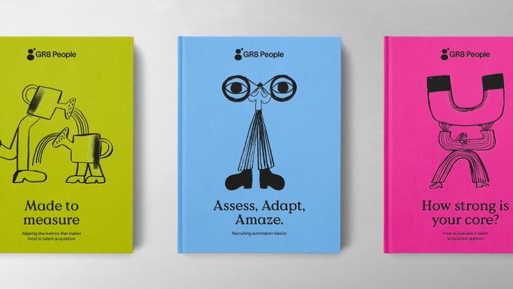
The studio commissioned Spanish illustrator Cinta Arribas, known for a playful style, which often involves line-drawn characters with exaggerated features. Finney says he was looking for “a messy, organic visual counter to the rigour and exactitude of technology”, adding that Arribas delivered illustrations that are “rich with diversity, flow and humanity”.
Animation studio Plastic Horse was brought in by NB to work on Gr8 People’s hero film, which combines all the elements of the new identity. The goal was to make language and image “work cohesively”, bringing the brand story to life, explains Finney.
NB worked with the company to craft brand new sales conference assets, such as hard copy sales pitch books, which seek to “stand out in a blue, corporate tech world”, he adds. There also more physical assets designed by NB for Gr8 People that are yet to come to fruition.
NB used photography to create “an immersive body of images spanning witty workplace commentary to the more workaday”, from happy workplace imagery to giraffes wearing neckties, according to Finney. All the images appear in black and white, with an added a sepia filter to “pull them together into a coherent set”, he says.
NB also designed the website for the company, ensuring it was” colour tested for accessibility”, adds Finney.
Gr8 People’s new branding will roll out across its digital and physical assets, including the website, apps, pitching materials and communications.
Recommended Posts

NB invites local designers centre stage for Vineyard Theatre rebrand
February 24, 2023

“AI revolution” will change way design studios look within three years
February 24, 2023
Rbl rebrands ZSL with ecosystem-inspired identity
February 23, 2023