M&M’s “inclusive” identity update – Design Week

by IBRAHIM
M&M’s “inclusive” identity update – Design Week

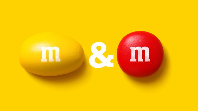
The updated identity for M&M’s, centring on the logo’s ampersand, also features the brand’s first custom typeface.
M&M’s has revealed a global redesign in an attempt to create a “world where everyone feels they belong”.
Jones Knowles Ritchie (JKR) has crafted the new look, which will be rolled out across product, retail environments and campaigns.
M&M’s were first sold in 1941 and named after the sweet’s two founders, Forrest Mars and Bruce Murrie. It’s currently owned by Mars.
According to Mars, the new strategy is built around the desire to belong. “Studies show our desire to belong is as strong as our desire to be loved, and that desire is common for all people irrespective of culture, race, ethnicity, geography, or location,” the company says.
“A sign of togetherness”
“We began with the ampersand – a sign of togetherness from the very beginning,” explains the JKR design team. There is now a fresh emphasis on the ampersand within the M&M’s logo (which appears horizontal instead of diagonal), as well as on brand visuals.
JKR has worked on an updated colour palette that “celebrates our full, iconic spectrum” which is “just like pouring out a pack of M&M’s”, the team says.
One of the most significant design elements is a new typeface, the first ever custom typeface for M&M’s. All Together seeks to evoke a sense of fun with an “eclectic mix of weights and widths”, says JKR, which worked with type foundry Monotype on the project.
The typeface makes reference to the chocolate’s distinctive lentil shape. As JKR says, “The real joy is in the details – there are ink traps that hint to smiles and ball terminals that reference M&M’s classic, circular shape.”
An updated tone of voice, which Mars calls “inclusive, welcoming, and unifying”, seeks to incorporate the brand’s new strategy while also maintain a sense of “wit and humour”.
JKR has also worked on motion for the new identity, creating videos where the sweets spin and cluster. “M&M’s fall, spin, bounce, and roll right off the page… making sure that the fun never stops,” the studio says.
Perhaps the best known feature of the M&M’s brand is its many mascots. These have been given a “fresh, modern” update by BBDO.
Last year, Design Week wrote about the importance of mascots and the possibilities for brand designers. Mars says it has introduced “more nuanced personalities” for the M&M’s brand mascots. The six brightly-coloured characters have also been given a subtle makeover, including a new pair of shoes.
What do you think of the identity update for M&M’s? Let us know in the comments below.
Recommended Posts

Norfolk Coast logo and identity by Lantern
November 23, 2023

SeidrLab visual identity by Mubien Brands
October 16, 2023

Jarrolds logo and identity by The Click
October 5, 2023

