Marugame Udon breaks into European market with giant neon noodles
by IBRAHIM
Marugame Udon breaks into European market with giant neon noodles

Design consultancy Harrison took on both the identity and interior design, showcasing traditional Japanese techniques.
Branding consultancy Harrison has designed the branding and interiors rolling out over 150 sites throughout Europe for Japanese restaurant group Marugame Udon, which features udon noodle lighting and a suite of bespoke illustrations.
The philosophies of Wabi Sabi, meaning “naturalness without pretence”, influences Marugame Udon’s overarching look and feel. As well as this, Harrison’s aim was to bring together moments of retail theatre to shape the dining experience.
The studio took a “kitchen-centric approach” to designing the space, says Harrison creative director Kevin Grima, opting to entice customers with an open kitchen, or “the noodle factory”, as Marugame Udon calls it. Since the Europe market is less familiar with udon, having the chefs and kitchen visible “engages the senses” and helps customers “to understand what udon noodles are and see up close how their food is made”, says Grima.
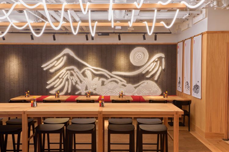
One of Marugame Udon’s unique is that almost every dish is centred around the Udon noodle, which is celebrated through the interior design and branding. Neon noodle lighting hangs from the exposed industrial ceiling, referencing how fresh noddle dough is hung across rods to dry. Noodle-like illustrations also run throughout the website, takeaway packaging and menus, seeking to tie the whole brand experience together.
Harrison collated a brand new suite of bespoke illustration for the eatery, aiming to reinforce the ritualistic nature of Japanese dining and better tell the Marugame Udon story. The illustrations appear on everything from trays and feedback postcards to the fabric dividers hanging from the ceiling.
An important consideration for Harrison was to recognise the differences in communication and aesthetics expectations between the UK and Japan. Harrison sought to evolve the whole brand experience, “from the service style to the décor”, to suit a UK audience “without it looking fake or gimmicky”, says Grima.
Some of the biggest adaptations made for the UK market include incorporating various service options. Though diners are encouraged to “embrace tray service” and order and collect food via the open kitchen, Grima says that Harrison considered that it would not suit a lot of customers so for those who want table service, touch screens were installed at some tables and at Kiosks.
Initially he did not think that UK customers would “clear their own tray and bring to a tray drop as they do in Japan”, Grima says. After learning that this was not the case, the studio implemented tray trolley areas for customers to clear away trays.
Harrison’s research revealed that the UK market has a greater reliance on a delivery and online takeaway service, resulting in a space that could accommodate two lines: one for restaurant guests and one for takeaways and deliveries.
Marugame Udon also had to position itself as an all-day dining destination, from breakfast through to late evening. Grima says the studio achieved this through “clever lighting changes” and a shift in music, making for a “more intimate” evening setting.
Despite having to make changes for the UK and European market, Harrison tried not to dilute Marugame Udon’s Japanese DNA. Simple details of the interior design are based on Japanese joinery principles and use a natural material palette. One example can be found in “the simple leg detail and the joinery on the high tables”, says Grima, while the flooring makes use of discarded offcuts of timber which is unevenly shaped and seeks to remind people of “a tree’s true imperfect form”.
Traditional Japanese Noren (fabric dividers) depicting the process of udon making can be seen hanging from the ceiling and walls and over the counters on a timber rail, which Grima says “creates clean lines throughout the restaurant”.
He describes details of the walls, such as the “mountain fret work art” illustrating where the brand came from, the texture clay back wall which is “based on the end tile of Japanese roof tiles” and the typography and artwork telling the story of Marugame.
Screens outside the restaurants help build anticipation for those in the queue, says Grima. Though they are digital, they make use of simple colour palettes and natural materials inspired by Japanese design and ethos, according to Grima.
The Japanese paper lights scattered throughout the restaurant demonstrate the art of origami, further evoking Japanese culture.
Recommended Posts

NB invites local designers centre stage for Vineyard Theatre rebrand
February 24, 2023

“AI revolution” will change way design studios look within three years
February 24, 2023
Rbl rebrands ZSL with ecosystem-inspired identity
February 23, 2023