How&How rebrands the world’s first smart menstrual cup
by IBRAHIM
How&How rebrands the world’s first smart menstrual cup

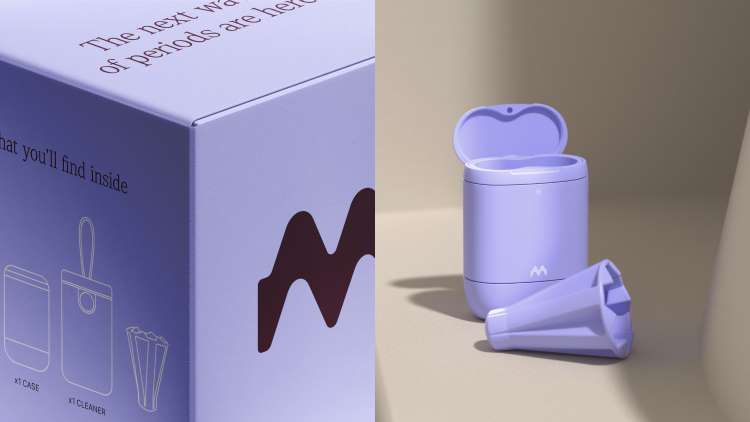
Emm has been given a new identity which looks to show how the product reframes menstruation as “a positive health experience” rather than a “monthly inconvenience”.
How&How has rebranded the world’s first smart menstrual cup with an identity based around the new “Catch Your Wave” concept.
Emm’s smart menstrual cup uses biosensor technology within a flexible medical-grade silicone cup, alerting users to the cup’s fill level and monitoring other metrics such as flow rate, cycle length and regularity.
It was designed by ex-Dyson design engineer Chris van Kempen, now chief design officer at Bristol-based femtech start-up Emm. How&How’s work comprised the brand strategy, messaging and positioning, as well as the design across its packaging, app and social media to enable Emm to develop a pitch deck and approach investors.
Explaining the idea of “Catch Your Wave”, How&How CEO, co-founder and creative director Cat How says while “on the surface it reflects the product’s ability to capture period blood”, the waves refer to the hormonal and emotional fluctuations of the menstrual cycle as well as the shape of the menstrual cup itself.
The metaphor also extends to the idea of “turning the tide” in feminine healthcare, with the data provided by Emm offering “the opportunity to use tech to do something new with your health and fundamentally transform it”, she adds.
For the new wordmark the client “wanted something which was ashamedly confident and bold”, to replace the previous “unassuming” and more “vanilla” brand, How says. The ‘M’ of the logo is wave-like in form, as well as emphasising “the phonetic sound of Emm”. The wordmark itself is kept lowercase as it felt “a lot more accessible” and “worked with the strength of the mark”, How explains.
For the headline typography, FK Screamer by Florian Karsten Typefaces was chosen for its “bold, quite bolshy” and ultimately “empowering”, character, alongside Denton Text Condensed Thin by Peregrin Studio which was “a bit softer and not quite as aggressive”, How says.
She adds that the waveform idea also “lent itself to lots of looping and patterns”. Illustrative waveforms are seen looping around the product or people to represent “this idea of enveloping yourself with and owning your data”, she explains.
When building the colour palette How&How’s research showed the sector to be dominated by “loads and loads of baby pinks”, How says, but for Emm, “although we have got a bright, bright orange and a peach, we also wanted to bring in some colours which weren’t very much seen in the territory, like the purples, the bright lilacs, the dark purple – colours which were not just associated with periods”, she explains.
The photography, meanwhile, is “warm and everyday”, not just featuring “skinny women doing exercise but a range of body shapes and diverse women”, How says.
How&How created all the renders for the project showing the identity working across “lots of different brand worlds” including packaging, billboards, animations as well as elements of the app design, including icons for UI elements, which are now being incorporated into Emm’s app design.
Overall, the “secret” of the project was the “simplicity of the brand idea”, How explains, with the wave being “so strong metaphorically” that it could inform everything – including the notion of being on “on the cusp of a wave” in female healthcare – turning “a monthly inconvenience into a positive health experience”.
Recommended Posts
NB invites local designers centre stage for Vineyard Theatre rebrand
February 24, 2023

“AI revolution” will change way design studios look within three years
February 24, 2023

Rbl rebrands ZSL with ecosystem-inspired identity
February 23, 2023
