How to choose a business card font that inspires professionalism and style –
by IBRAHIM
How to choose a business card font that inspires professionalism and style –
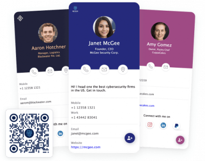
As a citizen of your nation, you have an ID card. The format is a brand, and people can recognize it instantly, even from far away.
You should think of your business card as the ID card of your business. It does not have to be overly complex, but you should aim for a certain level of quality. If your business grows to a decent size, your business cards should be as recognizable as any other brand/writing.
General guidelines
Everyone nowadays has access to an awe-inspiring selection of fonts. There are hundreds of possible selections, but not every style will match your business card needs.
Some writers, like those working for best paper writing services, mostly use Arial and Times New Roman fonts. Going to an essay site and asking for them to build you a good business card is not recommended.
You want to hire someone that has experience in marketing or design. A high-level mastery of the English language is not mandatory. Information should be readable, intuitive, and easy to skim or scan with a glance.
Don’t be too conservative
While you can’t go too crazy with card fonts, the opposite is also true. Picking a design that is too bland or too uninteresting can damage your business.
Larger companies can get away with a lot more than you, as they already have an established and recognizable brand.
In most cases, just flashing their logo is sufficient. Humans are hopelessly addicted to images, branding, and stories.
For example, some people support mediocre politicians just because of their family name. Or, they go to see the next horrible reboot of a movie that they once loved back in the 80s. We grow very attached to these brands.
Your job, as a business, is to build one of these brands. It is the most important thing that you will ever do. And, depending on the nature of your product or service, you can get creative.
If you own a pub with a medieval or a Victorian feel, you can research the writing styles and corresponding fonts of those periods. Old school barber shops, garages, and a multitude of other businesses have more options to customize and improvise.
The best fonts for business cards are out there, and you just have to find them.
Let’s take a look at some of the best fonts available in 2022:
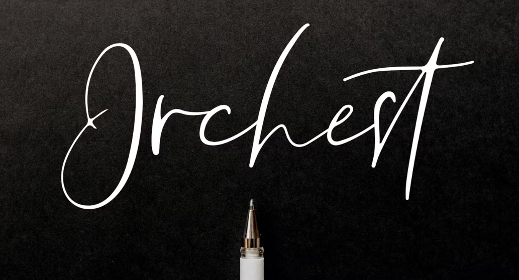
Orchest Luxury Calligraphy Font

Just a few years ago, writing by hand was the norm. It was what you learned in school. However, due to the prevalence of technology, handwriting, and especially cursive writing have gone the way of the Dodo.
Cursive is now a niche quirk, and it is strange for those who grew up writing cursive. It is similar to those who got used to driving stick on a car.
Tech aside, cursive handwriting remains astoundingly beautiful. And if you don’t have a good hand for calligraphy, thankfully, there are digital fonts for cards that imitate beautiful handwriting.
Speaking of beauty, you can’t go wrong with Orchest. It is a wonderful font that you can use to design your business card. It looks classic and refined. If you want to inspire that aura of old-school high society, this is your font.
Do not use it if your business cleans windows, delivers fast food, or you own a more working-class establishment. The “feel” isn’t right.
Kyoda Ascher

The modern world isn’t known for its beauty. Everything aims for efficiency rather than aesthetics. Just compare 18th-century architecture to modern-day glass and concrete buildings. This is why hipsters exist, as they desperately try to copy the past or other cultures, as they perceive the blandness of the modern world as suffocating.
It comes as no surprise that so many people are nostalgic for a more beautiful past. I doubt that someone bothered to count, but I would bet that the “Nostalgia” industry earns multiple billions per year.
Kyoda Ascher is a font that does not bring us back to an ancient past, but to a more recent one. This style has a nifty 50s-60s-inspired look that is sure to present your business nicely.
I would use it if I owned an ice cream shop, a diner, a bakery, or any other business that lets me be a little quirky without damaging my credibility.
Houston
Houston, we don’t have a problem.

This font may not seem nostalgic, but it is. It brings to mind the romantic notion of city elegance and business excellence. Everyone who lives in a large city can tell you that not all areas/districts are created equal.
Sure, you have areas that are crowded, expensive, and dangerous, but you also have that “downtown” feel. The place where people in 50K suits do business is at massive mahogany desks and signs with gold-tipped pens.
As far as fonts for professional use are concerned, the Houston signature is one of the. It makes your potential clients feel that you are one of those people, working downtown. Although you can use it for other areas of activity, stick to business.
It incorporates a pair of serif and script fonts.
Jackwel

In many ways, Jackwel is the exact opposite of our previous font, Houston.
While our last entry inspired a feeling of urban white-collar business excellence, Jackwel seems more like a Millenial’s font.
Gone are the days of massive desks, leather bindings, and bespoke suits. This generation wears Jeans with T-shirts, and everything is “green”, shiny, and made out of recycled plastics.
In terms of fonts for business, Jackwel would be used for a business card that belongs to a tech entrepreneur. Its main advantage is that it looks modern, digital, and sleek. Also, it is not difficult to read, unlike some other fonts that mimic cursive.
Nekofie
I’m pretty sure that “Neko” means “cat” in Japanese.

I don’t see what is particularly cat-like about this font, but it can be a good piece of typography for business cards. It has two variable font styles, and it comes in regular or bold.
Nekofie’s main perks are that it is bland-ish, with a slightly distinct edge. It is not as bland as Arial, but it is not that crazy, making it a good font that suits pretty much everything.
I would use it on my business card if I owned an IT company, worked as a freelancer, or even for a local photography studio. Sometimes, simplicity is what you are aiming for. Especially if you post signs on a store front, it should be readable from far away.
Think of Nekofie as a luxury digital font.
Coldiac

If Nekofie was a luxury digital font, Coldiac is a classic luxury font. The style does not go as far as to use cursive characters.
It scales things back, which makes it more readable. However, the way the letters are structured still gives it that handwritten feel. It inspires luxury and class, without seeming too over the top. It looks nice if golden letters are presented on a pure white background, with black/gray highlights.
Gold just pops when it is provided with proper complementary elements. It also supersizes well and can be easily read on signs.
Coldiac is free, only if you intended to implement it for personal use. Fonts from professional use are almost always premium features. However, in my opinion, it is worth the investment.
I would use it for any business that could be described as “high end” or “boutique”. This could include restaurants, venues for renting, perfume shops, clothing stores, and even some antique shops.
Author Type

It’s funny how many aesthetic things are born out of necessity, but then they become artistic styles. For example, men’s clothing is mostly derived from military wear. Many suits, shirts, coats, and pants left over from wars were sold as regular wear, and the style caught on and became fashion statements.
Writing is also similar. Cursive writing doesn’t look like it does because its developers thought that it looked ‘cool”. When you write by hand, with a quill and ink, the letters have a certain feel and look. Those swooshes and loops were the most practical way of writing.
Author type is a style that asks the question: what if we were to paint a font with a real-life brush. It looks like a real person took real paint and wrote something down. The elongated, stylized look is quirky and fun and gives off an aura of familiarity.
You have to trust the guys whose business card has this font!
ENMA

What’s the difference between elegance and tacky opulence?
The answer is taste. Those who lack taste will always try to be bold, adding too many details just to make things look expensive and hard to get. Painting everything gold and encrusting it with jewels isn’t the way to do things.
ENMA understands that elegance comes from symmetry and contrast. You can do a lot with marble-white letters on a tar-black background. While a millionaire may decorate his business card with gold thread and make it sing, a billionaire would use ENMA.
Subtlety only comes from the instincts of someone who has nothing to prove.
Fonseca

Remember when I said that the modern world is ugly? Well, I should have said the post-modern world. The modern period, starting with the turn of the last century, actually gave beauty a chance.
Fonseca is a professional font that draws inspiration from the art deco style. Art Deco is entirely modern, and it blends technology with much older sensibilities. Many buildings and train stations in Chicago, New York, and Detroit are made in Art Deco fashion. Just think of the statue of Atlas holding up the world.
Fonseca has 16 fonts and 8 weights, and a great amount of variety.
This is a good font for business cards if your business is somewhat urban. Don’t use it if you are in entertainment or a more rural area. Art Deco was always meant to project a solid, opulent, and strong dominance over nature.
If I had to describe the style in only three notions, those words would be: “ Concrete, gold, and classic architecture.”
Madelin

Some people try to over-analyze art. In advertising, this can be a fatal flaw.
If you have to explain a joke, it isn’t funny anymore. If you have to scream “you don’t get it” at people who are looking at your painting, your painting is bad.
Potential customers won’t give your business card a second look. If the first glance fails to capture them, there won’t be a second one.
So, what do I feel when looking at Madelin? Well, I feel like I’m looking at an article from a magazine or B-Tier publication. And I say B-Tier lovingly because they aren’t as rigid, dogmatic, or political as the A-Tier ones.
I would use this font if I ran a publication, a blog, an office supply shop, and other areas that are professional and intellectually oriented. It has 5 weights and 4 font features.
Southampton

And, as a bonus, number 11 will be Southampton.
We spent some time underlining the fact that some fonts are hard to read. Handwriting itself is hard to read, especially the writing of those who do not practice calligraphy.
Still, beauty is often inconvenient. Sneakers are more comfortable than heels, but you won’t wear sneakers to a fancy restaurant. Are you a gentleman who smells like perfume, cigar smoke, and old books?
Then, typography business cards are for you.
Conclusion
Branding is the most important thing that you can do. In some cases, branding is more important than the product itself. We all know many companies whose product is sub-par, but their brand name still holds them up.
While your business card alone cannot make or unmake a brand, it can certainly maintain and promote. There are some iconic fonts, colors, and combinations that every person alive recognizes, even if woke them up in the middle of the night.
While most of us won’t reach that billion-dollar tier of success, our businesses are our passion projects. Don’t just print cheap business cards, and get 1000 copies for 10$. You should invest a moderate amount of time and effort to make sure that your public-facing side is bespoke.
Also, the fonts have to match the theme of your business. You can’t have a medieval-themed pub, while your business card looks stolen from Star Trek. If you repair motorcycles, your business card shouldn’t look like that of a stock broken in Manhattan.
By knowing yourself and your audience, picking a business card font will be easy.
Recommended Posts

The Application of Cognitive Psychology to User-Interface Design – Print Peppermint
January 25, 2023