How Hermes rebranded as Evri with an ever-changing logo
by IBRAHIM
How Hermes rebranded as Evri with an ever-changing logo
The parcel delivery company has changed its name to Evri, and an innovative logo design uses ever-changing type permutations.
The courier company previously known as Hermes has gone through a complete make-over at the hands of design studio Superunion and type foundry Monotype.
Superunion was brought in after winning a pitch as part of an ongoing transformation at the courier, including a significant investment in customer service, which follows a period of growth during the COVID pandemic.
Superunion creative director Mark Wood, who leads the partnership with Evri, explains that the brief was focused on reflecting on “the role of a courier in a community being a really important one, especially during COVID, where in certain instances they were the only person some people would see in a day.”

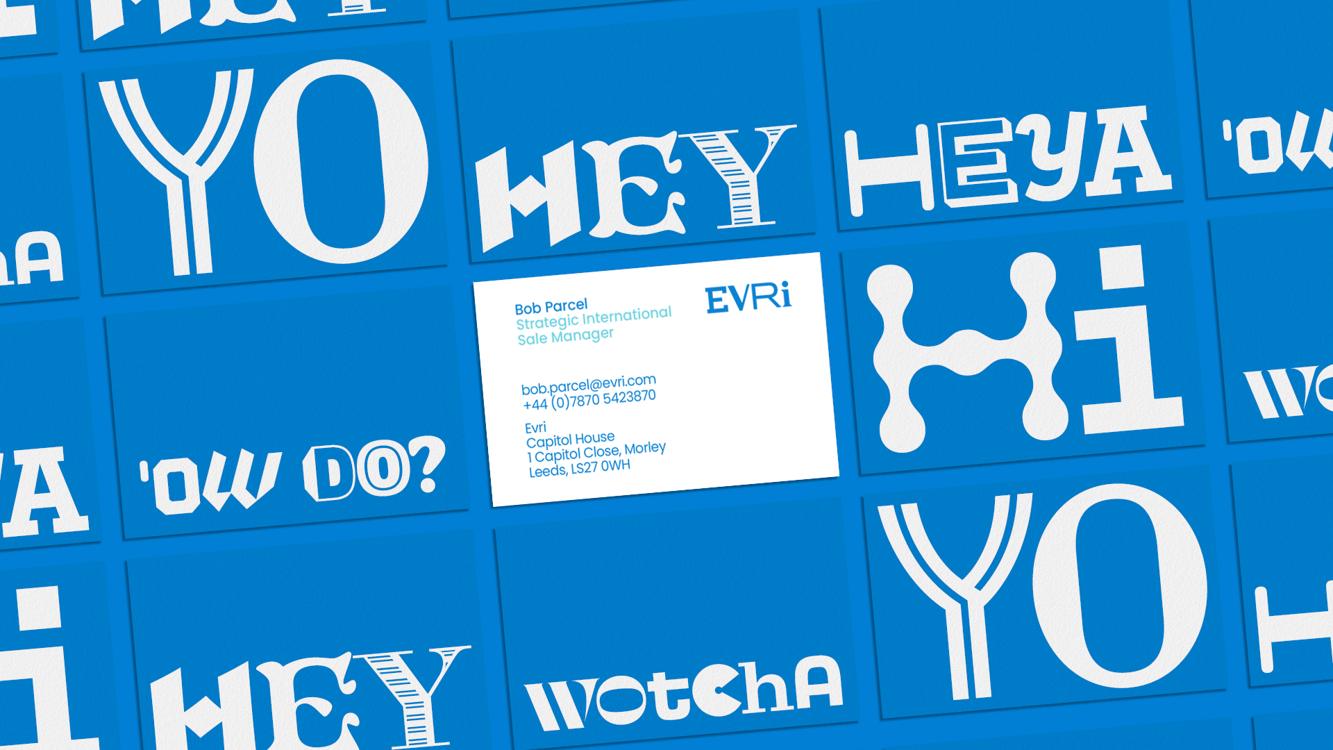
The focus, then, was on emphasising the diversity and multiplicity of the UK and its communities, with which, Wood said, the brand already had direct links. The studio wanted to find a way to represent all the “different people, different parcels, different places, different communities” which interact with the brand and its messengers.
This translated to the name: Evri represents a phonetic spelling of “every”. And the name in turn quite literally led to the creative response, which saw the studio partnering with Monotype to create a chamaleonic logo. Using what it calls “variable font intelligence”, Monotype created a tool, which is built into the typeface and makes it easy for Evri’s teams to randomnise the fonts of each letter in the logo for different uses – resulting, in practice, in a whopping 194,481 different possible logo iterations.

The idea is for each default character to appear stylistically unique across Evri’s communications, and beyond that, for each delivery van in the 5,000-strong fleet to have its own design, creating a piece of vinyl artwork for each truck. The core idea, Wood continued, was that “it should be lots of things. All things. Constantly changing, and full of characters – both in the sense of the typography-led identity,” and in the sense of representing the UK’s diversity.

Phil Garnham, Creative Type Director at Monotype, jumped at the opportunity of “playing with variety, especially in a really decorative sort of display. I’m really up for pushing technology as well, so I loved that idea of [working with] the variable font specification, which hasn’t been adopted by many brands – especially big ones. The idea that we could build a logotype, a variable font that could create as many iterations of the mark was really exciting.”
One thing will stay the same: the brand is sticking with blue.
Recommended Posts
Norfolk Coast logo and identity by Lantern
November 23, 2023
Jarrolds logo and identity by The Click
October 5, 2023
Pilo Hotel logo and identity by 5.5, Paris
June 30, 2023