How designers are helping gardening brands grow new audiences
by IBRAHIM
How designers are helping gardening brands grow new audiences

As gardening booms in popularity with a new generation, design studios are tapping into interior trends and heritage to reach new enthusiasts.
Earlier this year, the Royal Horticultural Society – the UK’s leading gardening charity – revealed a colourful rebrand, specifically aimed at appealing to a younger, more diverse audience. “There was a need to modernise,” says Design Bridge creative director Tim Vary. Perhaps the clearest example of this modernisation is the wordmark, which now appears as RHS rather than its full name which sounded “very posh”, Vary notes. “So they abbreviated it to the RHS to be a little bit more inclusive and open and for younger audiences.”
The RHS rebrand is indicative of wider trends within the gardening sector. There was a time, not too long ago, where gardening may have been perceived as the slightly boring pastime of older members of society. But in recent years, the appeal of gardening has grown far and wide – especially as people took up new hobbies during lockdown. In 2020, the RHS reported a 533% increase in the number of 18- to 24-year-olds visiting its website.
The RHS was founded over 200 years ago in 1804. It now runs gardens nationwide, annual events and offers plants for purchase and advice on its site. For its rebrand, the design team looked at more contemporary direct to consumer (DTC), plant brands like Patch and Sproutl. While Design Bridge was keen to adopt the “accessible and inspirational” aspects of these more modern upstarts, the designers hoped to convey the sense of history that comes with a 200-year-old brand. This involved a trip to the RHS Lindley Library in Pimlico, London, one of the largest horticultural libraries in the world. The team examined the botanical drawings, which date back hundreds of years, and incorporated the stylings into the new brand identity.
“We took that idea of old plant labelling and mixing of different typefaces,” Vary explains, “but then reimagined it in a much more contemporary way.” Past illustration style also influenced the new visuals – the designers took the old drawings and crafted new patterns which have been rolled out throughout the identity. “You have, at its heart, something that is quite classic in the old botanical drawing, and then is modernised with this overlay of colour and put on these bold, colourful backgrounds.”
“Gardening should feel like an extension of how you approach designing rooms inside your home”
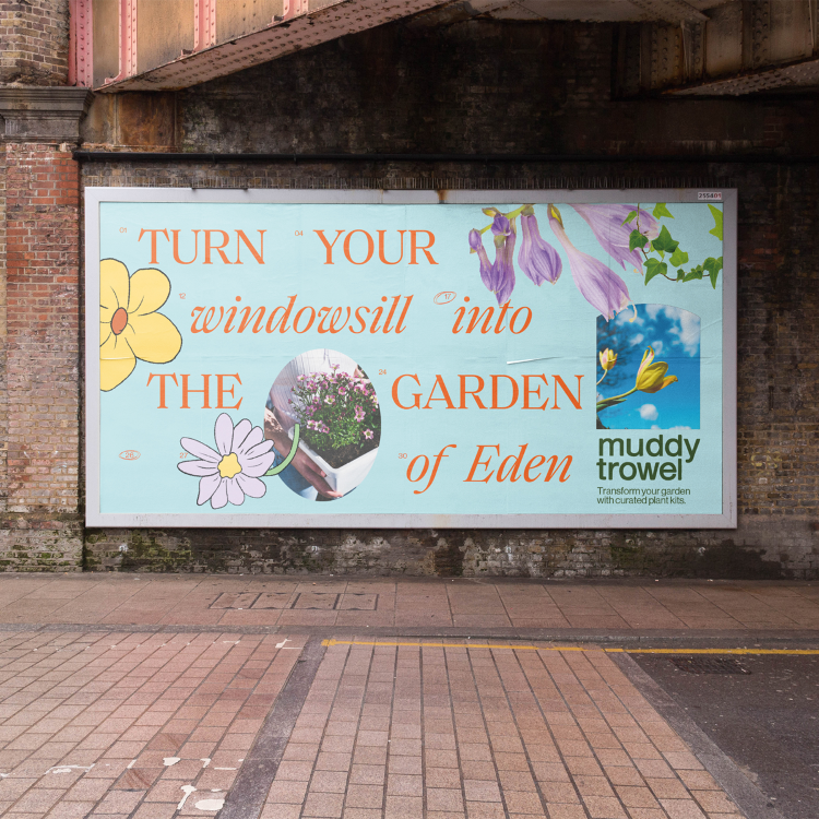
While the RHS has existed for two centuries, a younger generation of DTC companies has recently set up to cater to new audiences – whether that’s flat dwellers with limited outdoor space or green-fingered newbies. But how do you launch a gardening brand in today’s crowded market? Muddy Trowel, which sells indoor and outdoor plants and offers design services, was founded post-lockdown with an emphasis on sustainability and accessible advice. Otherway head of design Rosie Pearmain explains that looking outside of the gardening sector was a starting point for Muddy Trowel’s branding.
“Gardening should feel like an extension of how you approach designing rooms inside your home,” she says, “and we felt that Muddy Trowel could be a forefront of this point of view, with a specialism of plants for smaller outdoor spaces and balconies that feel very connected to interiors rooms.” This led to an unusual point of inspiration for a plant company: current interior design trends. “We honed in on a theme of maximalism,” Pearmain says – bright colours and a ‘70s Italian aesthetic seen in wavy candles and checkerboard print cushions. It’s a notable and “well-needed backlash” to minimalist trends of the past few years, the designer notes.
As well as appealing to contemporary tastes, the identity also evokes “joy and blandness” in a category that can often feel “functional and serious”, Pearmain says. That helps convey the positive emotional benefits of gardening, as well as acknowledging the booming interest among young people. The colour palette, comprising bright blues, yellows and greens, was also an attempt to evoke the “joy and optimism that can be created from gardening”. Like Design Bridge, Otherway also focused on illustration in the branding – building on the theme of eclecticism. “Cartoony, Disney-esque drawings were matched up with collage-style photo cut-outs,” Pearmain adds, which seek to show the “eclecticism and variation you tend to see in the most wonderful gardens”.
The need to differentiate from the millennial-friendly start-ups was also behind the branding of online plant shop The Stem. Helen Rabbitte, creative director of Hello Rabbit Design, adds that it was essential to “inject some fun and playful energy in to The Stem”. “We found many of the other online plant shops were very minimalist and sophisticated,” she says. On The Stem’s website, a series of revolving stickers depict variations of smiley faces and globes with the slogan “plant happiness”.
“Creativity and nurturing from the ground up”
As gardening brands reach new audiences, their platforms need to evolve – whether that’s in a digital or physical space. That’s partly because gardening habits change frequently, as they did over lockdown, and new trends come and go. Thanks to The Stem’s digital nature, it was easy to create a brand that “could be easily adaptd to reflect evolving style demands and the consumer’s needs in a continuously changing market”, says Rabbitte. The focus on digital was crucial for Muddy Trowel too. As Pearman explains, the website had to explain its USP – “potted plants as kits” – alongside a simple “shoppable functionality”.
Before the RHS overhaul, the organisation’s branding had been disparate, Vary explains. A key part of the new work therefore was to update digital platforms like its social media and website. The RHS website, which offers advice on starting and managing a garden, clocked 30m users in 2021. Design Bridge looked to implement a principle of “upwards movements” for the brand’s digital elements, hoping to convey an upward movement – “this idea of creativity and nurturing from the ground up”, as Vary says. It also opened up a world of animation for the branding, which was particularly effective to convey this theme.
Perhaps one of the most important aspects for brands hoping to engage with new audiences is tone of voice. The world of gardening can seem like the domain of experts or those with expansive lawns to experiment. Likewise, annual flagship events like the RHS Chelsea Flower Show can seem a world away from those just beginning to garden. One of the guiding pillars for Design Bridge was implementing an idea of the “approachable expert”. This was especially important for the RHS, as last year its advice page attracted almost 44m interactions. It has to cater for all levels – for those just learning how to grow courgettes to people growing them for shows, to use one example. As Vary adds, “It’s about inspiring people to go out and garden – whether it’s a window box or a big garden, and everything in between.”
Recommended Posts
SeidrLab visual identity by Mubien Brands
October 16, 2023

NB invites local designers centre stage for Vineyard Theatre rebrand
February 24, 2023

“AI revolution” will change way design studios look within three years
February 24, 2023