Gretel devises “consistent but flexible” framework for Rhode Island School of Design
by IBRAHIM
Gretel devises “consistent but flexible” framework for Rhode Island School of Design

Replacing an “unorganised” design framework and identity, the new design system aims for “unity without uniformity”.
Brooklyn-based studio Gretel has designed a new “consistent but flexible” identity framework for Rhode Island School of Design (RISD).
The initial brief was “complex” as RISD wanted to “involve the community in meaningful ways” and also needed to get “necessary approval from all stakeholders”, according to Gretel’s creative director Andrea Trabucco-Campos. To fulfil this, Gretel conducted a thorough research phase alongside London-based research agency On Road.
This involved carrying out infographic surveys and speaking to alumni, staff, technicians, students and professors to gather information about the school’s “general attitudes” and “diverse opinions”, says Trabucco-Campos. He adds that this also helped Gretel to identify “emerging talent and creatives” who were not pursuing “traditional” design paths, so that RISD could adapt to its identity to appeal to them.
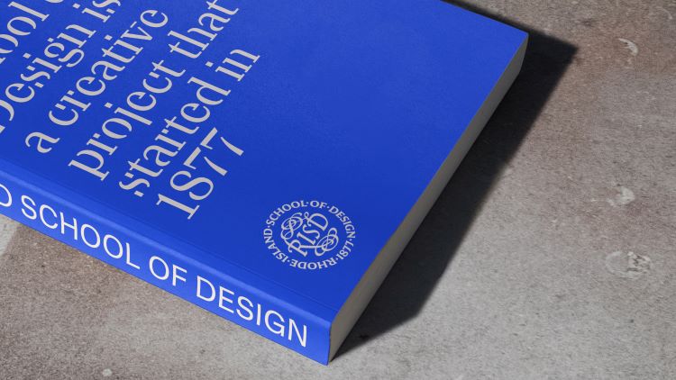
More than 105 font prototypes were created during the development of the bespoke typefaces RISD Serif and RISD Sans, says Trabucco-Campos. The design process began in-house but Gretel brought in RISD alumni Ryan Bugden to draw up the final versions.
The concept behind the typefaces’ “complete and incomplete” nature is inspired by design work, Trabucco-Campo explains. Designers go through a “constant cycle of completion and incompletion” as they finish one project and move to another and RISD Serif seeks to be a “typographic equivalent” to this process, he adds.
A resemblance to a “utilitarian” style was also important, says Trabucco-Campo, to fit in with the local Providence architecture.
RISD Serif in its more incomplete forms will be used for larger displays and communications. The more complete version of the serif is to be used “more editorially”, according to Trabucco-Campo, adding that the “blunter” RISD Sans will be used for communications.
Gretel sought to design an “open, speculative primary colour palette” which a “flexible” secondary palette could be built around, says Trabbuco-Campo. The result is a foundation of black and white with blue accents, though each department will be able to choose its own accent colour from the secondary palette.
Blue was chosen as the primary accent colour to “align the name of the school with the colour palette”, explains Trabbuco-Campo. He says that the colour blue was prominent in the canals and bodies of water that “engulf” the island.
RISD’s seal has also undergone a “future-facing but historically coherent” redesign, says Trabbuco-Campo. “It is a calligraphic, gestural, crafted object that connects to the history of RISD but feels somewhat timeless,” he adds.
In the process of “evolving” the seal, Trabbuco-Campo says that Gretel interviewed Nick Benson, the grandson of sculptor, stone carver, calligrapher and late RISD faculty member John Howard Benson who drew RISD’s original seal in 1951. Although first designed for diplomas, it gradually became RISD’s “official-unofficial logo” alongside the wordmark, Trabbuco-Campo explains. He says that the redesigned seal will “perform better in smaller sizes” and digitally.
RISD’s former framework was “unorganised”, says Trabucco-Campos, as individual bodies within the school had their own logos and tone of voice. The new design system aims for “unity without uniformity”, he explains, adding that Gretel wanted to avoid “flattening” the identity.
The new RISD design framework will be applied across all physical and digital touchpoints, from signage and prospectuses to the website and social media channels.
Recommended Posts

NB invites local designers centre stage for Vineyard Theatre rebrand
February 24, 2023

“AI revolution” will change way design studios look within three years
February 24, 2023
Rbl rebrands ZSL with ecosystem-inspired identity
February 23, 2023