Goolf matchmaking service for golfers given new look by Wildish & Co
by IBRAHIM
Goolf matchmaking service for golfers given new look by Wildish & Co

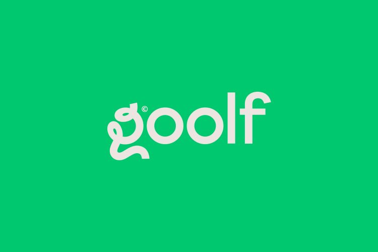
The new branding includes a varied colour palette, “flexible” typeface, and “friendly” illustrations.
Wildish & Co has partnered with Goolf in attempt to improve the golfing app’s character and appeal.
The Goolf app is a matchmaking service that aims to buddy up golfers so they can find someone to play with and is aimed at both new and existing players within the community. The new branding intends to make Goolf’s mission clearer – “bridging cross-generational gaps and making the game more accessible”, says Wildish & Co Managing Director Sam Fresco.
The studio wanted to avoid the “classic start-up tech brand conventions” and “stock golf imagery” used in the previous branding, according to Fresco. He adds, “The colour, characters, and creative direction of the new branding is slightly weird and always vibrant.”
In trying to avoid making the app look too masculine, the studio opted for a more vibrant green rather than the typical grassy green used in most golf brands. “We found through research that often, golf brands fall into the trap of constructing a male-orientated brand, with heavy blacks and chunky typefaces,” says Fresco.
The green, paired with bright pops of pink and blue accents, is meant to cater to everyone. It also aims to keep the brand firmly rooted in two worlds – tech and golf.
Taking inspiration from old golf scoreboards, Wildish & Co chose an Inter Bold typeface for the header, curving the text and adding impact lines around it. According to Fresco, this gave the brand “flexibility”, as it could be used straight in more formal settings but also curved and paired with illustrations to “inject personality and fun” in the app and on social media.
In attempt to continue the “fun and evocative” theme, Fresco says the team chose “a highly stylised ‘G’” for the logo. “We were interested in what we could do with the shape of the fairway, so we played with the curves and bends of the course, tying it up in the knot of the G,” he adds.
A key concept of the new branding is to move away from the “exclusivity” of the sport, “making everyone feel welcome”, says Fresco. Illustrator David Roberts was commissioned as his aesthetic already aligned with the project. He was given reference material and the general themes, according to Fresco, who says the project was “brought to life” with Roberts’ lively illustrations.
Fresco says that it was an exciting project for them as the team were able “shake up a sport that’s rarely looked at” in a new way. He adds, “We always think about whether we can add our value by taking or changing the world the brand is currently in.”
The Goolf app is available on the App Store now and the branding will be gradually rolled out across the UI.
Recommended Posts
NB invites local designers centre stage for Vineyard Theatre rebrand
February 24, 2023

“AI revolution” will change way design studios look within three years
February 24, 2023
Rbl rebrands ZSL with ecosystem-inspired identity
February 23, 2023
