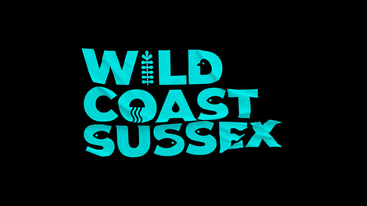
Evoke’s identity for Wild Sussex Coast
by IBRAHIM
Evoke’s identity for Wild Sussex Coast
Evoke’s branding for the new conservation project plays on Sussex marine life, from jellyfish to seabirds.
Brighton-based design studio Evoke has created the identity for Wild Coast Sussex (part of the Sussex Wildlife Trust), an organisation that aims to protect local sea life.
The new project hopes to inspire local communities – from residents to fishermen – to look after the diverse marine environment in Sussex. Issues to address may range from coastal health to plastic waste.
While the audience was fairly broad, specific audiences included 16-25 year olds and primary schools, explains Evoke creative director and founder Tom Leach.
The design work includes a logo (which also animates), bespoke typography, and printed material. Evoke looked to the diverse sea life itself as inspiration for the visuals.

“What’s amazing about the Sussex coastline is how surprising and diverse the variety of marine life really is,” explains Leach – pointing to seahorses, sharks, rays and cuttlefish as examples. “There’s so much to explore and find if you take a closer look.”
This provided the backdrop for the identity, which had to catch people’s attention from the get-go and also stand out in the sector, according to the designer. During a consultation period, incorporating the different species resonated well with key age groups, he adds.

Evoke customed an existing typeface with a series of chosen “critters” for the wordmark, Leach adds, including jellyfish and seabirds. The hope was that a sense of curiosity would run through the branding, and also be simple to apply in everyday use, he explains.
The studio used a relatively clear and bold typeface so that it would be easy to read from a distance and also work with a combination of imagery and backgrounds, according to Leach.

A bright turquoise has been used as the primary colour – chosen to “represent the ocean and sky in a contemporary way”, Leach says. Black contrasts with the brighter shade throughout the identity, meaning that it can be applied in “quite a lo-fi” way, he adds. Branding can be printed in black on turquoise paper for posters and flyers, for example.
The studio has also produced a ‘Go explore’ guide for the identity, which will be distributed along the Sussex coast. The guide builds on the branding, providing people with information, activities, and places to visit along the coastline. Evoke has also designed a series of digital assets for social media, including stickers, presentation templates, and logo variations.
What do you think of the identity for Wild Coast Sussex? Let us know in the comments below.
Recommended Posts
Norfolk Coast logo and identity by Lantern
November 23, 2023
SeidrLab visual identity by Mubien Brands
October 16, 2023
Jarrolds logo and identity by The Click
October 5, 2023