Everton FC’s new identity features heritage tower symbol
by IBRAHIM
Everton FC’s new identity features heritage tower symbol

Prince Rupert’s Tower has been drawn from the crest to work alongside it as an “anchor for the new design system”.
DixonBaxi has built a new identity and digital strategy for Everton FC with a strong focus on the fans.
Everton has played the most seasons of any club in the top tier of English football and is known as “the people’s club”. According to DixonBaxi co-founder and creative director Simon Dixon, the new system aims to “connect to the club’s audiences and fans and build on the strength and ethos of Everton.”
The club appointed DixonBaxi on the strength of its AC Milan rebrand, which Dixon says was “very successful at reaching fans globally”. Everton FC detailed a similar ambition in the initial brief – to reach fans outside of Merseyside from across the world.
“Another thing they liked about the AC Milan rebrand was that we’d gone beyond just sports branding and focussed on the heartbeat and ethos of the club,” adds Dixon. Using this same strategy for the Everton FC project, the studio says that it spoke to fan groups and carried out workshops, during which the idea for the tower motif emerged.
Dixon says, “We knew that Prince Rupert’s Tower as a piece of iconography was important to the fans because that’s what they told us.” He describes the tower as an “anchor for the design system” which is also a subtle but knowing nod to the club’s history.
The club’s crest has remained the same as the design team believed it to be a crucial part of the brand that did not need to be simplified. Dixon adds, “There can be a tendency in sports branding to get rid of everything including the crest, but we believe that if you’ve built decades of history in something, you have to be very careful about how you change that.”
In 2013 the club faced backlash from its own fans after it was rebranded without fan consultation. This resulted in a new club crest which was only used for the 2013-14 season before another crest was introduced, designed by Liverpool-based consultancy Kenyon Fraser following a period of fan consultation.
The new tower motif is designed to reference the crest but also liberate it as a graphic element that can be applied across the identity. According to Dixon, it aims to provide “a graphic language beyond the crest” and is used as a framing and transitional device on social media and also on merchandise and kits.
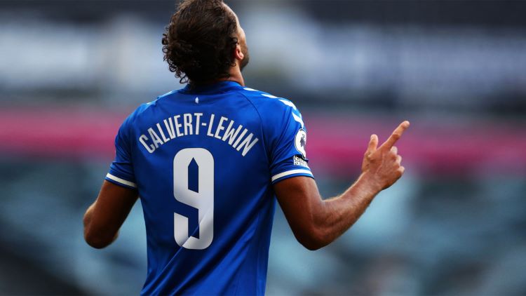
In the new jersey the tower appears as a repeat pattern which is stitched into the fabric. Prince Rupert’s Tower also had a new typeface named after it, which is used on the jerseys and across digital touchpoints.
There are two typefaces implemented across the new branding – a serif and sans serif style. The serif is meant to convey a “conversational, lifestyle feel”, while the sans serif, Rupert Condensed, is the bespoke font influenced by the tower motif, according to the studio.
Everton FC’s move to a digital-first design strategy is another way that it is trying to connect with fans from all over the world. Dixon describes football as “an alive and immediate narrative” – a multi-layered story which must include details of when the match is on, who will be playing, the in-game fan interaction, and then the analysis afterwards.
“There are around 40,000 fans in the stadium but then there are millions of other fans watching around the world that might never visit the club,” adds Dixon. The strategy aims to use social media and other digital touchpoints to make the Everton FC “more contemporary and connected” to make fans feel part of the club without having to physically be there.
The club’s new mantra “Everton is everywhere” also reflects its new strategy. It intends to reinforce that, although the club is rooted in Merseyside and part of the Liverpool culture, their values have a global reach.
DixonBaxi were also tasked with striking a balance between making the brand premium and accessible, which Dixon describes as “a constant push and pull”. He explains that having a digital focus can sometimes make things feel “very slick”, which does not always fit with the “tactile and visceral” nature of the game itself.
He adds, “A lot of clubs are also seen as elitist and there’s a lot of money in the game and there seems a great distance between that money and the fans.” In an effort to close this gap, the studio attempted to create a brand that is “premium with an edge”. The new Everton FC identity is meant to exude “a street level confidence and take cues from life as opposed to just sport.”
The new identity is being rolled out in phases, which started with the shirt launch earlier this week. This was the first time the tower motif appeared formally in the brand.
Prior to that there was a soft launch on social media where the tower and some other graphic elements were used as transitions in socials. According to Dixon, fans spotted the tower and cut it out to post on their Twitter feeds.
“So far fans seem to be liking it but we’re trying to be sensitive to them and roll it out slowly,” he adds. Over the next few weeks, the branding will appear across all existing touchpoints.
The new design system will also be integrated into Everton FC’s new stadium as it is built.
Recommended Posts
Norfolk Coast logo and identity by Lantern
November 23, 2023
SeidrLab visual identity by Mubien Brands
October 16, 2023
Jarrolds logo and identity by The Click
October 5, 2023