Ethical coffee company Mozzo rebrands to break away from Italian clichés

by IBRAHIM
Ethical coffee company Mozzo rebrands to break away from Italian clichés

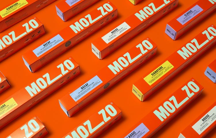
Mozzo’s new identity by B&B Studio aims to symbolise the company’s “ethical mission” and highlight its work with coffee-growing communities.
Coffee company Mozzo has swapped its Italian-inspired look for an identity devised by B&B Studio featuring a new logo that emphasises connection and is designed to be animated.
According to B&B studio co-founder and creative partner Shaun Bowems, Mozzo’s previous identity signalled the world of Italian coffee and did not truly represent the company’s “story or over-arching commitments”. The rebrand seeks to make Mozzo’s “true values” known and represent the brand as “progressive, brave and uniquely purposeful”, says Bowems.
A fixed social dividend is built into Mozzo’s business model and is invested into its Community2Community (C2C) Fund. Previously the money from the fund has gone towards the building of a maternity clinic in Idjwi, Democratic Republic of Congo (DRC) and has also helped coffee farmers in the DRC to develop their own start-up co-operative, enabling them to manage their own production and introduce sustainable growing practices. Mozzo is now working on new projects with its growers in Nicaragua.
Unlike its previously “generic” logo, Bowems says the new logo is at the heart of the Mozzo identity and features an extended “Z”, aiming to illustrate the idea of connection. The new C2C Fund logo also has an elongated 2, which Bowems says “echoes the mother brand”.
The idea behind it was to “bring back the energy” that Mozzo had when it first launched as a wind and solar-powered coffee cart covered in community art, explains Bowems. B&B Studio also designed the identity to work in both physical and digital spaces, particularly the extended “Z” which is exercised as a platform for animated illustrations.
Mozzo’s new illustrations are a nod to the community art that featured on the original Mozzo truck. Bowems says that they were created to work in harmony with the Mozzo logo and support the brand’s key messages. He adds that a set of cup illustrations were drawn to “visually capture” Mozzo’s brand world and can be reworked throughout the seasons to signify different occasions or events.
The green and bright orange colour palette is another example of how Mozzo has ditched Italian coffee cues. While green is prominent in coffee brands, Bowems says, the Mozzo “mint green” brings “a contemporary freshness”, helping to set Mozzo apart in the market. He describes the contrasting primary palette as progressive, adding that it creates “instant recognition across all touchpoints”. In a bid to differentiate products within the coffee ranges, B&B added secondary hues to complement the main colours.
B&B Studio also crafted the company’s new tagline – Coffee. Community. Connection. – which Bowems says positions the Mozzo business as “a catalyst for connection” as it works to bring together “coffee growers, coffee makers and coffee drinkers”.
Bowems explains that B&B Studio always looks for clients who are striving toward “a brighter, fairer and braver future” and aim to “fulfil an ethical mission or positive category change”. He adds: “We have been doing this since we began and it’s a big part of what defines us.”
Mozzo’s new branding will roll out across all coffee packaging, coffee machines, merchandise, digital assets and its physical spaces.
Recommended Posts

NB invites local designers centre stage for Vineyard Theatre rebrand
February 24, 2023

“AI revolution” will change way design studios look within three years
February 24, 2023

Rbl rebrands ZSL with ecosystem-inspired identity
February 23, 2023

