E1 rebrand hopes to resist sustainability clichés
by IBRAHIM
E1 rebrand hopes to resist sustainability clichés

Mother Design is behind the new look, which includes a marine flora and fauna-inspired colour palette.
Mother Design has crafted the new branding for E1 sports entertainment series, as it makes its debut at the Venice Boat Show ahead of the 2023 inaugural racing season.
The ambition for the design work was to create a “futuristic, fluid and electrifying” new look while keeping in line with the brand’s sustainability goals, according to the design team.
E1 is an electric boat racing series founded in 2020 during the first wave of lockdowns, which makes it relatively new compared to other sports. Mother Design creative director Harry Edmonds says this presented an opportunity to “define the brand” from a fresh perspective.
“The world’s first all-electric raceboat championship is absolutely new territory, which is distinctive in its own right,” says Edmonds. “We believe a brand should be distinctive, relevant and true to its founding principles; not reliant on what other people are doing.”
The three core principles of the E1 Series are sustainability, technology and entertainment. According to Edmonds, the series and the technology itself — the new E1 RaceBird electric powerboat — clearly embraces sustainability, so the studio sought to showcase its entertainment value.
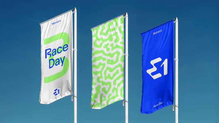
The new logo is designed to reference elements of the E1 RaceBird powerboat, such as “the innovative hydrofoil technology, the iconography of electricity, and the flow of water”, says Edmonds. He adds, “Patterns are inspired by marine flora and fauna from the coastal waters that E1 is looking to protect, alongside the bold colour palette, with Electric Blue, Aquatic Green and Coral Pink referencing tropical seas.”
The Aquatic Green and Coral Pink accent colours also intend to serve a functional purpose, he points out. Being easy to see in the water, it should allow crowds to follow the action from the shoreline and drivers to navigate the courses at speed.
The studio worked with Displaay Type Foundry to craft a bespoke typeface, which is based on existing design Roobert. The aim was to strike a balance between technical, flowing and distinctive characteristics, Edmonds explains. “Type is fundamental to so many of the brand touchpoints,” he adds. “We wanted something that would be instantly recognisable and ownable to E1.”
The E1 Roobert typeface includes 27 specially crafted characters that are devised to evoke fluidity, reference the movement of the RaceBird boat and give a nod to the hair pin bends and large sweeping turns of the racecourses.
Used on tickets, programmes and event banners to the broadcast graphics and in-cockpit displays, the typeface has been designed to “flex across the tonal range of the visual identity, feeling equally at home amid the energy of race festivals as in VIP spaces”, says Edmonds.
The studio has attempted to resist clichés associated with sustainability throughout the branding. Edmonds adds, “It was important to us that the new identity transcended tired cues of sustainability and doubled down on E1’s entertainment value.”
The new E1 identity seeks to reach as wide an audience as possible, raising more awareness of the brand’s ambitions. Mother Design hopes the project can “shift how people talk and think about sustainability”.
“It doesn’t have to consume your whole identity, and there’s no need for thrill and excitement to be compromised,” says Edmonds.
What do you think about E1’s rebrand? Let us know in the comments below.
Recommended Posts

NB invites local designers centre stage for Vineyard Theatre rebrand
February 24, 2023

“AI revolution” will change way design studios look within three years
February 24, 2023
Rbl rebrands ZSL with ecosystem-inspired identity
February 23, 2023