Dice rebrands to focus on the fans

by IBRAHIM
Dice rebrands to focus on the fans
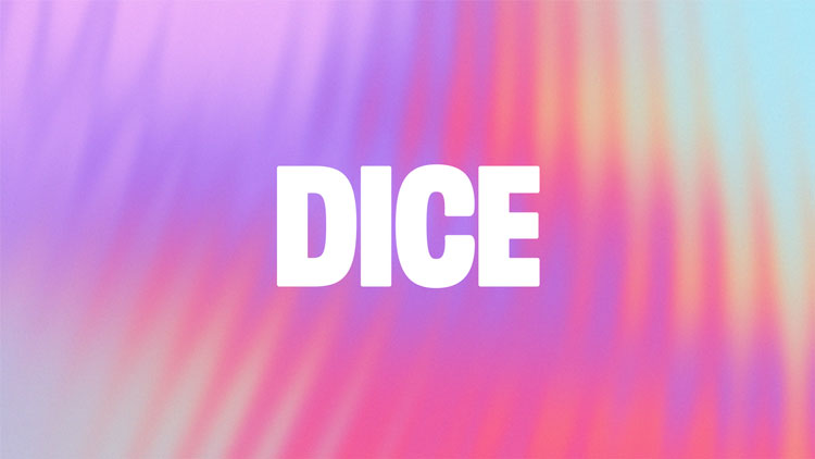
The new look for Dice, designed by the app’s in-house team, is inspired by the energy of fan culture.
Ticketing platform Dice has revealed a rebrand, introducing a “confident and approachable” mascot called The Fan.
Dice was set up in 2014, in the hope of streamlining the ticket-buying process and avoiding ticket touts. It was co-founded with Ustwo, though the London-based consultancy has since stopped working with the music app.

The rebrand has been led by Dice’s in-house creative team. “Our new brand is all about what fans do day in, day out to celebrate their love of artists,” says executive creative director Patrick Duffy. The team worked to the new brand proposition of: ‘Find the fan in everyone.’
Though you can access Dice on a desktop, the app is mobile-first. The rebrand includes an update to Dice’s UI.
A tribute to the “energy and emotion of live events”

The updated identity draws on fan activity, Duffy explains, from making zines to crafting hand-drawn signs for live shows, and even tattooing lyrics on their bodies. “We wanted to create a new identity that captured the pure and simple expression of fandom in a way that remains true to the energy and emotion of live events,” he says.
As well as a new workmark, the rebrand has introduced a mascot, simply named The Fan. The icon – inspired by Dice’s former diamond logo – has a pair of stick legs and eyes. This new “confident and approachable character intended to capture that beautiful sense of anticipation that we feel in the moments before a show starts”, the design team adds.
The mascot also takes centre stage for a series of animations, used throughout the branding. A new set of bright, colourful visuals have also been designed. The design team has called these Vibrations, and says they “represent the energy of fans at a live show”.
They are accompanied by new images from Dice’s photo library, a collaboration between photographers Tim Barber and Daniel Arnold. These images are once again a tribute to live events, evoking the “raw, unstyled joy of a great night out”, the team adds.
A bespoke typeface, Foggy, has also been designed as part of the update. It’s named after Dice’s global head of music Andrew Foggin, in the hopes of honouring his contribution to the company’s growth, according to the designers.

Duffy says of the rebrand: “What we’ve landed on recognises the vibrance of our fan community as well as the visceral emotion and feeling of togetherness that makes people return to live events again and again.”
What do you think of Dice’s rebrand? Let us know in the comments below.
Recommended Posts

NB invites local designers centre stage for Vineyard Theatre rebrand
February 24, 2023

“AI revolution” will change way design studios look within three years
February 24, 2023

Rbl rebrands ZSL with ecosystem-inspired identity
February 23, 2023

