Designing the UK’s first permanent gallery dedicated to South Asian culture
by IBRAHIM
Designing the UK’s first permanent gallery dedicated to South Asian culture
Polyvocality, jewel-like cases and a multilingual wordmark feature in the new co-curated and co-designed South Asia Gallery at Manchester Museum.
A landmark project sees the first permanent gallery in the UK dedicated to the experiences and histories of South Asian diaspora communities as part of Manchester Museum’s reopening after a £15 million transformation.
Alongside a new exhibition hall and galleries on Chinese culture and ideas of “Belonging” in a new two-storey extension by architects Purcell, the development was funded by Arts Council England, The National Lottery Heritage Fund, The University of Manchester – which the Museum is part of – and other supporters.
Not only is the gallery’s remit significant, but its development was also unique, co-curated by 30 members of the South Asia Gallery Collective – made up of South Asian diaspora artists, educators, community leaders, journalists and musicians, all with a connection to Manchester.

This wasn’t the initial idea for the 372 square meter gallery, however, says Nusrat Ahmed, Collective member and co-curator, but was a decision that followed the appointment of the museum’s director Esme Ward, who wanted the museum to be “more inclusive, imaginative and caring”, Ahmed explains. Ahmed was first invited to contribute in 2018 as a community member, where “we were asked, what would you like to see in a South Asia Gallery. For a lot of us, that was key: we were actually being asked about our heritage and what we want to display”, she says.

From a series of workshops with 65 initial participants, “it became visible really early on that it was going to be a story-led gallery”, Ahmed says. They then created a “core group of 30 members whose stories we then developed over the last three and a half years”, grouping them into six “anthologies”: Past & Present; Lived Environments; Science & Innovation; Sound, Music & Dance; British Asian; and Movement & Empire.
Describing the co-curation process as “quite a departure”, Georgina Young, head of exhibitions and collection for Manchester Museums adds that the partnership with the British Museum enabled the Collective to select objects from its collections as well as Manchester Museum’s own, in combination with their own personal objects. “It’s really interesting to see these things sit alongside each other to tell those stories”, Young says.

Shaped through the eyes of diaspora members, it “will be the first time [for audience members] to see themselves reflected in a space of culture”, she adds. But while this has been “a really rewarding” process there was an emotional toll working with such personal stories as well as the “traumatic histories” that pertain to South Asian history and diasporic culture, she explains.
The design team was appointed after interviews with both the museum and Collective teams. It comprised Manijeh Verghese of Unscene Architecture (interpretation and liaison with the curators), Studio C102 (design lead and 3D) and Mobile Studio Architects (3D), Sthuthi Ramesh Design (2D design and visual identity), aDi (AV), Arup lighting and Leslie Clark (health and safety).

It stood out that the collaborative team came together specifically “to assemble a scheme that really worked for this particular project”, Young explains; the diasporic heritage of some its members, meanwhile, was also important, Ahmed adds.
Process
“To do co-curation at this scale and for it to be really meaningful takes a lot of time, which I think all of us underestimated from the outset”, Verghese says.
“We did one-on-one sessions with each Collective member to understand what their story was, and together with the museums we really tried to think of a structure and main themes”.
Then to translate this to design, “the Collective and the museums were very clear that they wanted a feeling of South Asia to be conveyed throughout the gallery, but not to have it rely on stereotypes”, she adds.
Kyriakos Katsaros, founder of Studio C102 says: “our initial thought was to leave enough space for members of the Collective to be able to inform the process, while at the same time you have to have a unifying aesthetic”.
“We had some really interesting sessions with the museums, and amongst [the design team] trying to brainstorm what it means to be South Asian, and what if feels like to be in a space that is South Asian”, Sthuthi Ramesh adds.

“There were lots of things that we showed the Collective and museums to try and figure that out. Everything from materiality to graphics, to what languages are present in the gallery.
“That approach – to question things and rely on our intuition to a certain extent – cuts across all aspects of the design of the gallery and hopefully its experience”, Ramesh says.
3D exhibition design
Katsaros explains that another challenge was working with an exhibition where “we traverse all the way from antiquity to the present day”.
“How do you build a series of displays that cater for this huge variety, and not prioritise one object over another. It’s to say somebody’s personal lived experience is as important visually as a precious stone”.
Verghese says that the team’s initial assumption that “the objects would be very vibrant and colourful”, led Studio C102 and Mobile Studio to first propose a neutral colour palette that “relied on textures”. However, given the story-driven approach, often the objects turned out to “invite close inspection” or “celebrate texture rather than colour”, she explains.
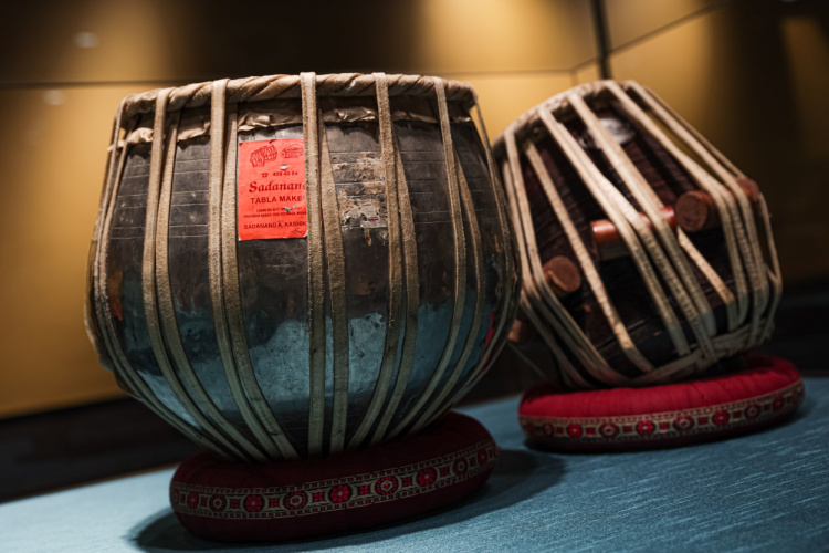
Instead, brightly coloured “jewel-like” silk lines the display cases, which might contain objects as simple as an ancient brick: “we’re just letting that be one thing in a case, and we make it feel special”, Young says.
Against walls painted a deep ochre shade, materials include hand-patinated brass panels that run across the exterior wall of the gallery. According to Verghese, “the choice of brass as a kind of datum across the gallery cerebrates both everyday objects that you find across South Asia as well as celebratory religious objects”. Other materials include traditional Khadi paper, made from “rag cloths in India where I come from”, she adds.

In the centre is an open project space to be used for gatherings, workshops and film screenings. Unlike the colour and texture elsewhere, a neutral “projection grey” allows these walls to act as a canvas, he says. A gradient to black blends with the building’s acoustic ceiling and helps conceal lighting and audio-visual equipment.
“In this instance we are relying on people to bring the colour”, Young adds.
Furniture for the gallery comes from India-based company Phantom Hands, so named to “acknowledge all the unnamed people that laboured on furniture, especially during the Colonial period”, Verghese says. Such details are not made explicit but create a “tactile multi-sensory experience as you walk through”, she explains.
2D design and gallery identity
Ramesh worked across the 2D design in the exhibition, but also on the wider visual identity for the project.
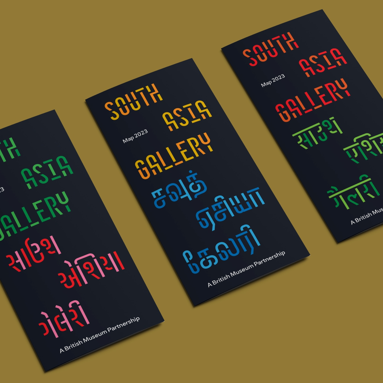
A bespoke typeface called SAG was created in collaboration with Universal Thirst, a Bangalore – and Iceland-based foundry that specialises in South Asian and Latin scripts. It “resonated with the diasporic journey from South Asia to Manchester, which could also adapt to multilingual characters in a fresh and modern way”, Ramesh says.
The dual-coloured design was inspired by “stencilled hand-drawn wayfinding signs on train stations across South Asia”, Ramesh says. This led to her wanting to explore a “modular type system or a stencil typeface”, she says. She came across a 1920s South Asian foundry, the Gujarati Type Foundry. “The type specimen I found in their catalogue had a modular system that could work well with the multilingual bespoke typeface”, she adds.

A multilingual wordmark comprises seven different scripts from seven different languages: Latin, Punjabi, Hindi, Bengali/Bangla, Urdu, Gujarati and Tamil.
“Just the beginning”
The gallery is designed to be iterative, with a regular rotation of objects as well as complete redisplays over its intended lifespan of 15 years. To this end, display cases are custom-designed and modular, while signage uses a rail system to allow it to be easily rehung along with reconfigurations of the collection.
Verghese comments that even having South Asian heritage and growing up in India, she has learned so much from the Collective. She is excited for how the gallery will develop further through the audience, who will be able to “learn from these stories and have their own stories to contribute to future iterations”, she says.
“The opening of the gallery isn’t the end, it’s the beginning”, Ahmed says.
Recommended Posts

NB invites local designers centre stage for Vineyard Theatre rebrand
February 24, 2023

“AI revolution” will change way design studios look within three years
February 24, 2023
Rbl rebrands ZSL with ecosystem-inspired identity
February 23, 2023