Design Week’s most popular long reads of 2022
by IBRAHIM
Design Week’s most popular long reads of 2022
In 2022 designers stepped up to support people in Ukraine, studios sought B-Corp status and the design of the Elizabeth Line was finally revealed.
As the war in Ukraine approaches its 300th day, having spanned most of 2022, two features looking at how designers in Ukraine have been supporting their country and raising awareness were of continued interest to Design Week readers.
The first was from Kyiv-based Katerina Korlevtseva sharing her own experience and the actions of designers in Ukraine. She urged that silence was not possible, and shared posters created by fellow Ukrainian designers. She added that the most useful messages “are not with doves and calls for peace but calls to make donations”.
The second article highlighted more projects by designers who have been creating motivational material, communications designed to fight misinformation as well as work calling to international clients to stop working with Russia. Some projects, designer Iliya Pavlov said, were “too beautiful for what is going on”.
Given the long wait for Crossrail, or the Elizabeth Line, as it was renamed to coincide with the Queen’s Platinum Jubilee, it is unsurprising that designers were keen to read the story behind its design.
The new line, which TfL claimed as “one of the most complex digital railways in the world”, features 42km of new tunnels, 7 million tonnes of excavated material and came in three and a half years late at a total cost of around £19 billion.
We looked at the “distinct character” of its stations designed by different architects, and their new features such as platform edge screens and newly designed seating. The trains themselves feature interconnected carriages, multi-use spaces and “intelligent lighting and temperature control”, with interiors by Barber & Osgerby and a new seating moquette by Wallace Sewell.
A series of notable public artworks were unveiled too, from artists such as Yayoi Kusama and Conrad Shawcross.
For the wider branding of the new line its typeface is Johnston100, Monotype’s modification to the one used by TfL for over a century, and its colour palette comprises Elizabeth Line Purple, TfL Blue and White, then Legible London Blue and magenta.
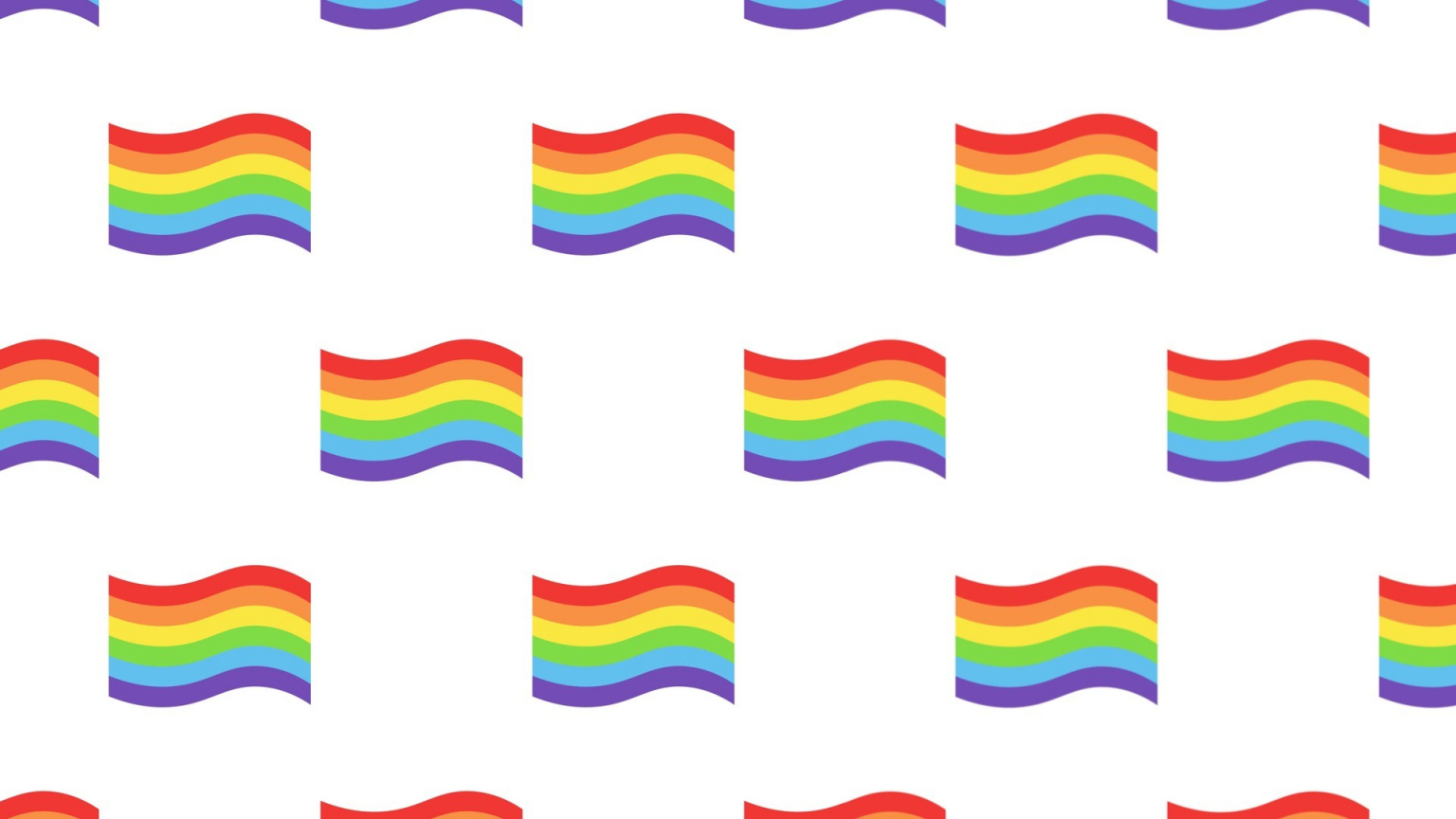
At the start of Pride month – and celebrating the 50th anniversary of UK Pride – we looked into the history of the rainbow Pride flag and its many permutations since it was first designed in the late 1970s.
Gay artist and drag performer Gilbert Baker came up with the design in 1978 when prompted by LGBT campaigner Harvey Milk to create a new symbol for the gay community. Baker said of the use of a rainbow, “to me, it was the only thing that could really express our diversity, beauty and our joy.” Each of the colours of the flag had specific meanings, but the modified rainbow we recognise in the flag today came about after difficulties sourcing some of its bright colours for mass production.
We then looked at how the symbol has grown and adapted through time, with new versions modified to recognise trans and intersex communities and people living with HIV/AIDS.
In recent years there have been many examples of products and branding designed to celebrate Pride, but there is also a growing issue of “rainbow washing”, which has seen brands benefit from associating themselves with LGBTQ communities without giving anything meaningful back.
 As part of our in-house design team series, we spoke to a designer from the LEGO team to find out how its sets are designed – as well as the recruitment process, the way teams are structured and how the design brief differs for products designed for different ages.
Luis Gómez, a Columbian product designer at LEGO gave insight into the process, which does actually involve a lot of building things from big boxes of LEGO bricks, much “like a kid playing at home”. But he also compares the process to “sculpting with bricks” and explains that the “complexity” of the projects means that often one designer is responsible for each set.
Other glimpses behind the curtain reveal that the HQ contains a library of every single LEGO brick in existence, teams go on group trips for location-specific inspiration, and that both local kids and robots test the new sets.
In February we reported on the Super Bowl half-time show designed by Es Devlin for a line-up of Dr Dre, Eminem, Snoop Dogg, Mary J. Blige, 50 Cent and Kendrick Lemar.
To accommodate so many different stars Devlin segmented the set into a series of buildings that came together as a “composite Compton Street”, referencing the home to West Coast rap. After a meeting with Dr Dre, who Devlin reports was particularly drawn to her installation pieces, over her previous set designs and was “interested in approaching the Super Bowl project as narrative art installation as well as celebratory performance,” she said.
The buildings were conceived of as more like lit museum piece, with each holding a particular significance to the artists, and each used in different ways during the 14-minute performance. Snoop Dogg began on the roof of a Compton house styled a bungalow commonly found in the South LA area and Eminem started his performance in a “courtroom” before busting his way out.
“Veteran” Super Bowl production designer Bruce Rogers made it possible for the set “to appear within eight minutes and disappear within six minutes – an immense challenge requiring military precision and crew choreography,” Devlin said.
In January, we looked at how retail designers are blending interior and interactive design to create engaging brand experiences.
In Berlin, visitors to the M&M store can create a virtual version of themselves made up of individual M&M sweets. Other features inspired by the city include a street art display drawing on the East Side Gallery, a recreation of an M-Bahn carriage breaking out of a wall, and interactive “clubbing pods”. Landor & Fitch senior 3D designer Ashley Randolph said: “We tried to get as artful as we could in the store”.
Lavazza’s first store outside of Italy hoped to bridge British and Italian coffee culture, explains Mirko Cerami of Ralph Appelbaum Associates. The design took on bean cues: a cafeteria by architect Carlo Ratti is shaped like a coffee bean and uses coffee as a material, while the store also features a chandelier of 700 beans. Interactive elements include an AR game where Londoners could hunt for virtual coffee cups hidden across the city, and an immersive tasting area which projects tasting notes onto the ceiling.
Meanwhile, Samsung KX, sought to make the brand ethos “fun and tangible”, explained Samsung head of premium retail Andrea Ferrara-Forbes. In the space, designed with Brinkworth, visitors can browse products, try out new tech or attend workshops.
Ten years on from the London 2012 Olympics, we spoke to Wolff Olins about an identity which drew much criticism at the time of launch.
While it was always going to be a moment where the studio was in the spotlight, as global CEO Sairah Ashman told us, “Within half an hour, [the studio’s] website crashed. It was just the start of a backlash so extreme that some of its designers had to be rehoused”.
A decade on, Wolff Olins now describes the colourful, jagged logo as “bold, spirited and dissonant, reflecting London’s modern, urban edge”. The identity as a whole eschewed London’s obvious iconography in favour of looking to engage with a young crowd and showcase accessibility – to reflect what senior designer Patrick Cox called “my beautiful, disobedient London.”
Ashman also recalls the unique process of designing an Olympics identity – working in secret beforehand, only emerging for meals, and not being able to “grab a microphone” in the chaotic aftermath either. However, despite all the furore, Ashman adds that clients often “want an Olympics” and a number of designers joined the studio on the back of the work.
In August, we spoke to some of the growing number of design studios becoming B Corps about what the certification means for design.
B Corp status is awarded to for-profit businesses that are meeting “high standards of verified performance, accountability and transparency on factors from employee benefits and charitable giving to supply chain practices and input materials”. The certification’s emphasis on sustainability, diversity and wellbeing is aligned with changing attitudes within the design industry, but its process is challenging, with most applicants failing the B Impact Assessment test the first time around.
Nice and Serious founder Tom Tapper called the assessment “eye-opening” but commented that the certification is useful in filtering agencies that “are genuinely committed to creating positive change, from those that display performative purpose”.
Kingdom and Sparrow found the process helped it to apply more formal policies for its team, and We Made That found the framework helped bring hard-to-define issues into focus. How&How also reported that the B Corp certification was a positive for prospective employees as well as clients.
However, the process is easier for younger studios with progressively minded clients. As Tapper adds, “No matter how many charity projects an agency does, if they’re still working for destructive clients (like oil), they’re making the world a worse place.”
Recommended Posts

NB invites local designers centre stage for Vineyard Theatre rebrand
February 24, 2023

“AI revolution” will change way design studios look within three years
February 24, 2023
Rbl rebrands ZSL with ecosystem-inspired identity
February 23, 2023